Building for Scale Across a Product Portfolio
2026
Branding
Design System
Project Overview
About Togetherwork
Togetherwork is a portfolio of vertical SaaS companies that build software for communities, membership organizations, recreation businesses, pet care providers, wellness professionals, and other specialized industries. With dozens of products under one umbrella, Togetherwork has grown largely through acquisition — resulting in a broad portfolio of established platforms, each with its own history, brand, and product experience.
About the Project
I joined Togetherwork in March 2026 to create an enterprise-scale design system across seven major brands: Gingr, Studio Pro, Smartwaiver, ShulCloud, MassageBook, Onsight Pro, and CircuiTree. Because Togetherwork is the parent company rather than a standalone product, my work focused entirely on its portfolio brands.
Each product needed a significant UX/UI overhaul, but redesigning them individually would have been wildly inefficient (and unnecessary) from a design and engineering perspective. The goal was to create one flexible system that could modernize each product while preserving its brand identity.
A System Built to Scale
From the beginning, the goal was to build a system that could extend well beyond the initial seven brands. Rather than creating isolated libraries for each product, I focused on establishing a shared architecture of foundations, primitives, reusable components, and larger interface patterns that could adapt to each brand without requiring teams to repeatedly solve the same design problems.
Longevity was especially important. Because I joined Togetherwork as a contractor, the system needed to remain intuitive and maintainable long after my involvement ended. IMO, there’s nothing more irritating than working with a design system structured on an individual designer’s quirks, as there’s simply no reason why a design system shouldn’t be intuitive. Thus, I focused heavily on organization, including:
| 01 | Clear naming conventions |
| 02 | Predictable component structures |
| 03 | Carefully considered properties and variants |
| 04 | Consistent hierarchy from small UI elements through complex components and full-page experiences |
| 05 | Creating a clear architecture in Storybook so that design and engineering could share the same underlying component logic |
The system was continually tested through real product experiences. I designed complete screens and workflows using the components as they evolved, which helped expose gaps, validate flexibility, and demonstrate how individual pieces were intended to work together. This was enormously helpful, as the product experiences became an ongoing stress test for the system itself.
Despite my wariness of AI (I personally think designers abuse it, but that's a separate conversation), I utilized Claude to continually audit my component library and identify any holes or areas for improvement. As I mentioned, I wanted to make sure the design system was usable long after my contract ended, so things needed to be as buttoned-up as possible. I also wanted to stay up-to-date on any relevant Figma updates or capabilities I might have initially overlooked.
Colors
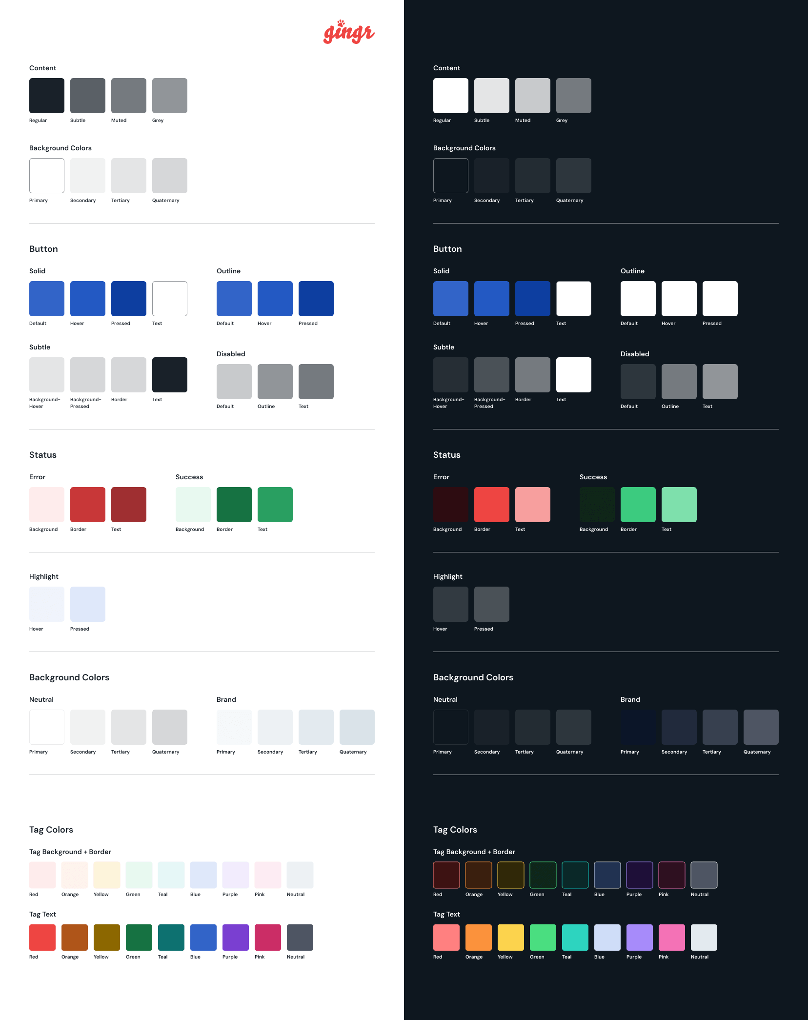
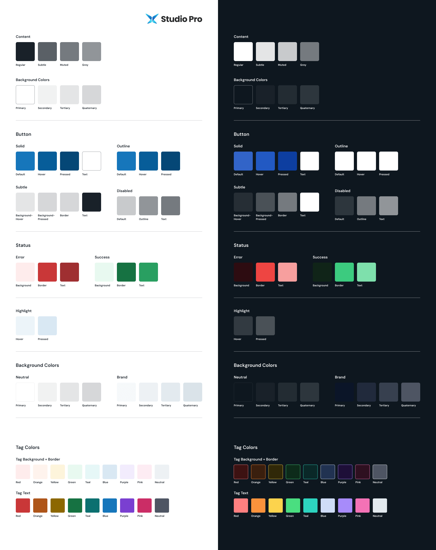
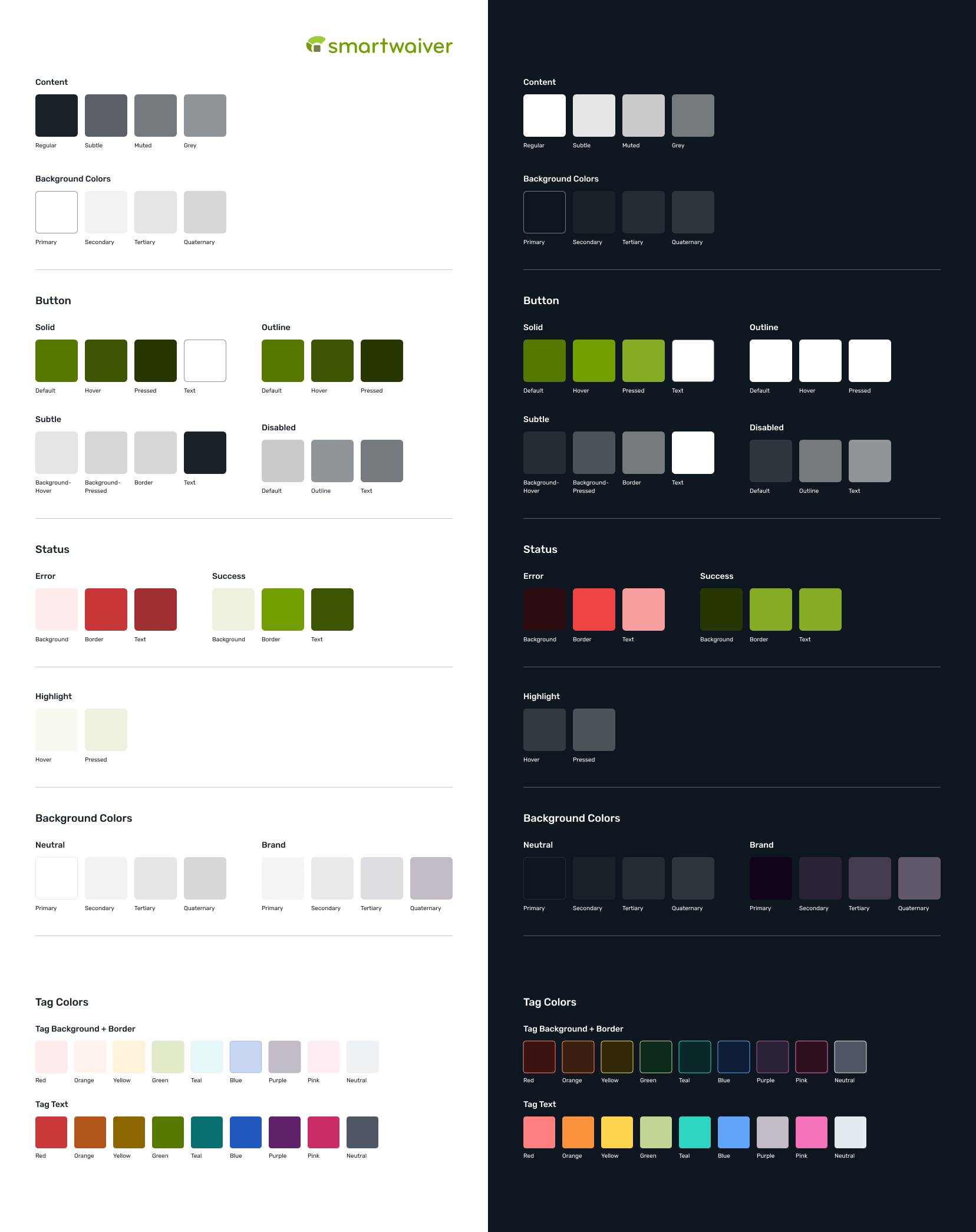
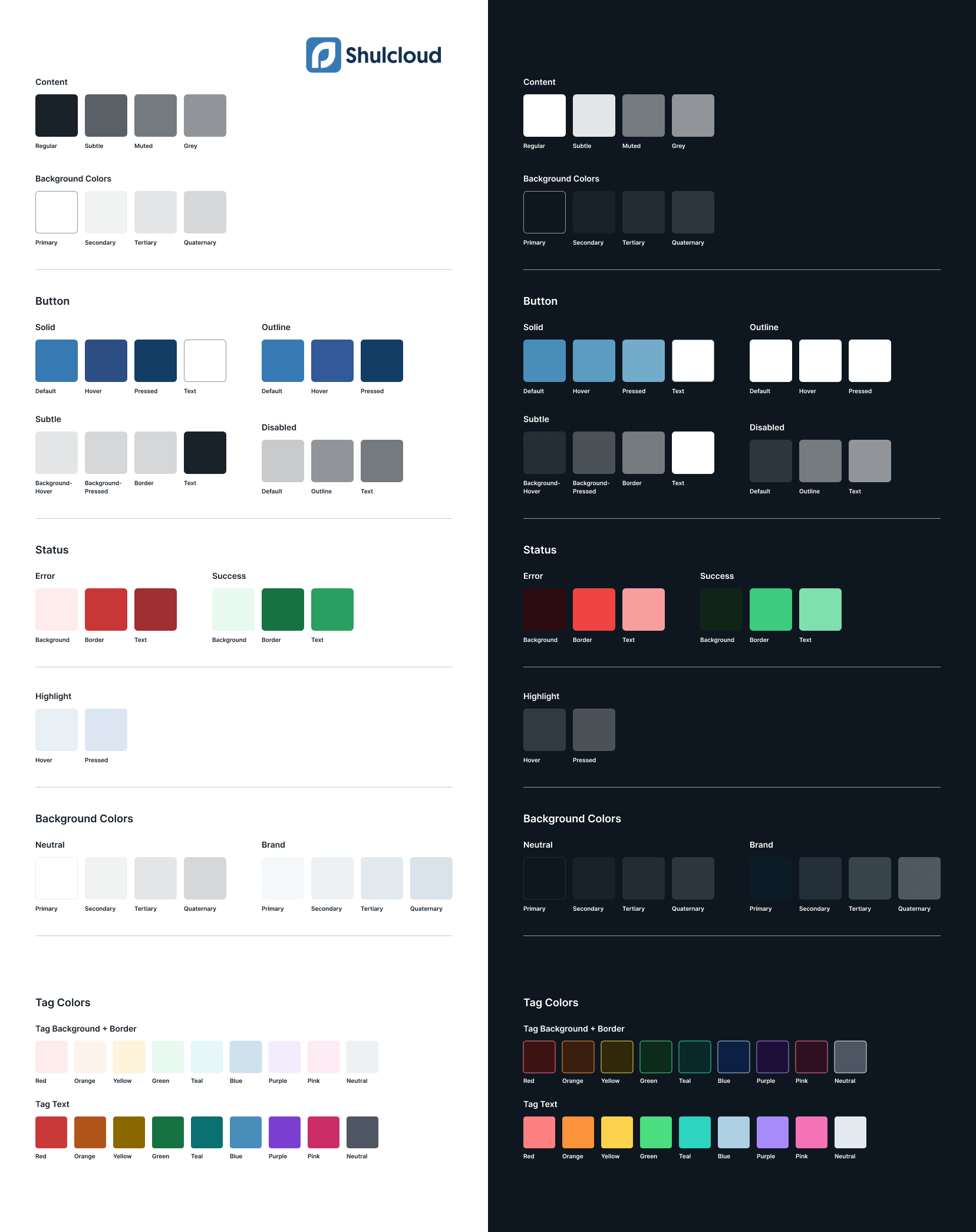
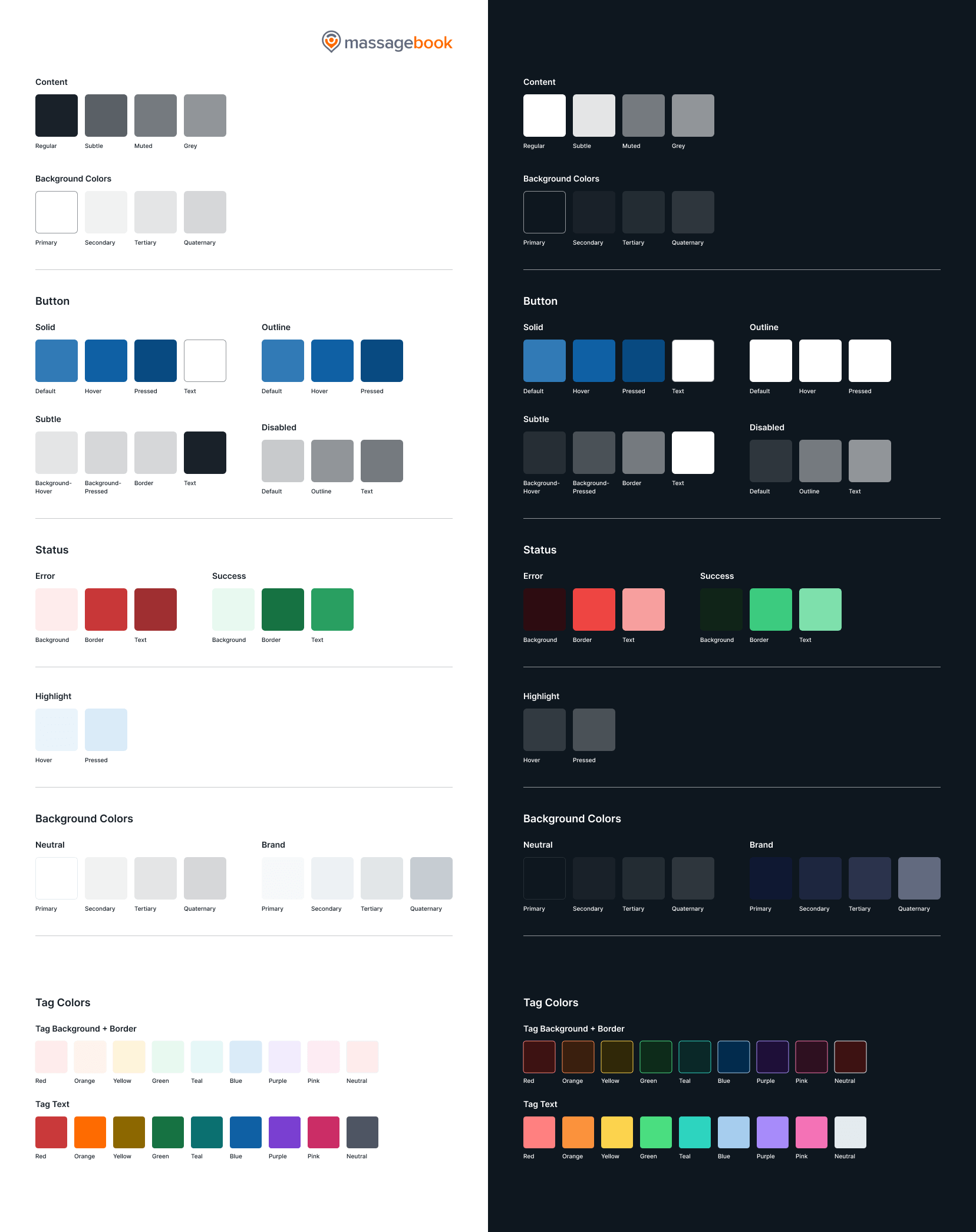
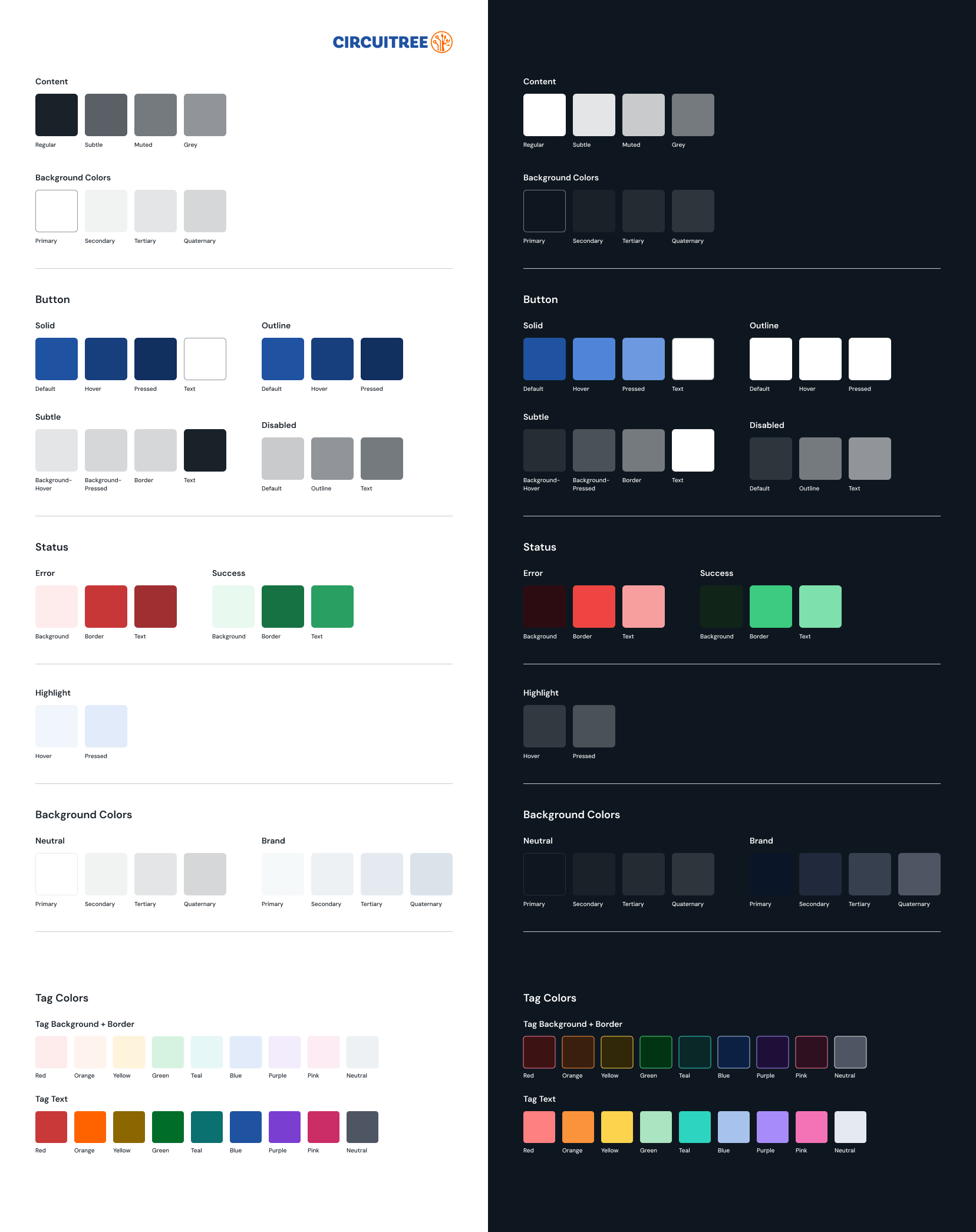
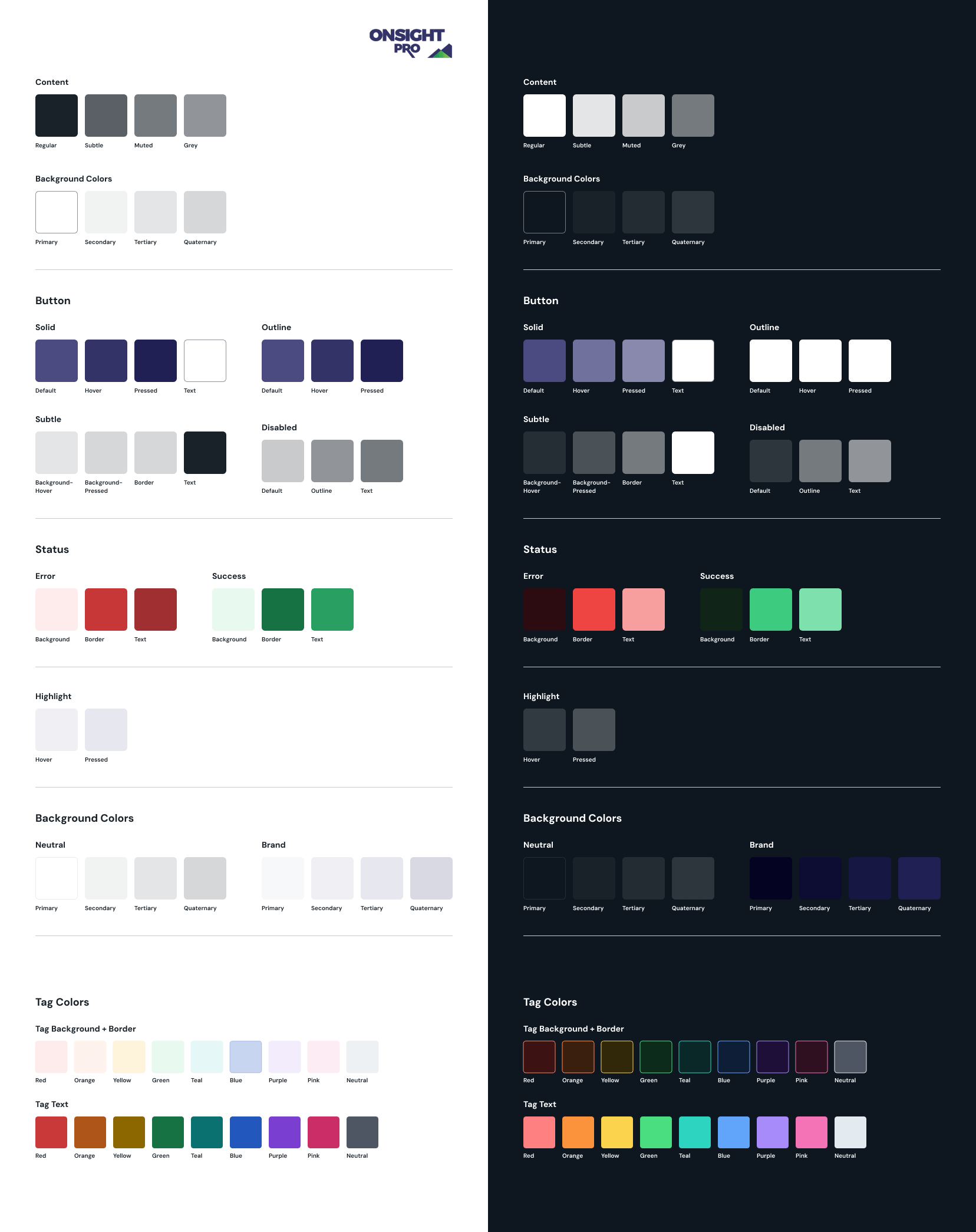
Each brand uses the same color structure, with flexible brand-specific values. This keeps the system consistent for engineering and makes switching between brands seamless in Figma.
Components
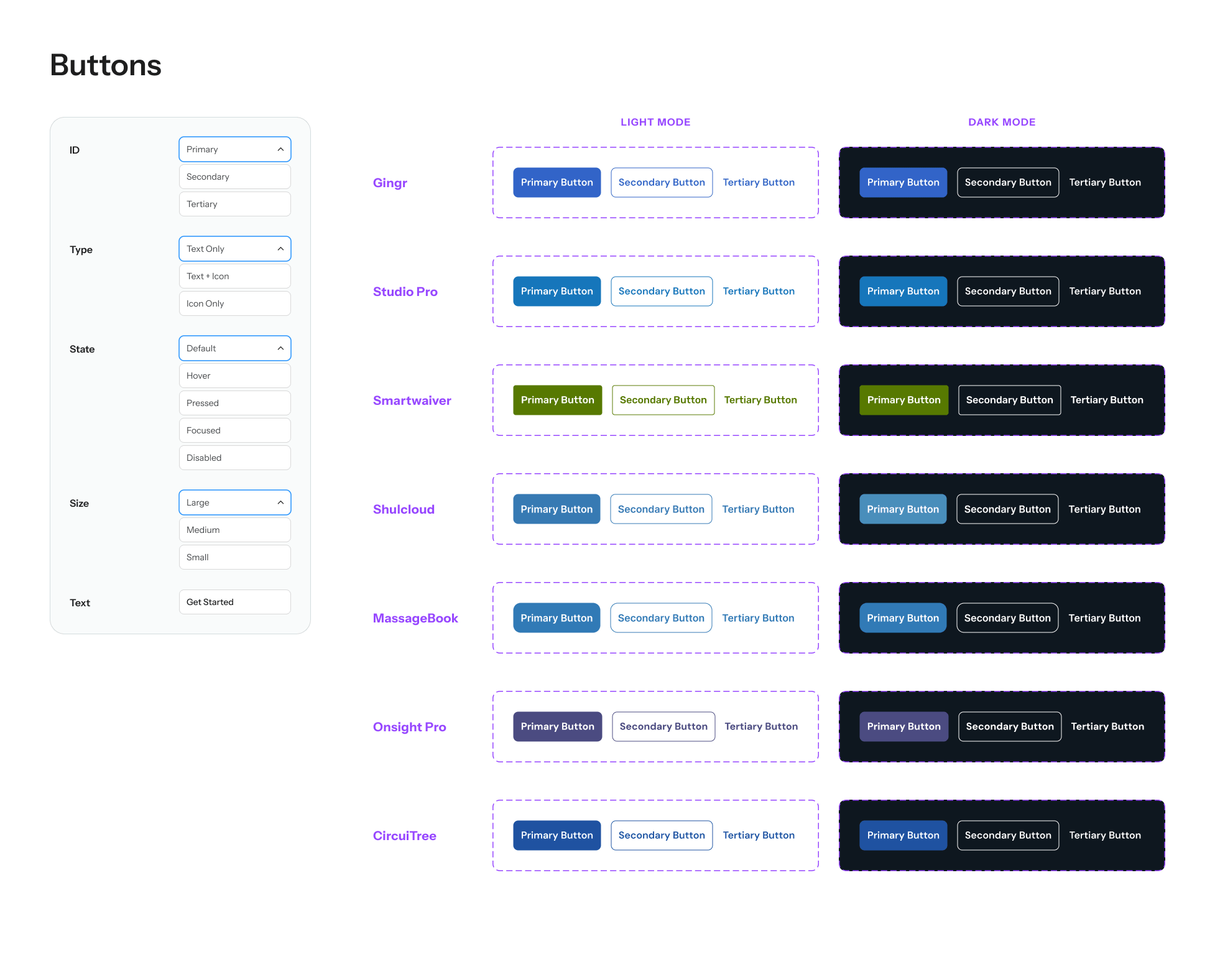
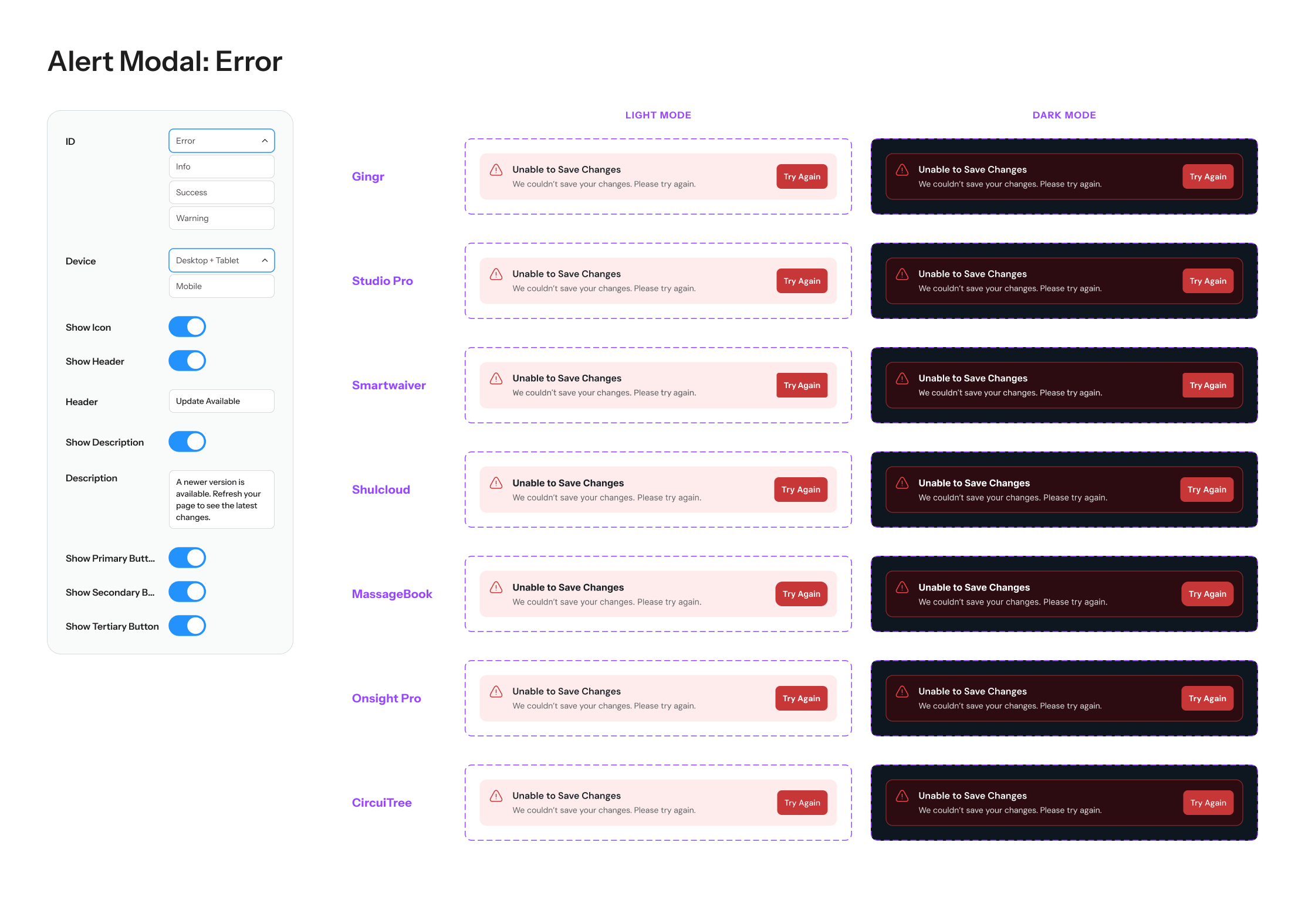
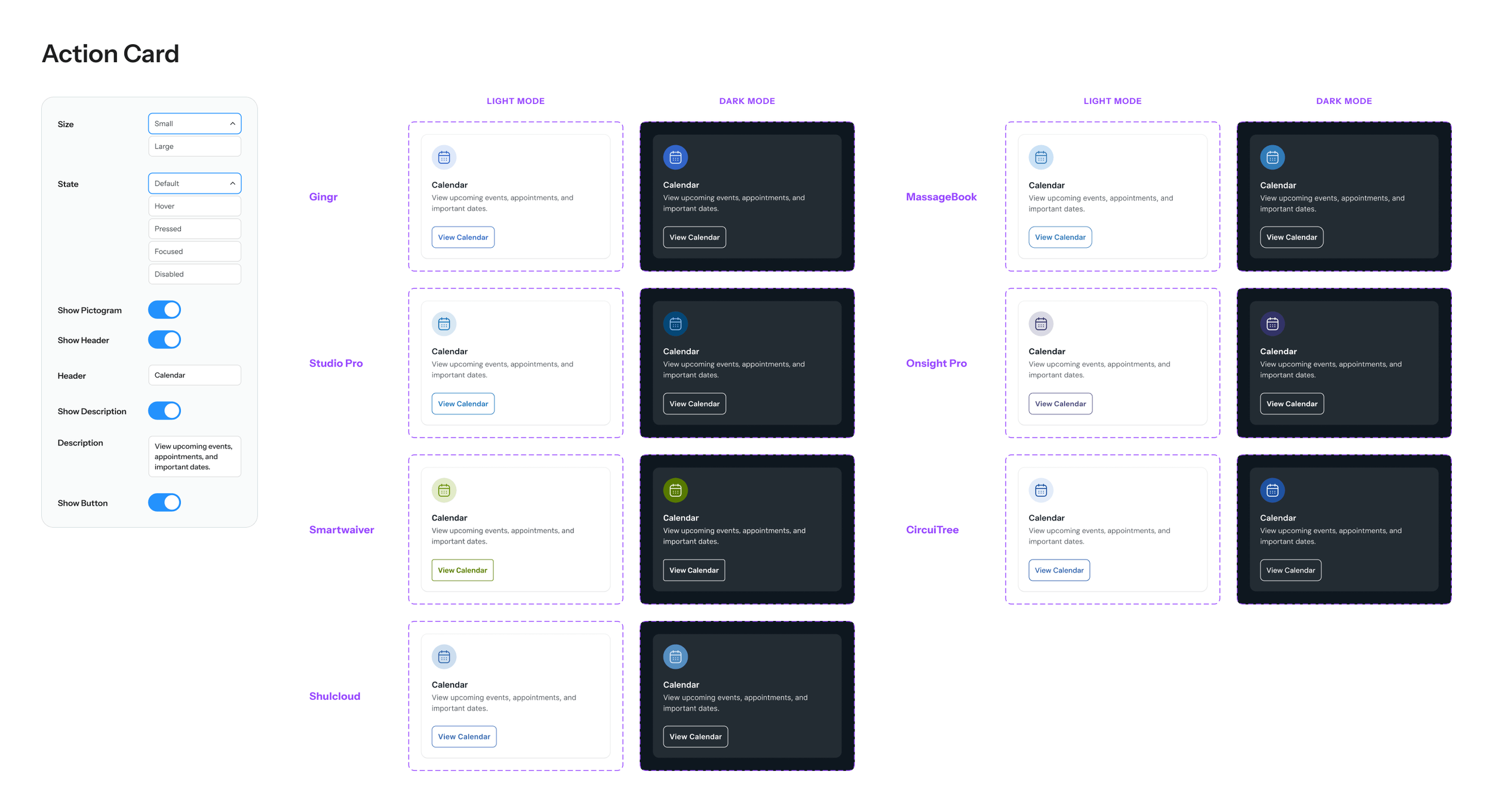
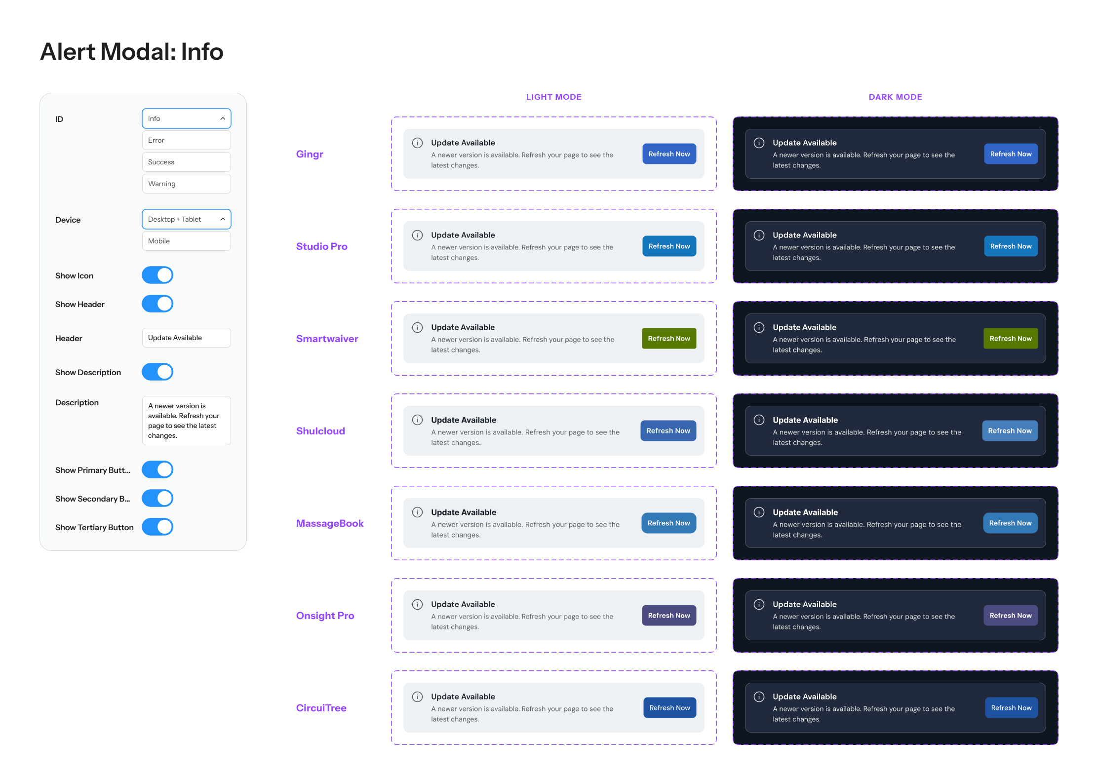
Rather than showing you every component and variant, here are a few examples of the shared component architecture used to scale across brands. Through consistent properties, variants, and design tokens, each component can shift seamlessly between brand identities and light or dark themes while maintaining the same underlying structure and behavior.
A Closer Look at Design Tokens
Shared semantic tokens define each component’s behavior and structure, while brand-specific values control color and formatting across products. You’ll notice this in the tables below, where Buttons is a featured example.
For the best experience, please view this on a desktop device.
Structural Tokens
| Name | Gingr | Studio Pro | Smartwaiver | ShulCloud | MassageBook | Onsight Pro | CircuiTree |
|---|---|---|---|---|---|---|---|
| Formatting / Button / All | |||||||
| Padding-Left Right | 12 | 12 | 12 | 12 | 12 | 12 | 12 |
| Padding-Top Bottom | 12 | 12 | 12 | 12 | 12 | 12 | 12 |
| Corner Radius | 8 | 8 | 4 | 8 | 12 | 12 | 8 |
| Formatting / Button / Outline | |||||||
| Border-Width | 1 | 1 | 1 | 1 | 1 | 1 | 1 |
| Name | Gingr | Studio Pro | Smartwaiver | ShulCloud | MassageBook | Onsight Pro | CircuiTree |
|---|---|---|---|---|---|---|---|
| Button / Solid | |||||||
| Default | Button/Solid/Default | Button/Solid/Default | Button/Solid/Default | Button/Solid/Default | Button/Solid/Default | Button/Solid/Default | Button/Solid/Default |
| Hover | Button/Solid/Hover | Button/Solid/Hover | Button/Solid/Hover | Button/Solid/Hover | Button/Solid/Hover | Button/Solid/Hover | Button/Solid/Hover |
| Pressed | Button/Solid/Pressed | Button/Solid/Pressed | Button/Solid/Pressed | Button/Solid/Pressed | Button/Solid/Pressed | Button/Solid/Pressed | Button/Solid/Pressed |
| Text | Button/Solid/Text | Button/Solid/Text | Button/Solid/Text | Button/Solid/Text | Button/Solid/Text | Button/Solid/Text | Button/Solid/Text |
| Button / Disabled | |||||||
| Default | Button/Disabled/Default | Button/Disabled/Default | Button/Disabled/Default | Button/Disabled/Default | Button/Disabled/Default | Button/Disabled/Default | Button/Disabled/Default |
| Text | Button/Disabled/Text | Button/Disabled/Text | Button/Disabled/Text | Button/Disabled/Text | Button/Disabled/Text | Button/Disabled/Text | Button/Disabled/Text |
| Outline | Button/Disabled/Outline | Button/Disabled/Outline | Button/Disabled/Outline | Button/Disabled/Outline | Button/Disabled/Outline | Button/Disabled/Outline | Button/Disabled/Outline |
Color Tokens
To show how these tokens map back to each brand library, here’s Gingr as an example. Its Light and Dark mode button tokens reference values from the Gingr blue palette.
To show how these tokens map back to each brand library, here’s Gingr as an example. Its Light and Dark mode button tokens reference values from the Gingr blue palette.
| Name | Light | Dark |
|---|---|---|
| Button / Solid | ||
| Default | Blue/0 | Blue/0 |
| Hover | Blue/100 | Blue/100 |
| Pressed | Blue/200 | Blue/200 |
| Text | Neutral/White | Neutral/White |
| Button / Outline | ||
| Default | Blue/0 | Neutral/White |
| Hover | Blue/100 | Neutral/White |
| Pressed | Blue/200 | Neutral/White |
| Button / Disabled | ||
| Default | Button/Disabled/Light/Default | Button/Disabled/Dark/Default |
| Text | Button/Disabled/Light/Text | Button/Disabled/Dark/Text |
| Outline | Button/Disabled/Light/Outline | Button/Disabled/Dark/Outline |
| Name | Gingr |
|---|---|
| Blue | |
| 600 | 252F42 |
| 500 | 213251 |
| 400 | 1D3461 |
| 300 | 193771 |
| 200 | 0D3EA0 |
| 100 | 2359C3 |
| 0 | 3264C8 |
| -100 | 91AFEB |
| -200 | BED1F7 |
| -300 | CFDDF8 |
| -400 | DFE8FA |
| -500 | F0F4FB |
Expanding the Framework
Creating the App Shell
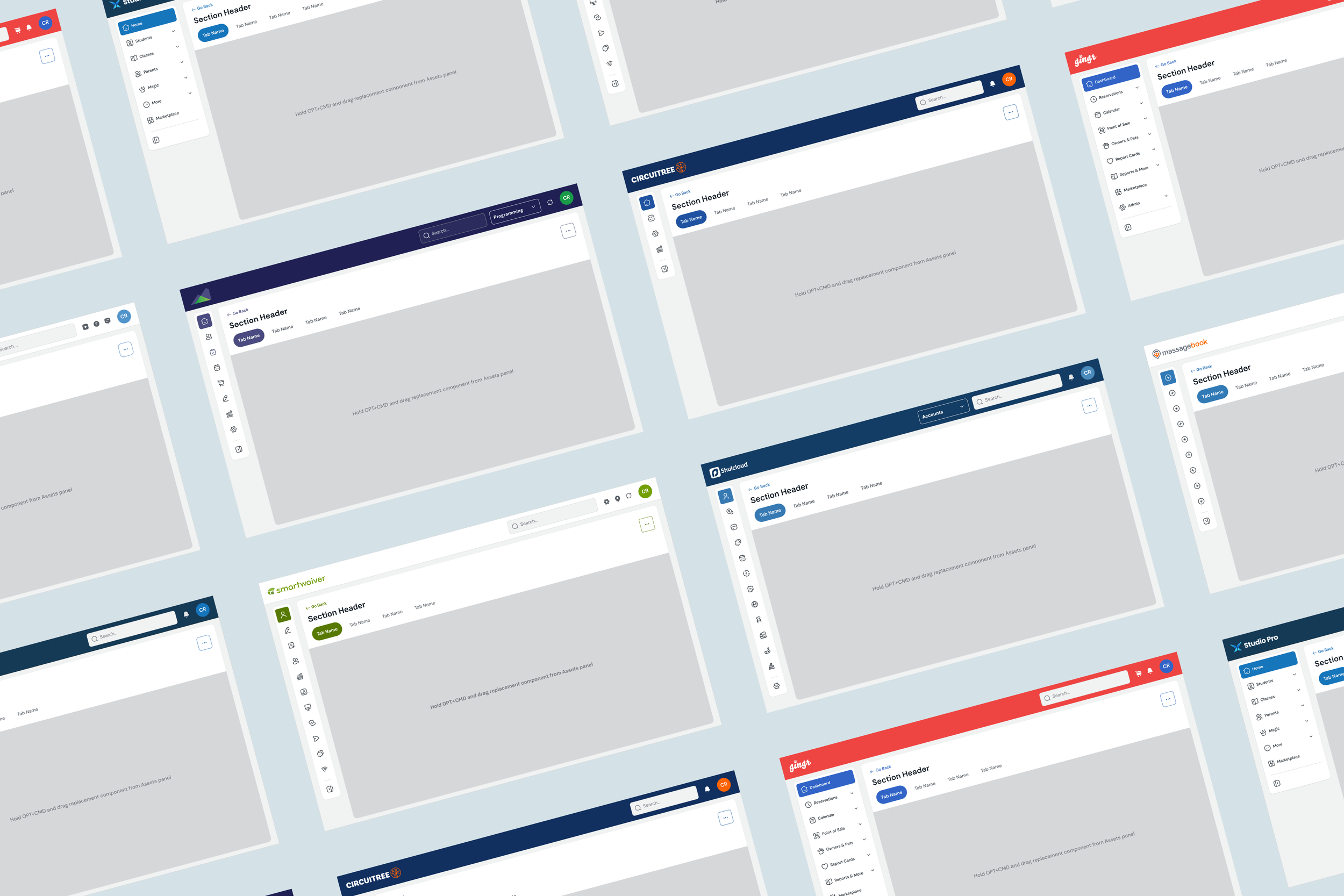
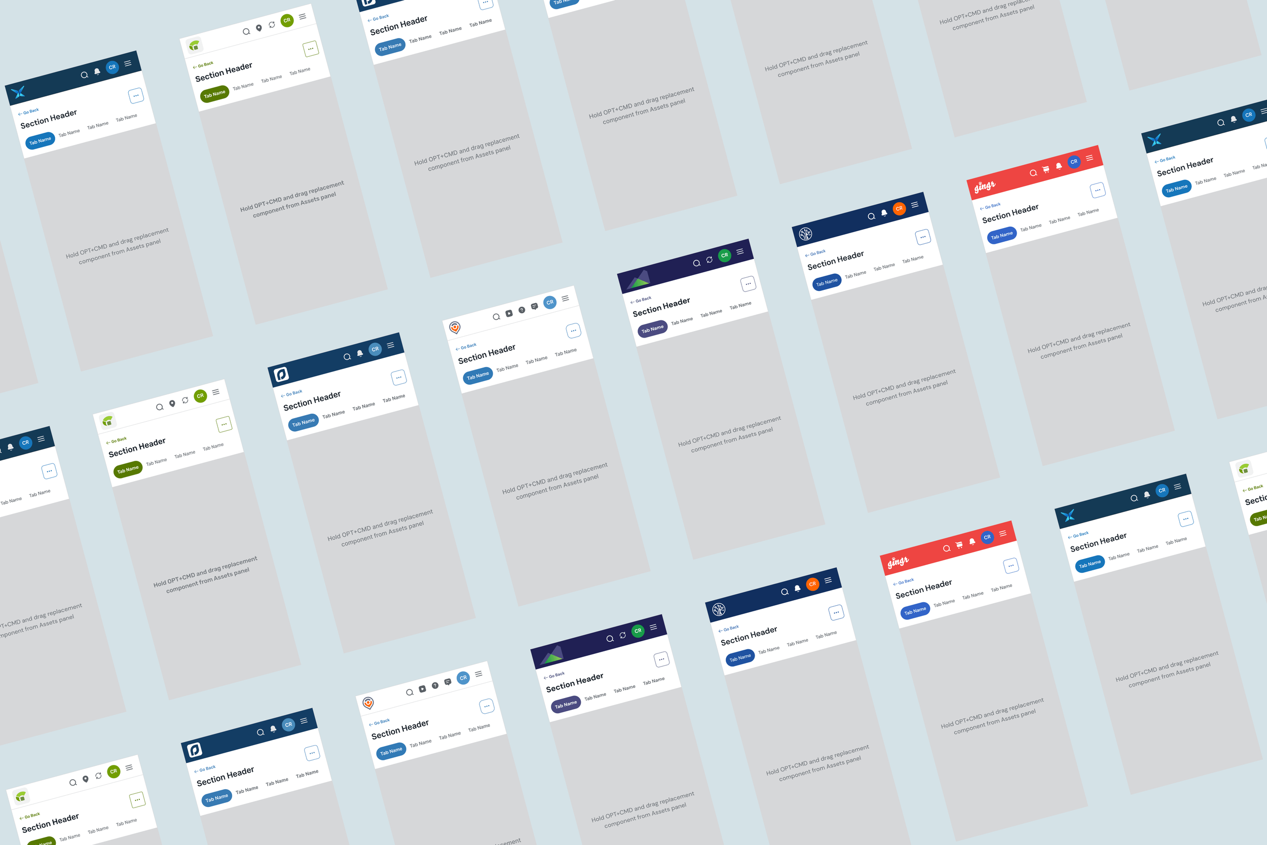
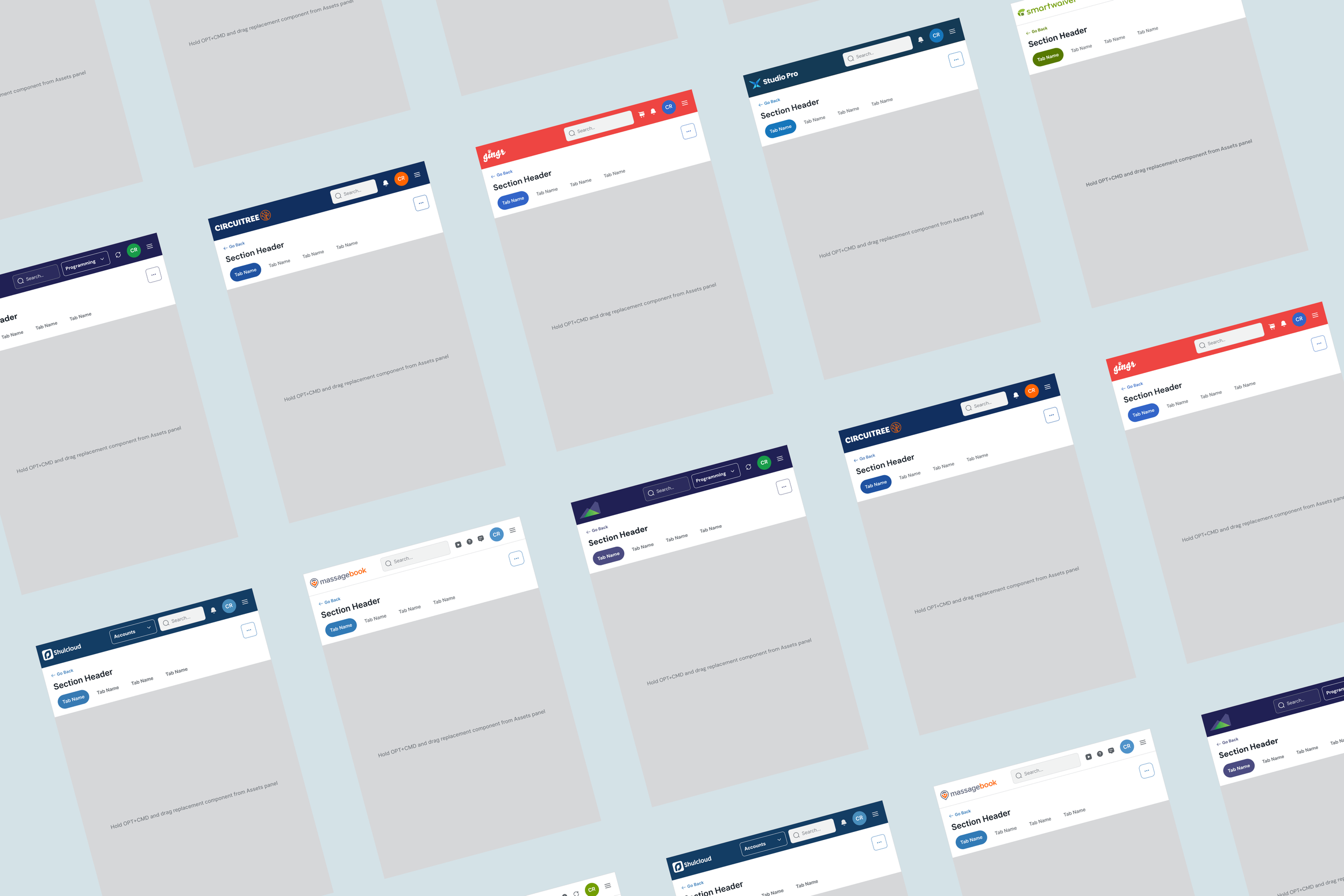
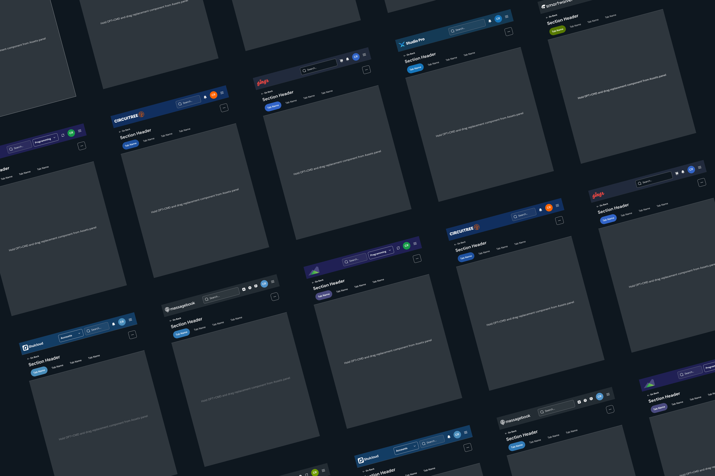
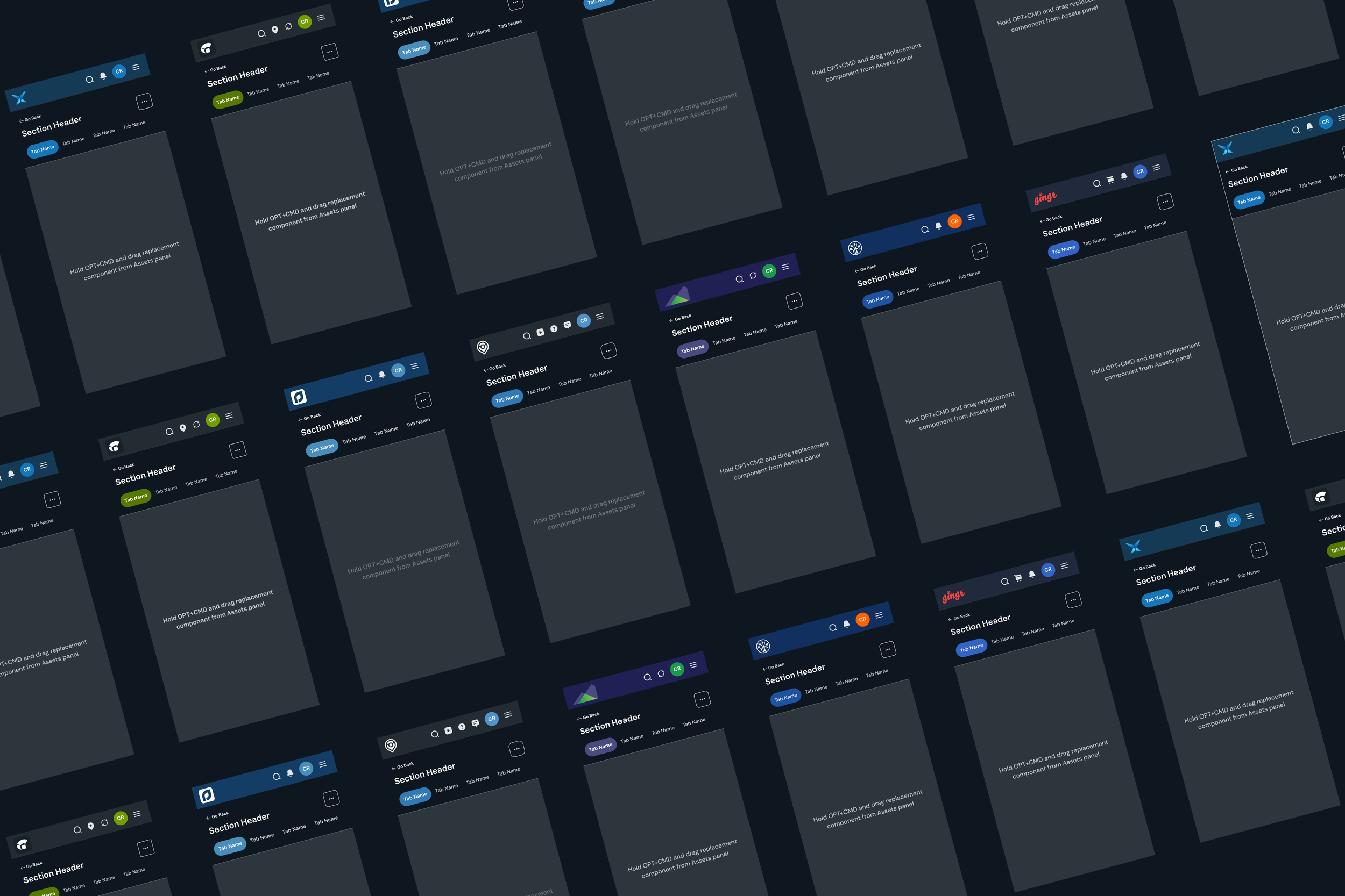
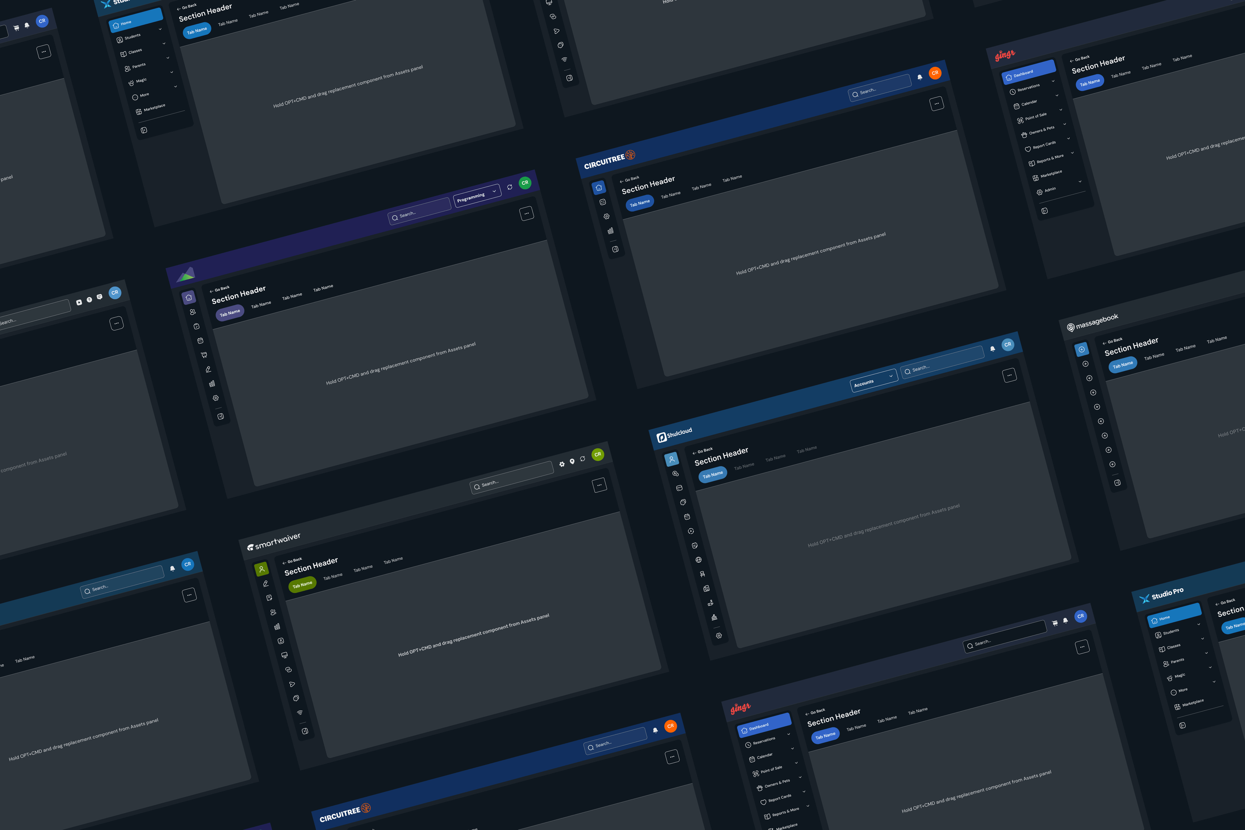
With colors and components established, the next step was creating a shared app framework across devices. The goal was to create a consistent structural foundation while ensuring designers would have enough flexibility to build distinct, brand-specific experiences.
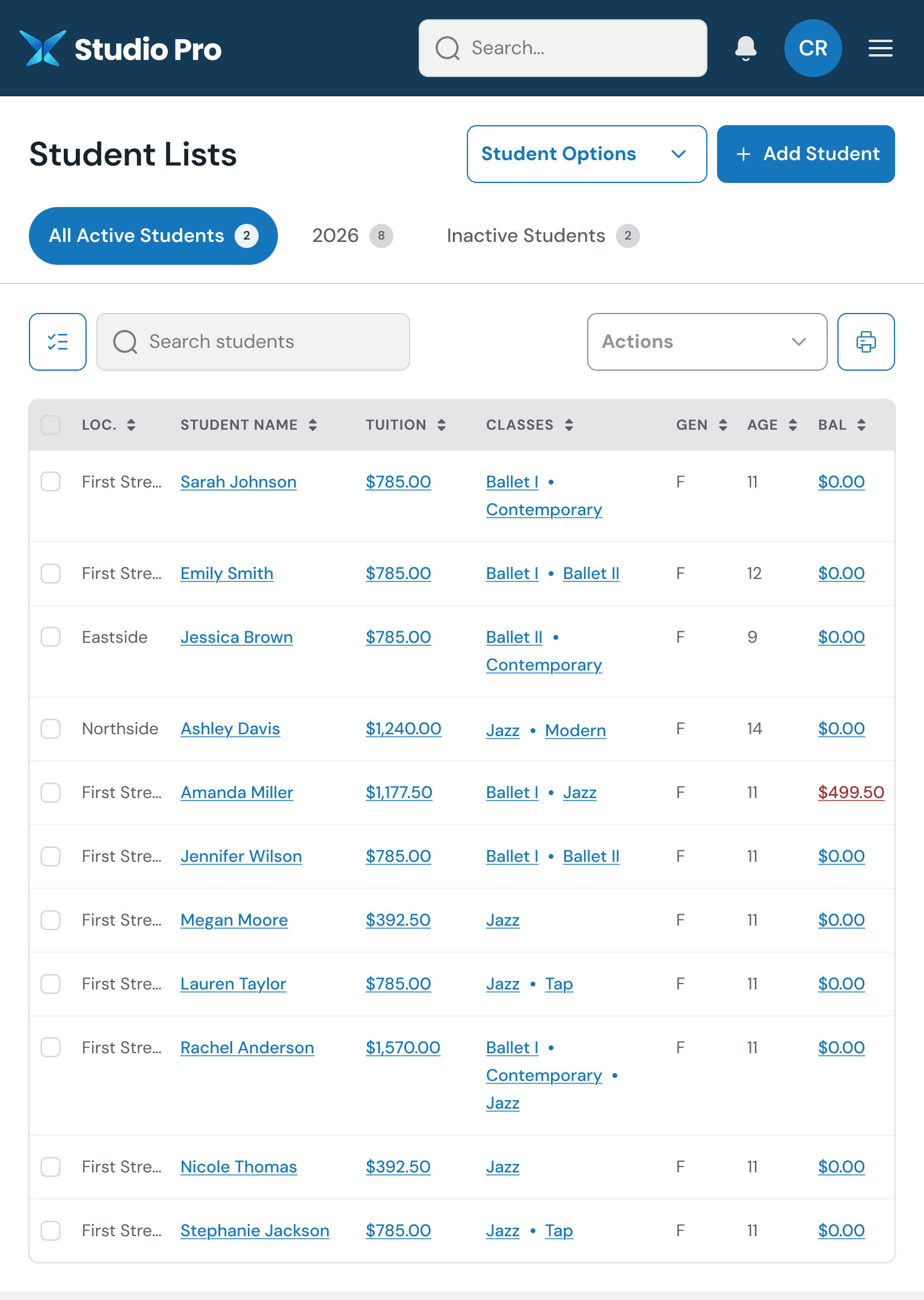
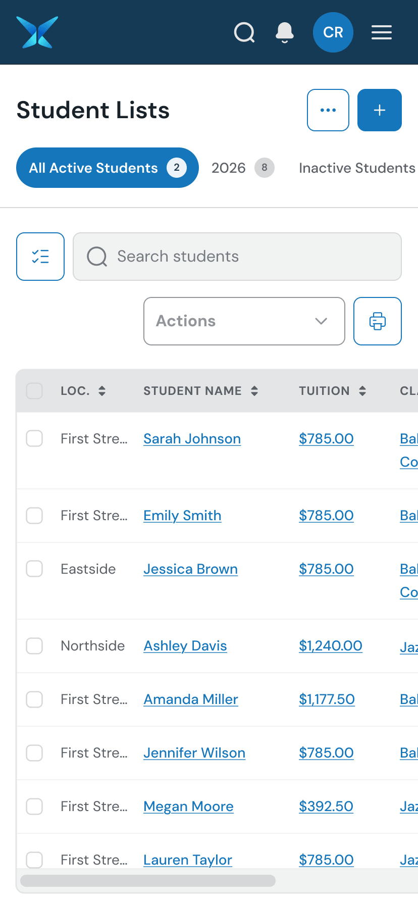
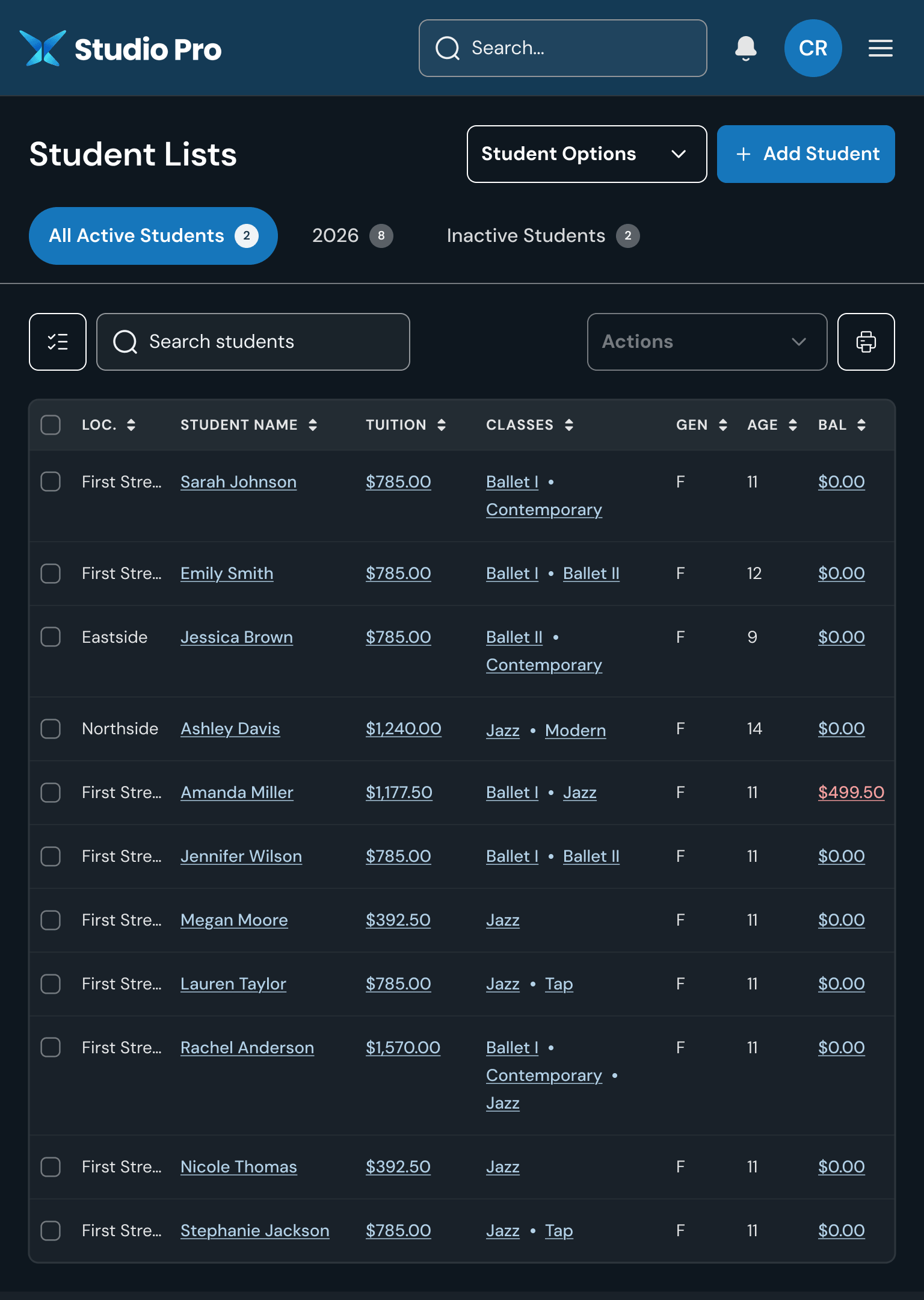
The images below show the “shell” of our desktop, tablet, and mobile applications in both light and dark modes.
What’s next?
With the app shell finalized, the next step was designing the screens unique to each brand.
In a perfect world, every screen would be rethought through extensive research, journey mapping, and exploration. At Togetherwork’s scale — 20+ products, many in need of modernization — that approach wasn’t practical or cost-effective.
Instead, I focused on preserving familiar functionality where it still worked, while improving usability, visual clarity, and consistency with the new design system. Our goals are outlined below.
(Note: Although the design system spans across seven brands, Gingr and Studio Pro were my primary product focuses.)
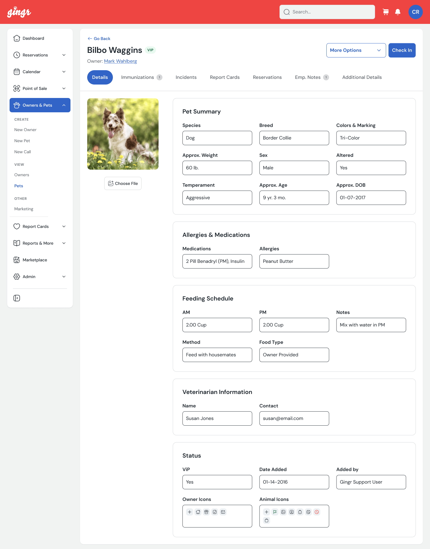
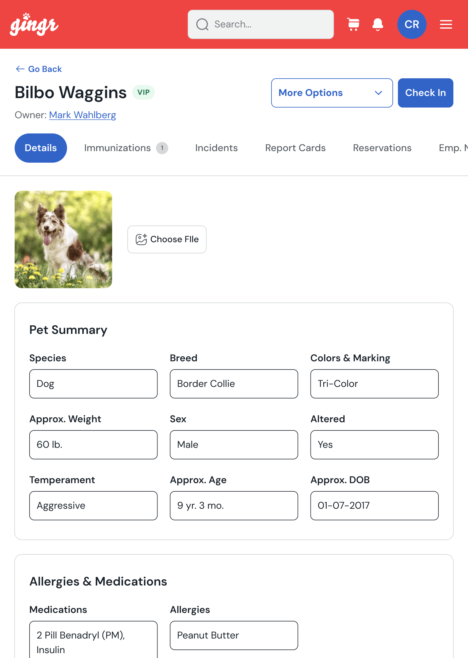
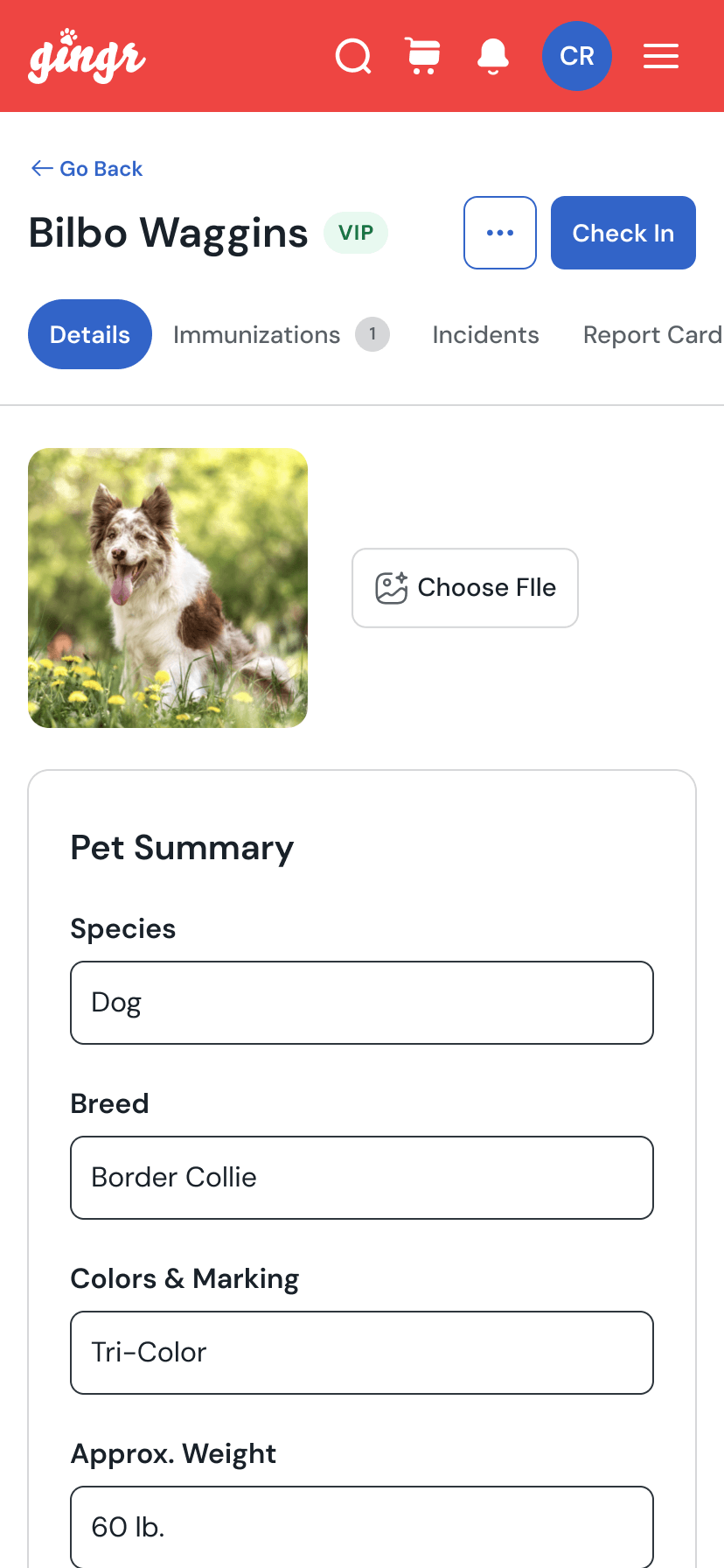
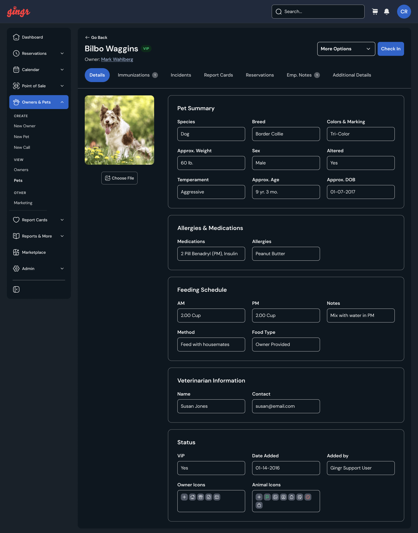
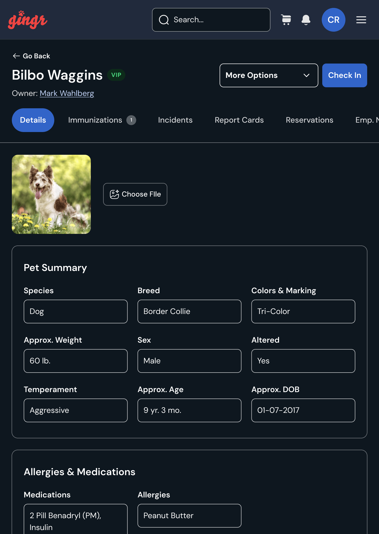
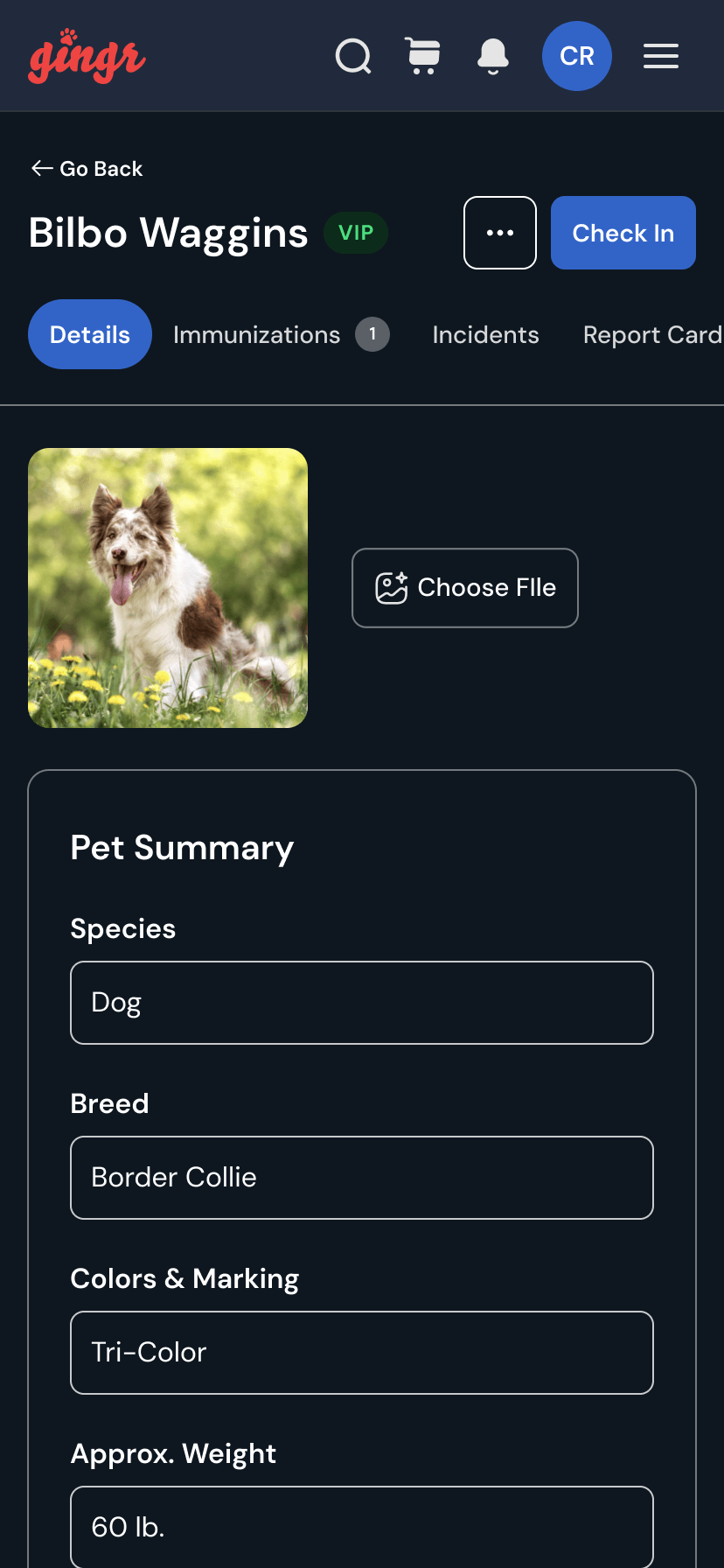
Gingr: Reimagining the Pet Profile Experience
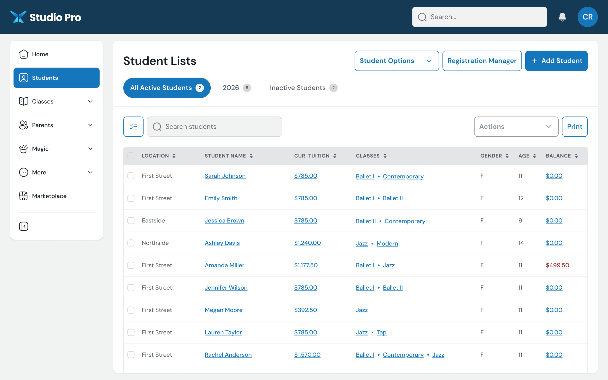
Studio Pro: Improving Studio Management
More Focused Student Management:
The page is clearly centered on finding and managing students, rather than surrounding the core task with unrelated links.Cleaner Student Status Switching:
Active, seasonal, and inactive students are surfaced as clear tabs.Improved Search Placement:
Student search is positioned directly with the table, where users would naturally expect to find it.More Intentional Bulk Actions:
A single '‘Actions’ control replaces various competing links.Clearer Primary Tasks:
High-value actions like ‘Add Student’ and ‘Registration Manager’ are promoted into the page header instead of competing with utility links.Better Table Readability:
Columns are cleaner, spacing is improved, and the data is easier to scan row by row.Improved Sorting Affordance:
Sortable columns are more consistently indicated, making the table feel more interactive and predictable.Better Financial Visibility:
Tuition and balance information is easier to compare across students, with negative balances receiving appropriate emphasis.Reduced Reliance on Utility Sidebars:
Quick links and administrative shortcuts no longer take up a large portion of the screen, giving the actual student data more room.More Modern Record Selection:
Row checkboxes and table controls are integrated into the data grid more cleanly, making multi-select workflows easier to understand.Clearer Separation of Global vs. Page-Level Actions:
Product navigation lives in the sidebar, while student-specific actions stay within the student-list experience.Better Use of Screen Real Estate:
The redesign gives significantly more horizontal space to the student table and the information users are actually there to manage.