Establishing a Digital Presence for a Growing Agency
2022-2023
Web Design
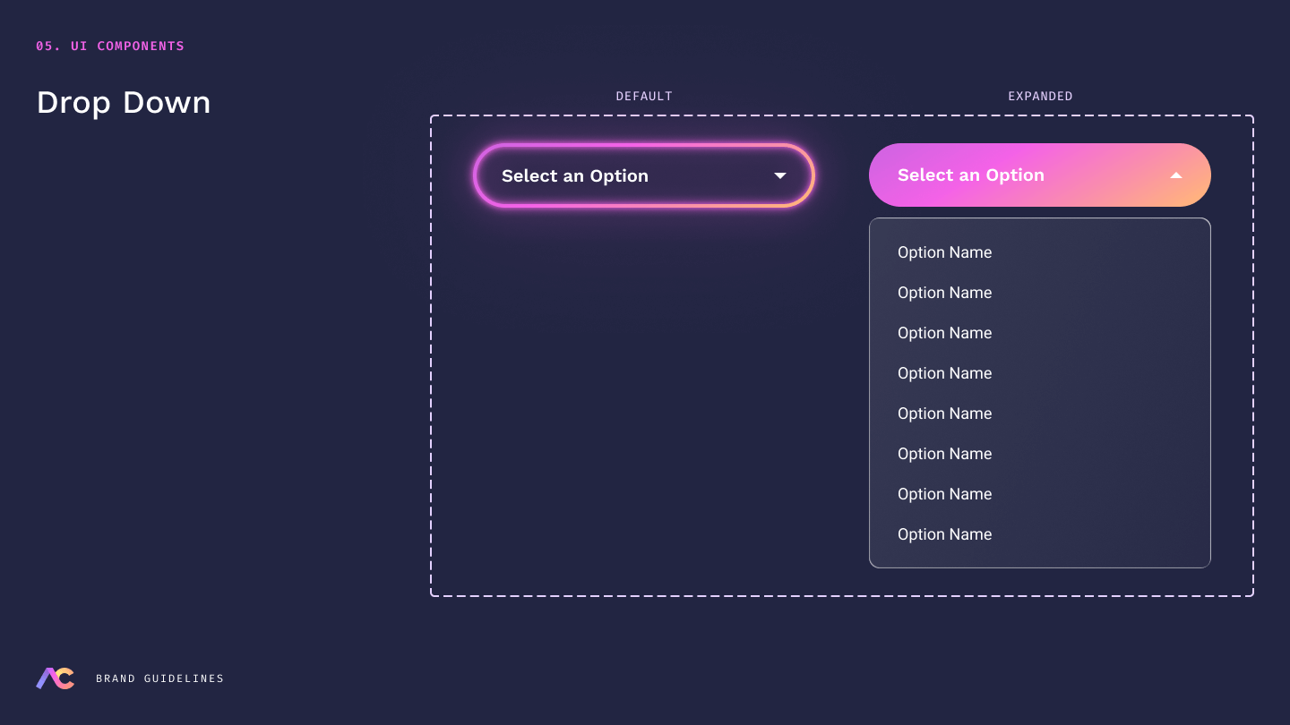
Design System
About Arm Candy
Arm Candy is a full-service media intelligence agency powered by CYRIS, an industry-first media intelligence platform. Blending AI with human insight, the agency delivers a modern, high-performance approach to advertising.
The Challenge
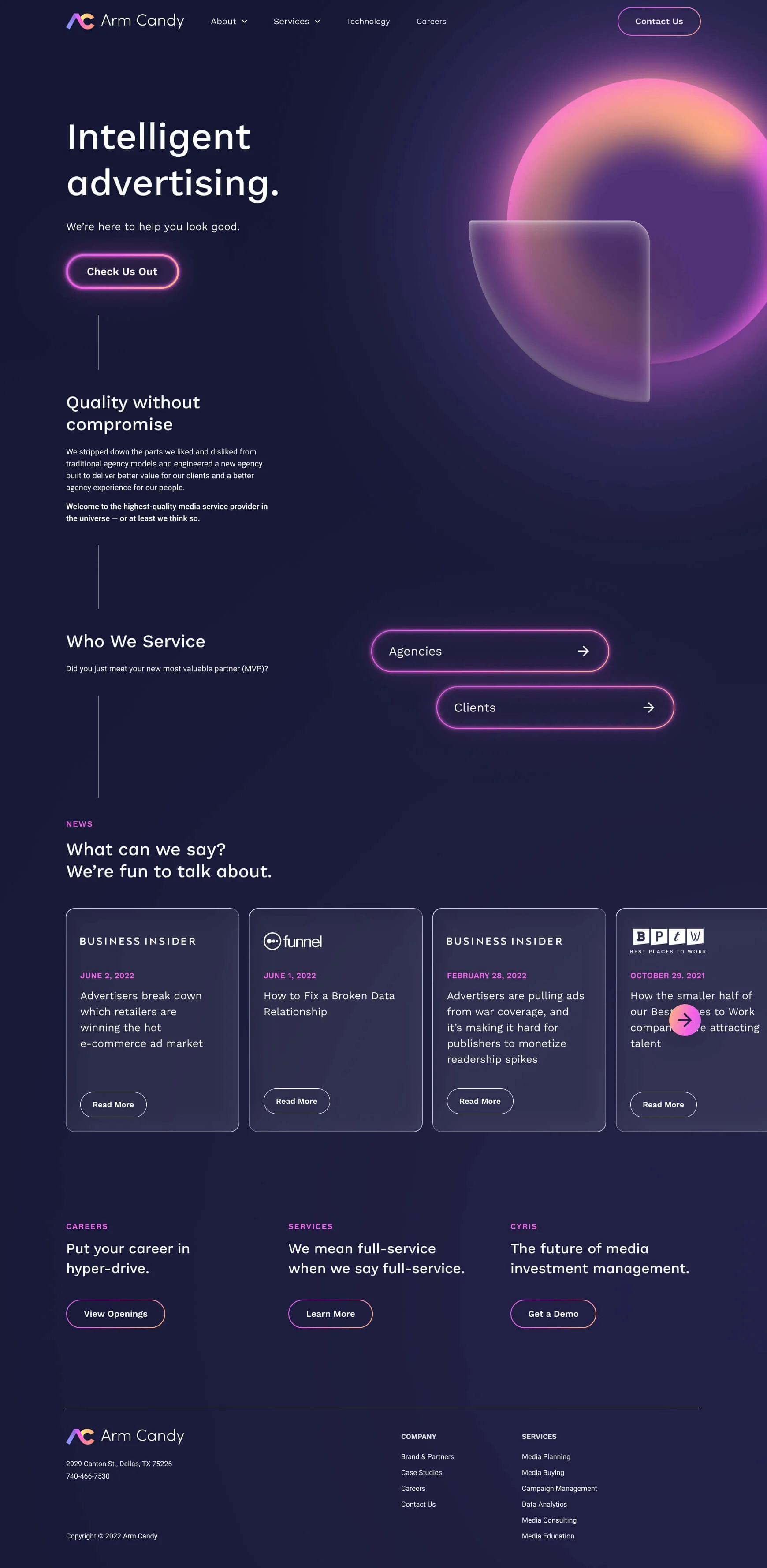
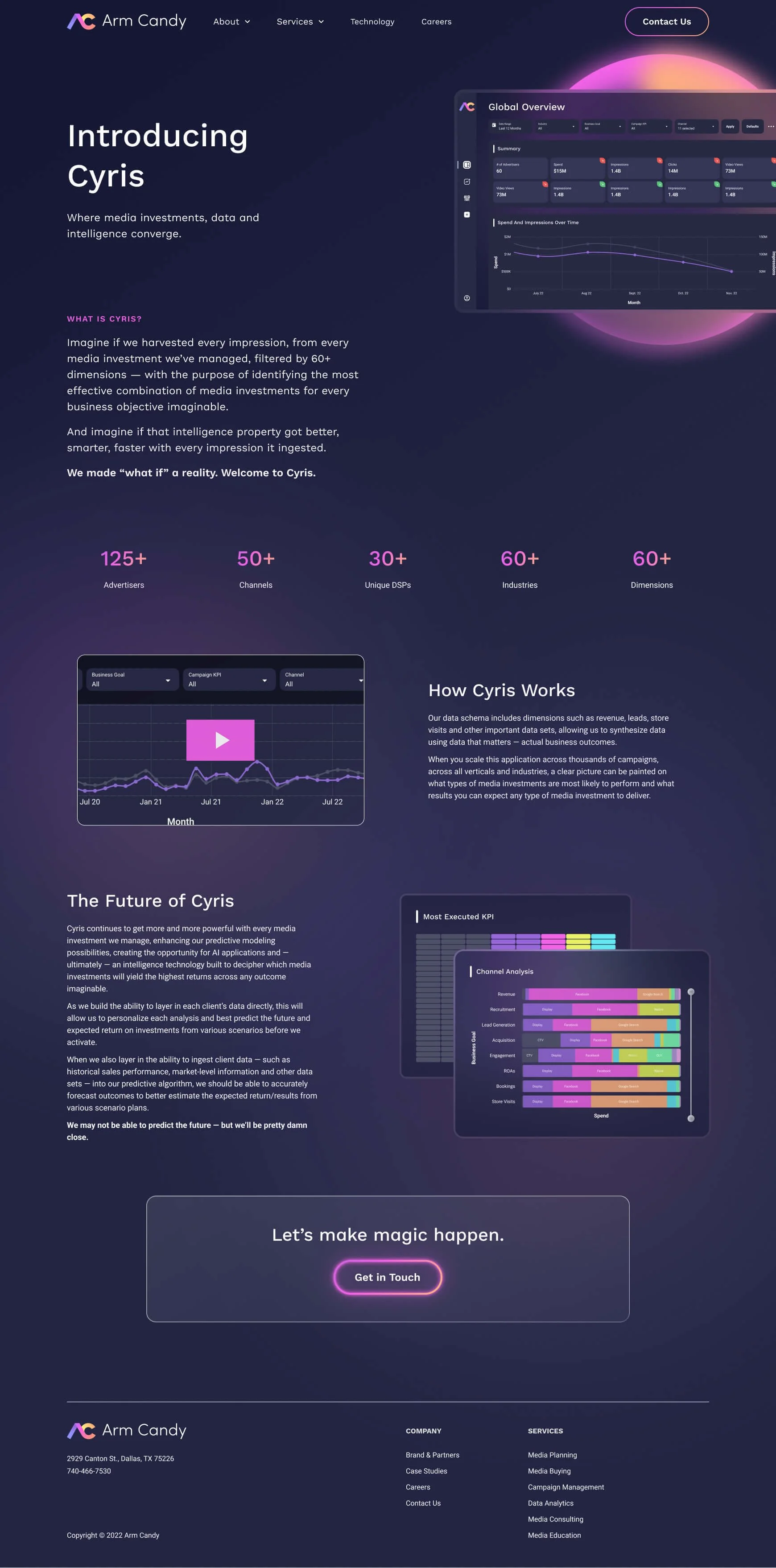
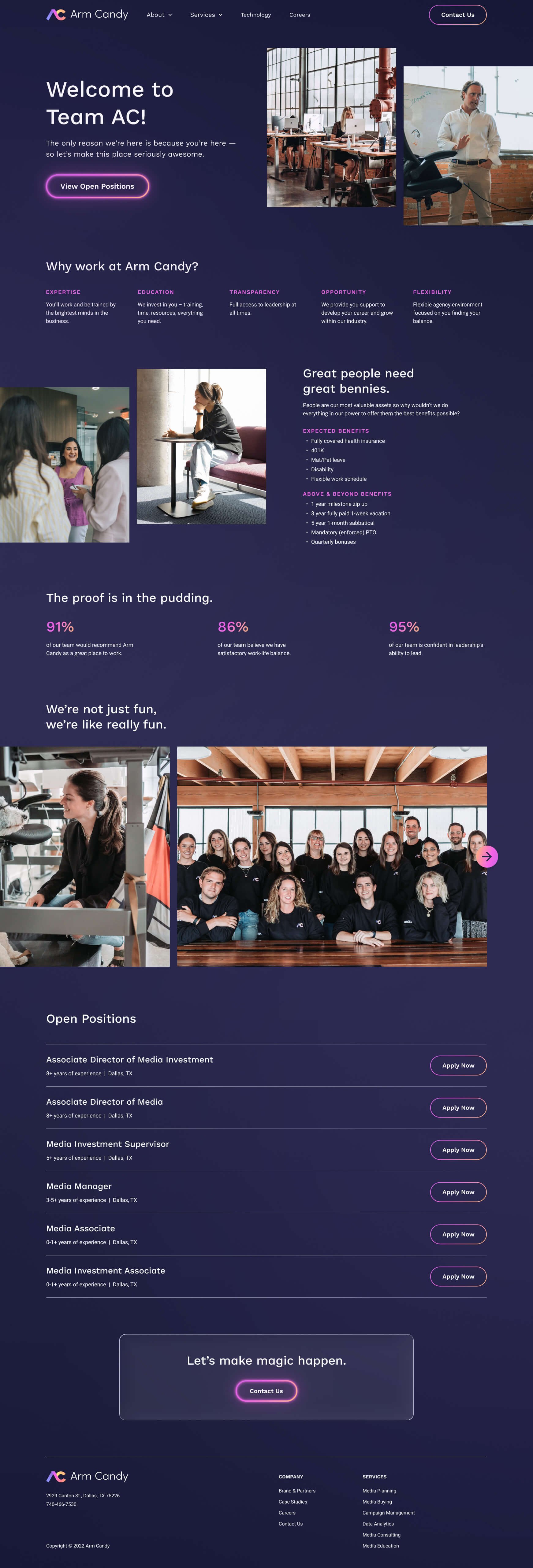
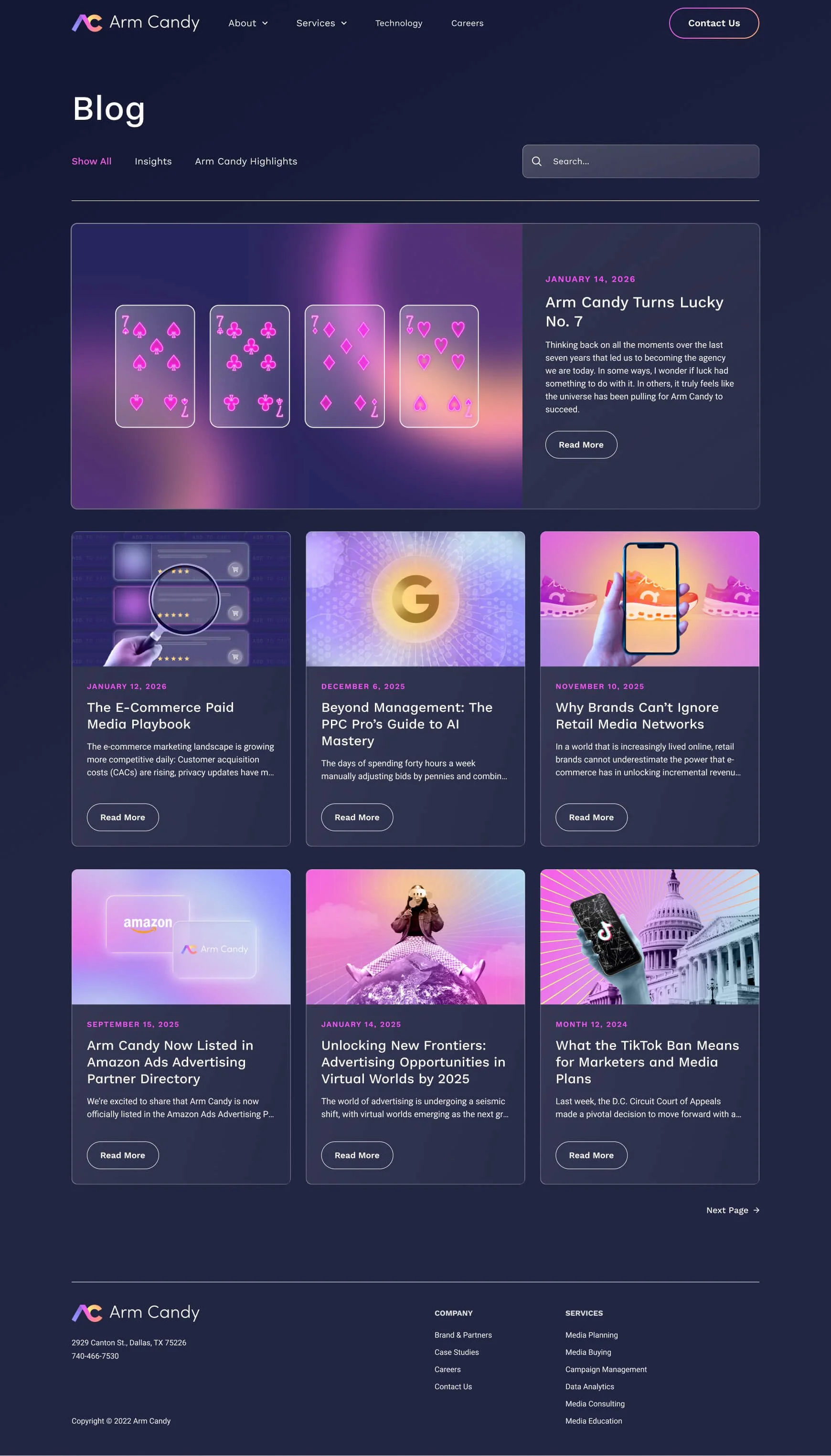
By October 2022, Arm Candy had simply outgrown its website. The agency had evolved quickly, and the existing site no longer reflected who they were and where they were headed. Arm Candy wanted a full relaunch that positioned them as bold, confident, and experienced, with a clear emphasis on CYRIS, their proprietary media intelligence platform.
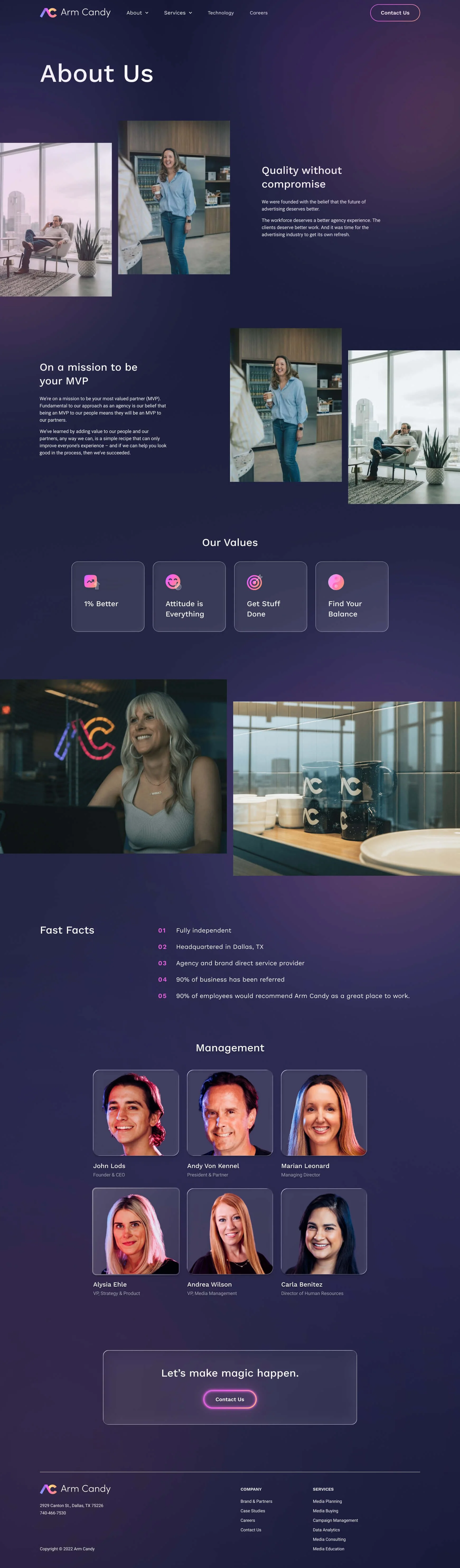
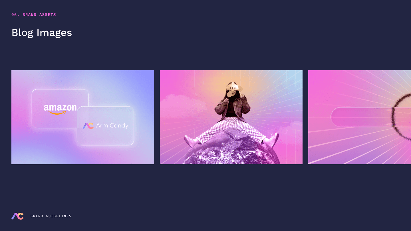
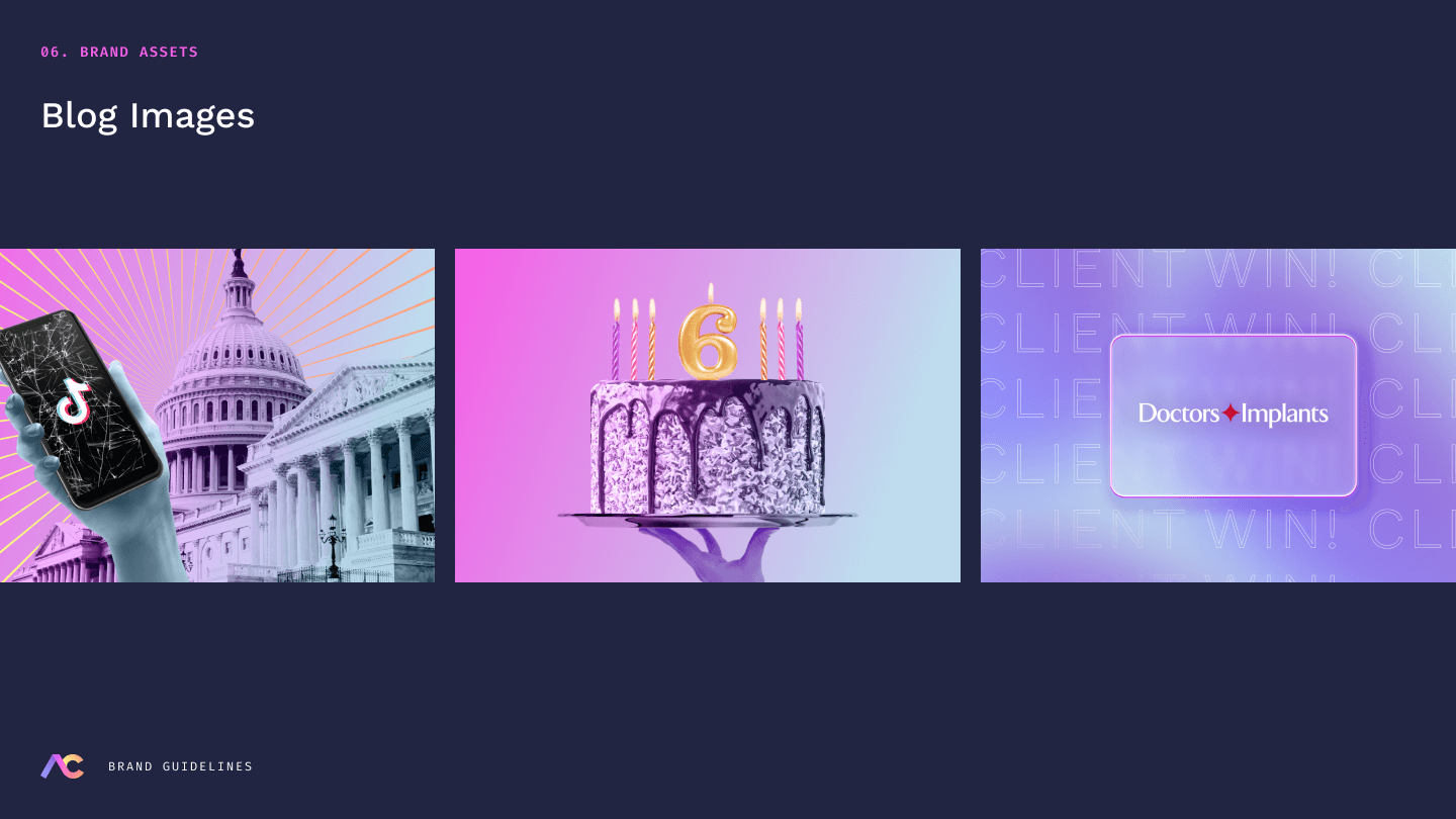
They also needed a better home for their growing library of thought leadership, with a blog that felt intentional rather than homemade. The site also had to capture Arm Candy’s culture and personality, helping them capture their ‘cool factor’ that would help attract ambitious young professionals in Dallas.
Key Objectives
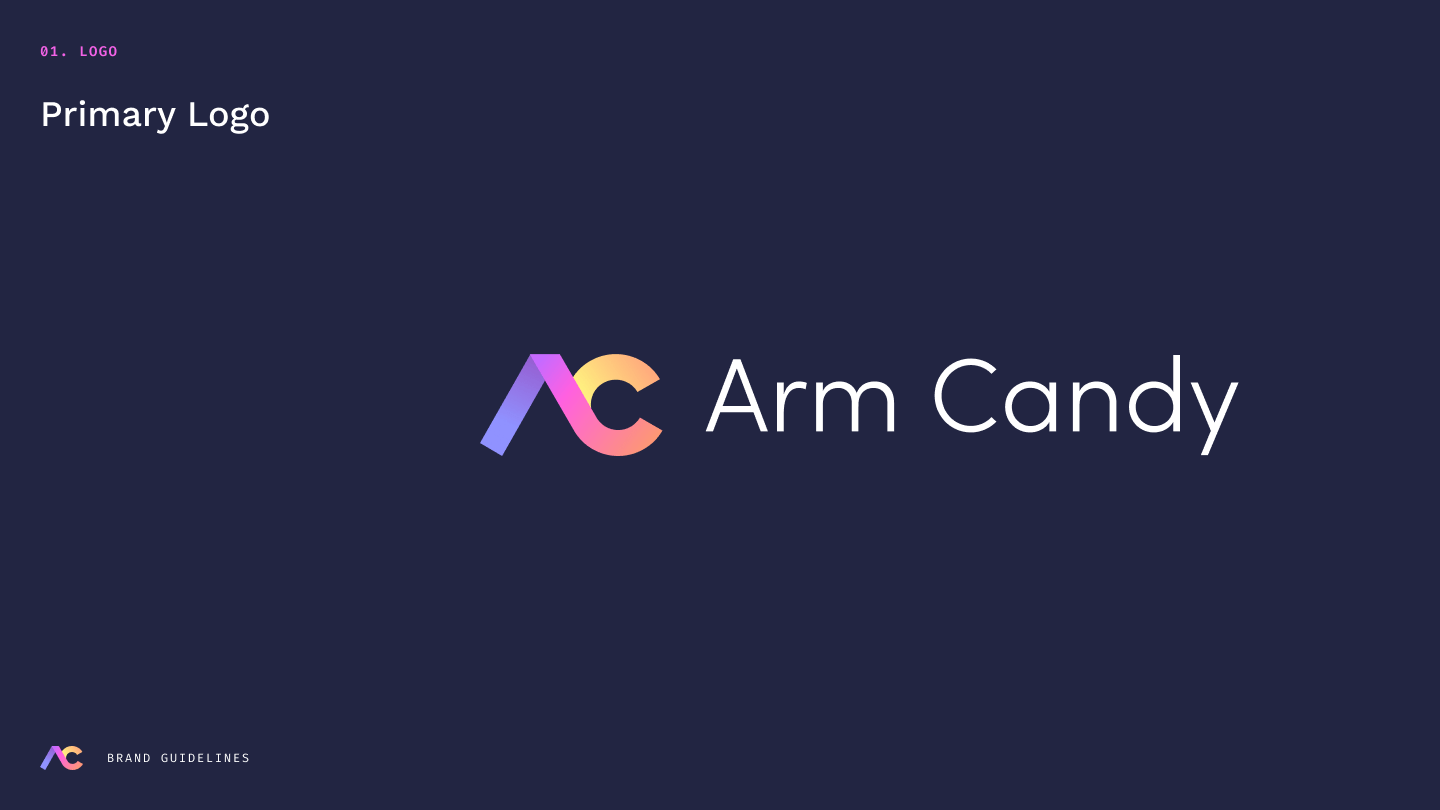
Create a brand identity: Arm Candy had a few branded assets, but needed to build them out in a much bigger way to create a clear, confident visual presence.
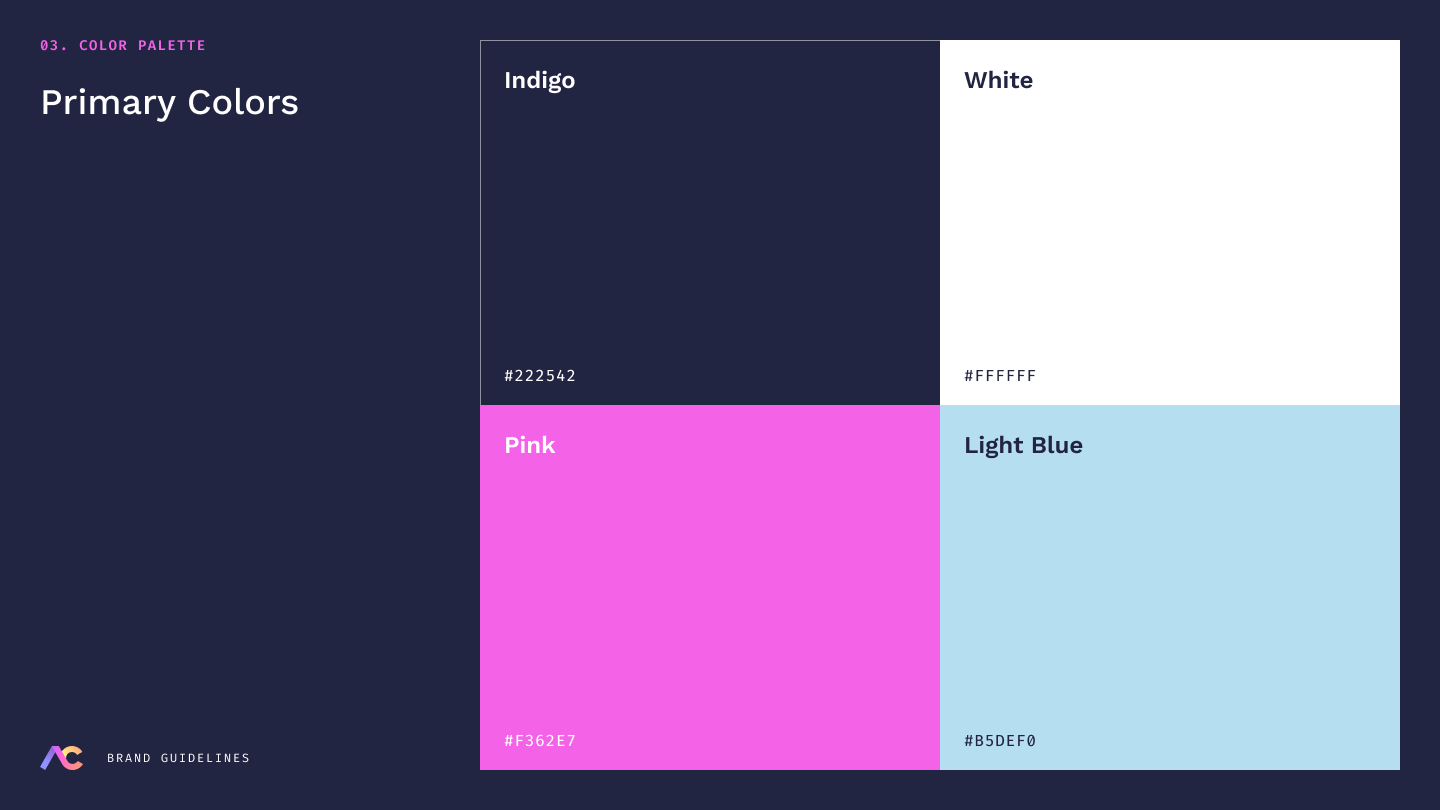
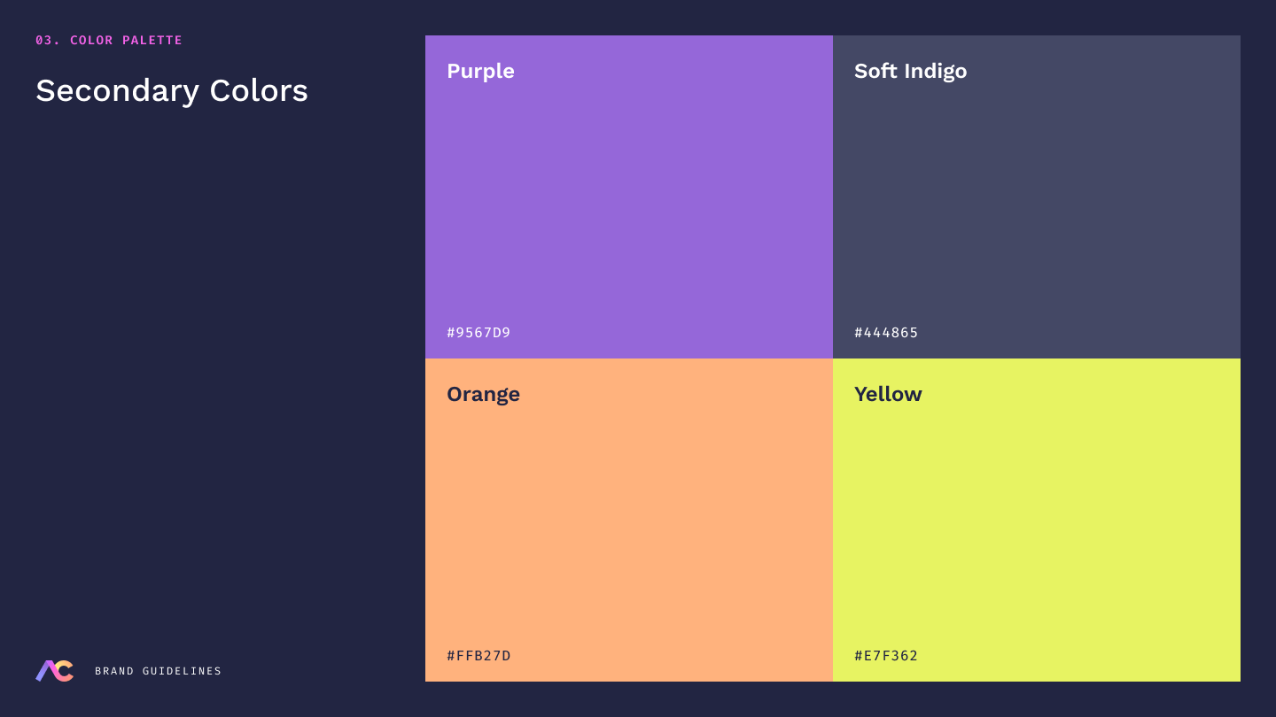
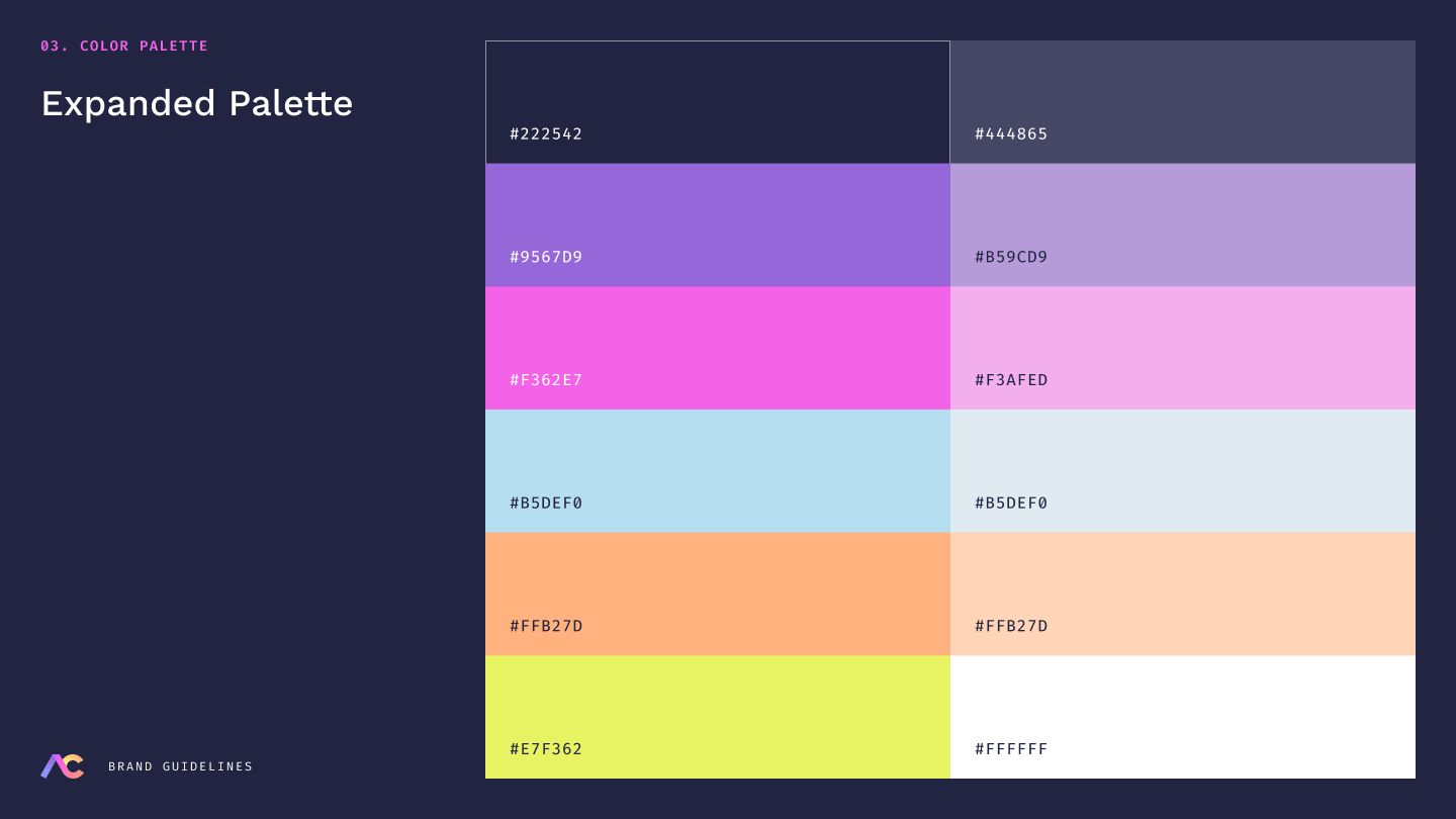
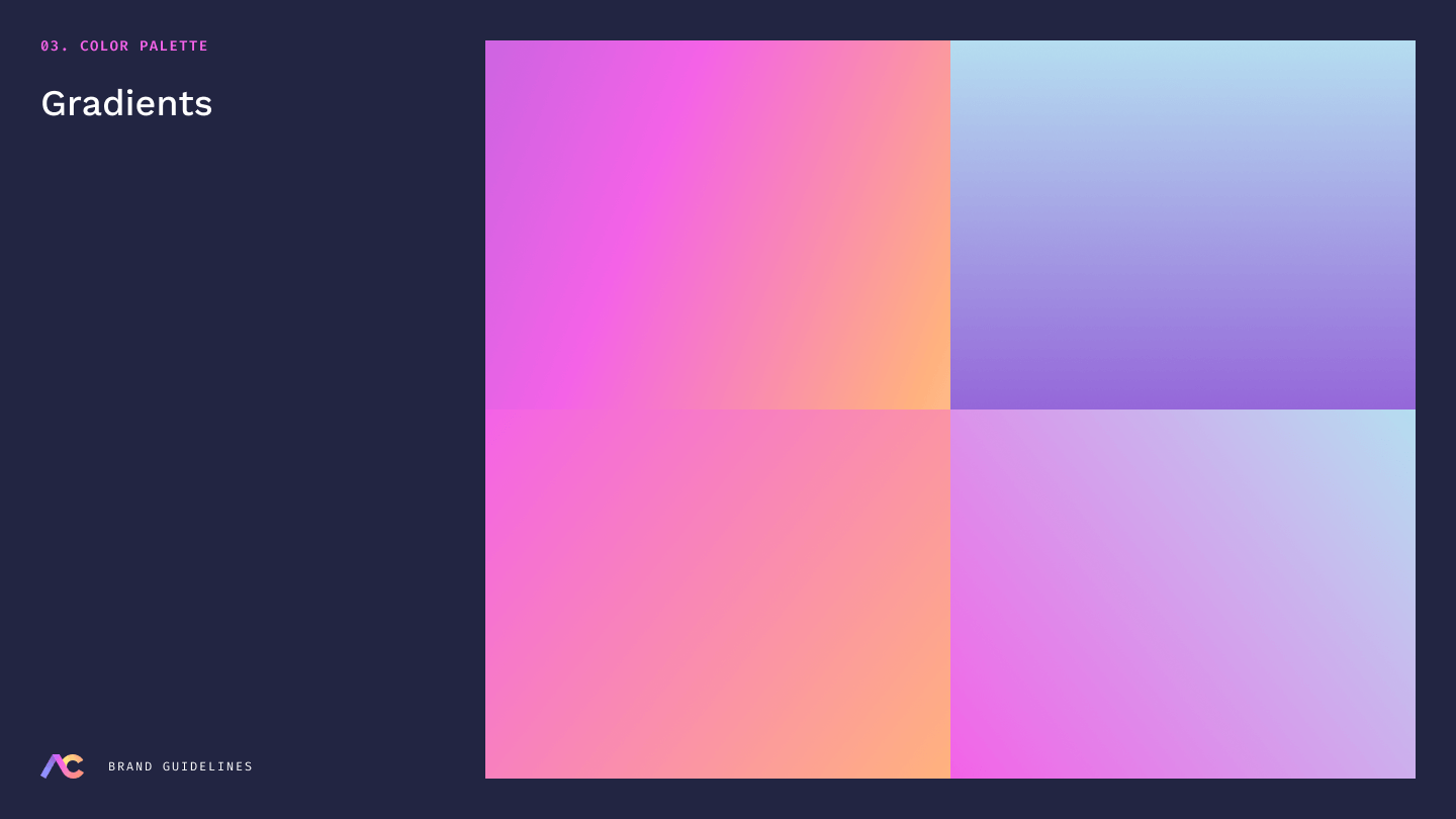
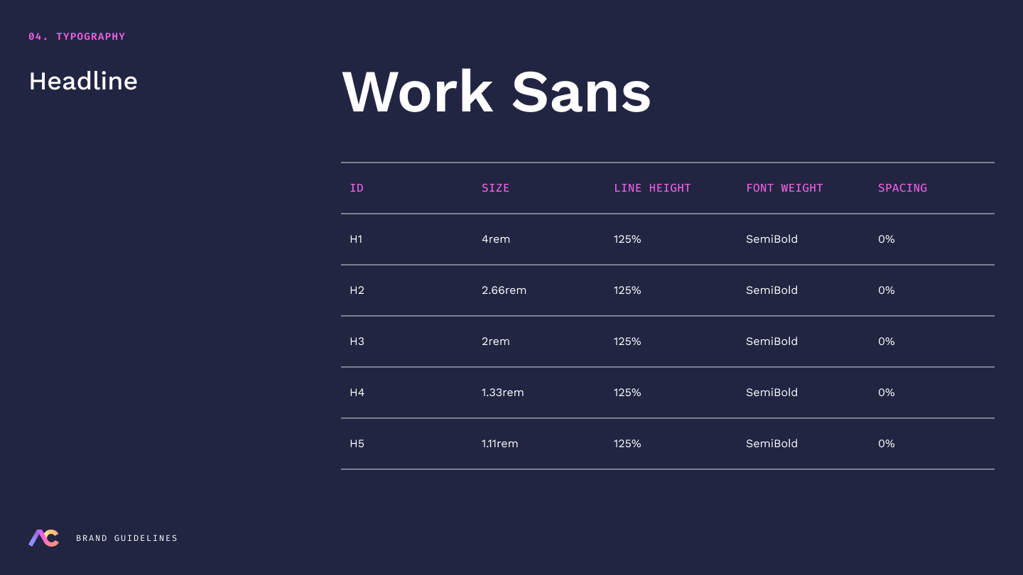
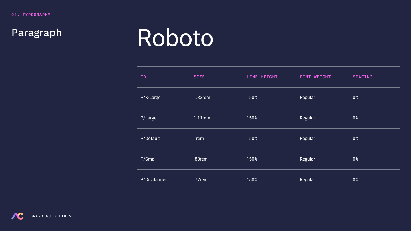
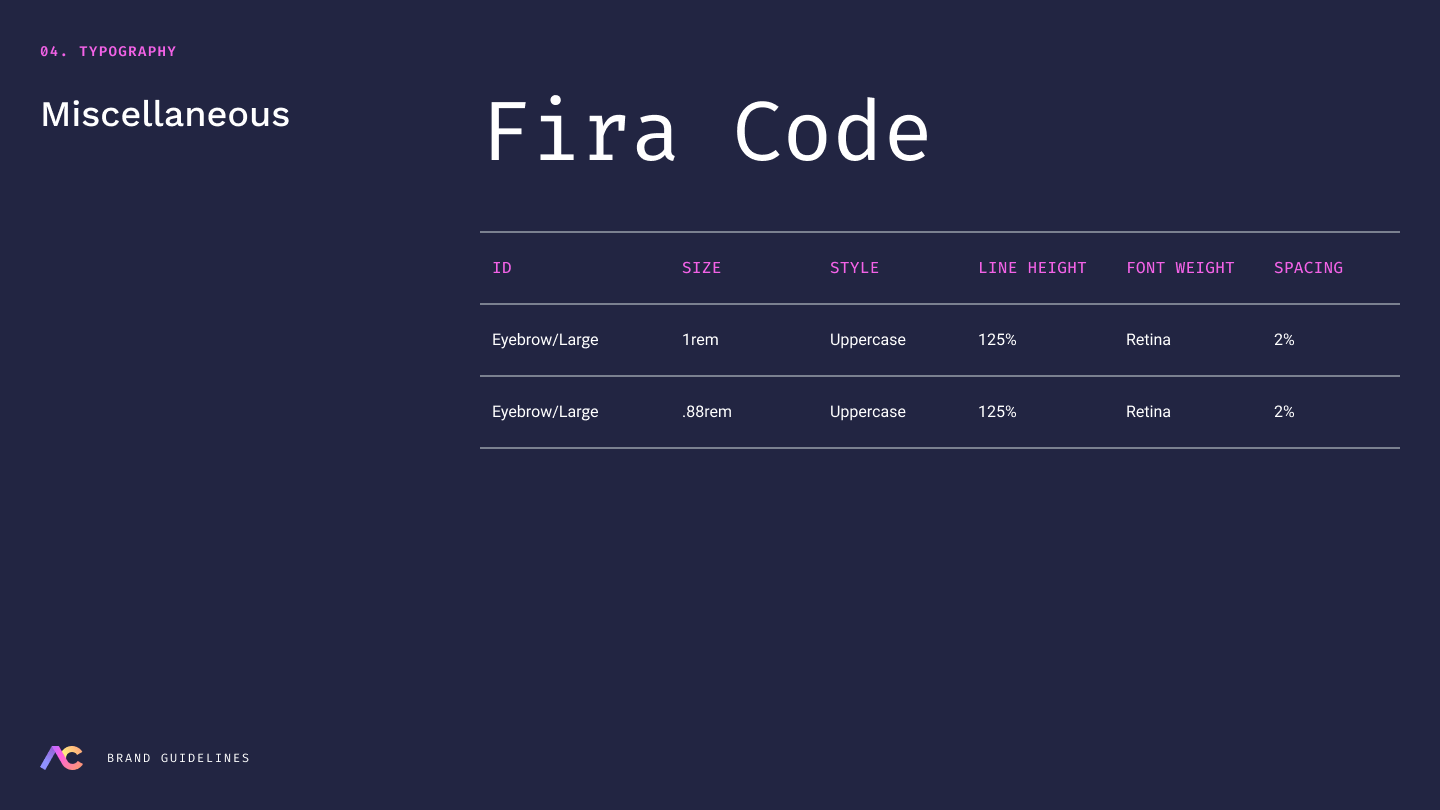
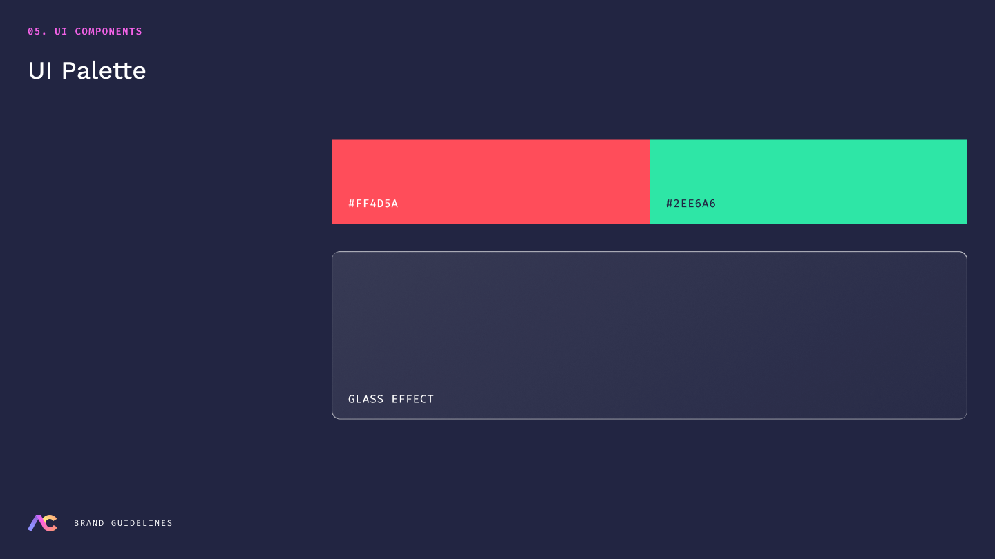
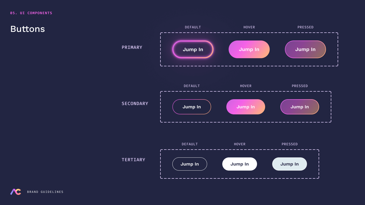
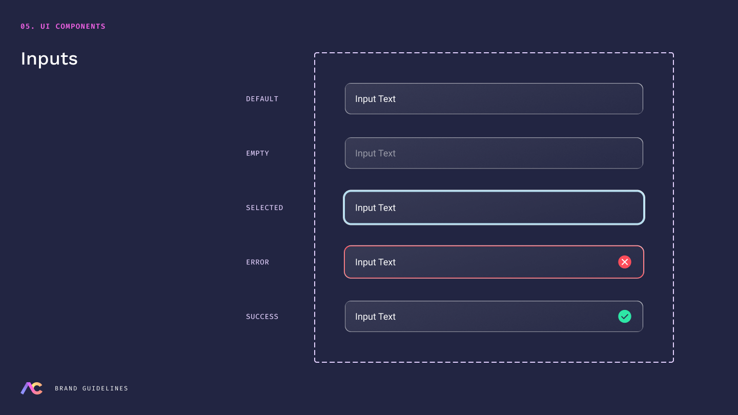
Create a design system: Arm Candy had established brand colors and slide-deck guidelines, but they lacked defined UI standards. A clear, documented design system was needed to ensure consistency and accessibility, and to support Hooked on Code, the agency responsible for implementing my designs.
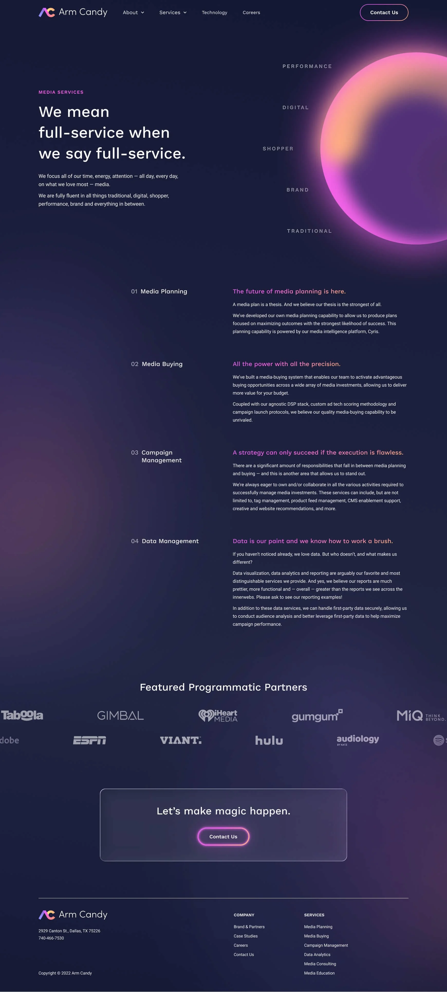
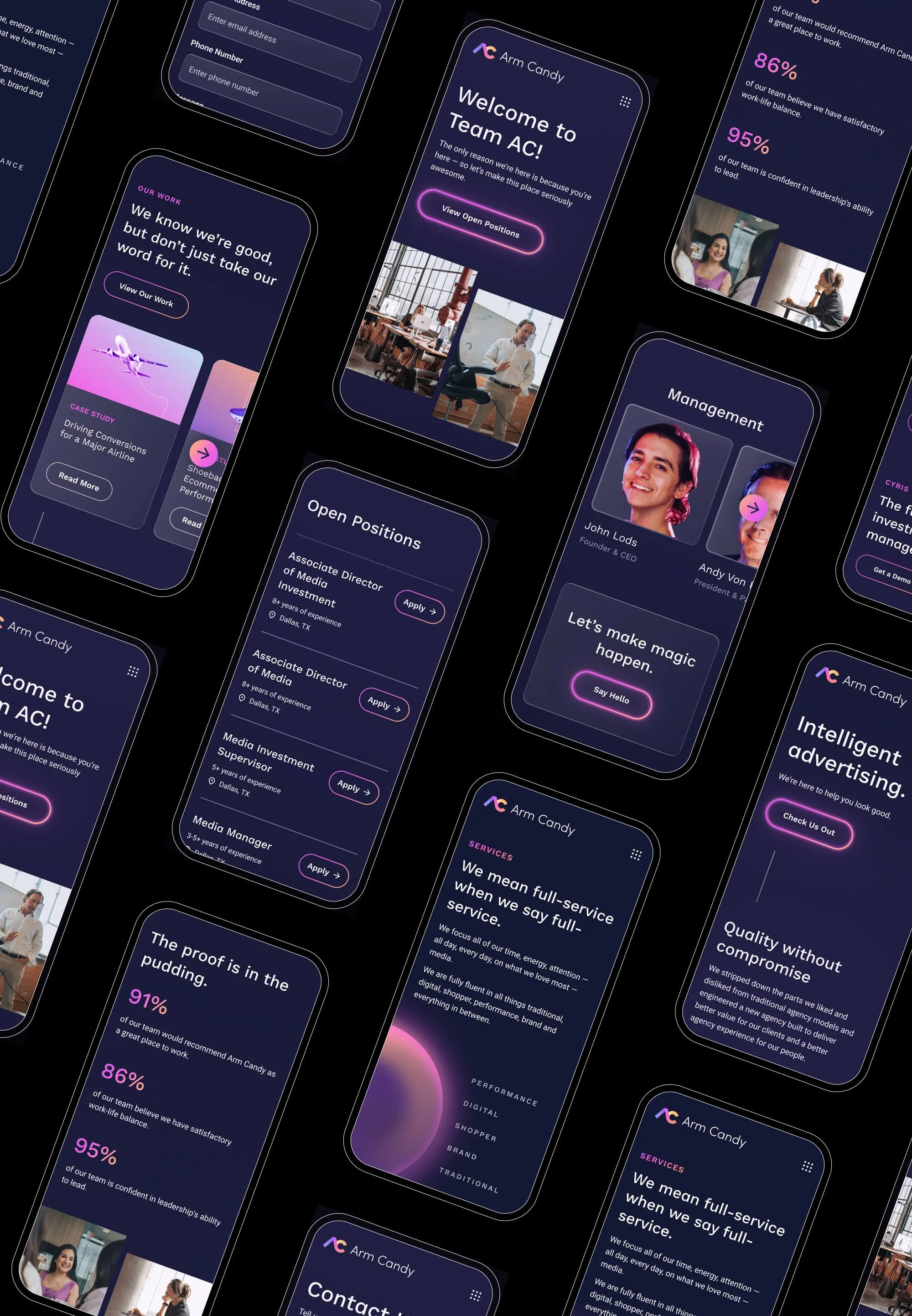
Build a website: Arm Candy was clear on how they wanted to position themselves, but wanted guidance on how to shape a compelling, user-friendly narrative and keep visitors engaged.
Website Design
Identifying Key Problems
The original Arm Candy website (shown below) had a range of issues the team wanted to address:
Bold visual language, weak execution: While the initial concept was strong, the execution botched it. Graphic elements were treated as static PNGs or JPEGs uploaded with white backgrounds (yikes), giving the site an unpolished, PowerPoint-like feel — a vibe that completely undermined Arm Candy’s credibility. These shapes needed to function as true vectors, not as decorative images exported from Canva.
Awards mattered, but the presentation was… ugly. Industry awards are critical for establishing credibility, but the original color treatments clashed with the brand. We needed a way to showcase each award without junking up the page.
Overly verbose copy: Given our rapidly decreasing attention spans, there’s absolutely no need for long blocks of text. Messaging needed to be sharper, more intentional, and designed for scanning.
A more modern, forward-looking aesthetic: The site needed to feel cutting-edge and confident. Everyone agreed that white felt too soft for Arm Candy. It needed a bolder, darker and stronger site.
Take a look at the before and after, and some featured pages below.