
Rebuilding the Marketing Experience
2022-2024
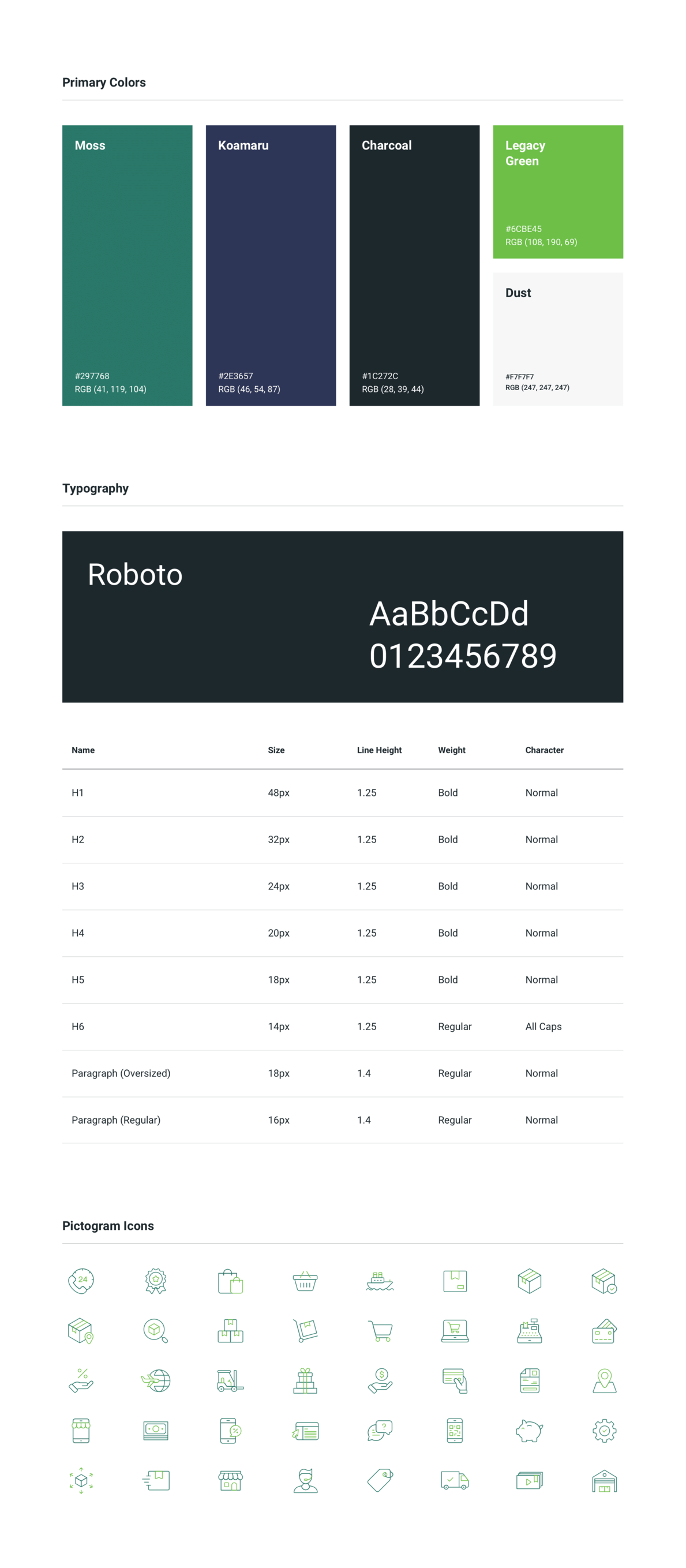
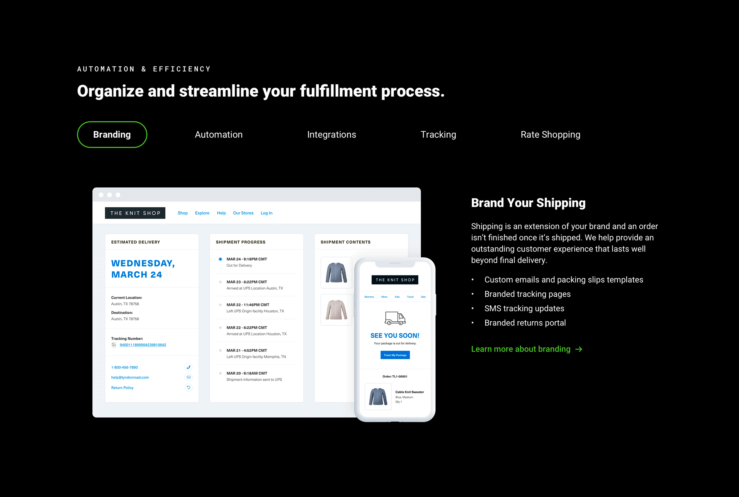
Branding
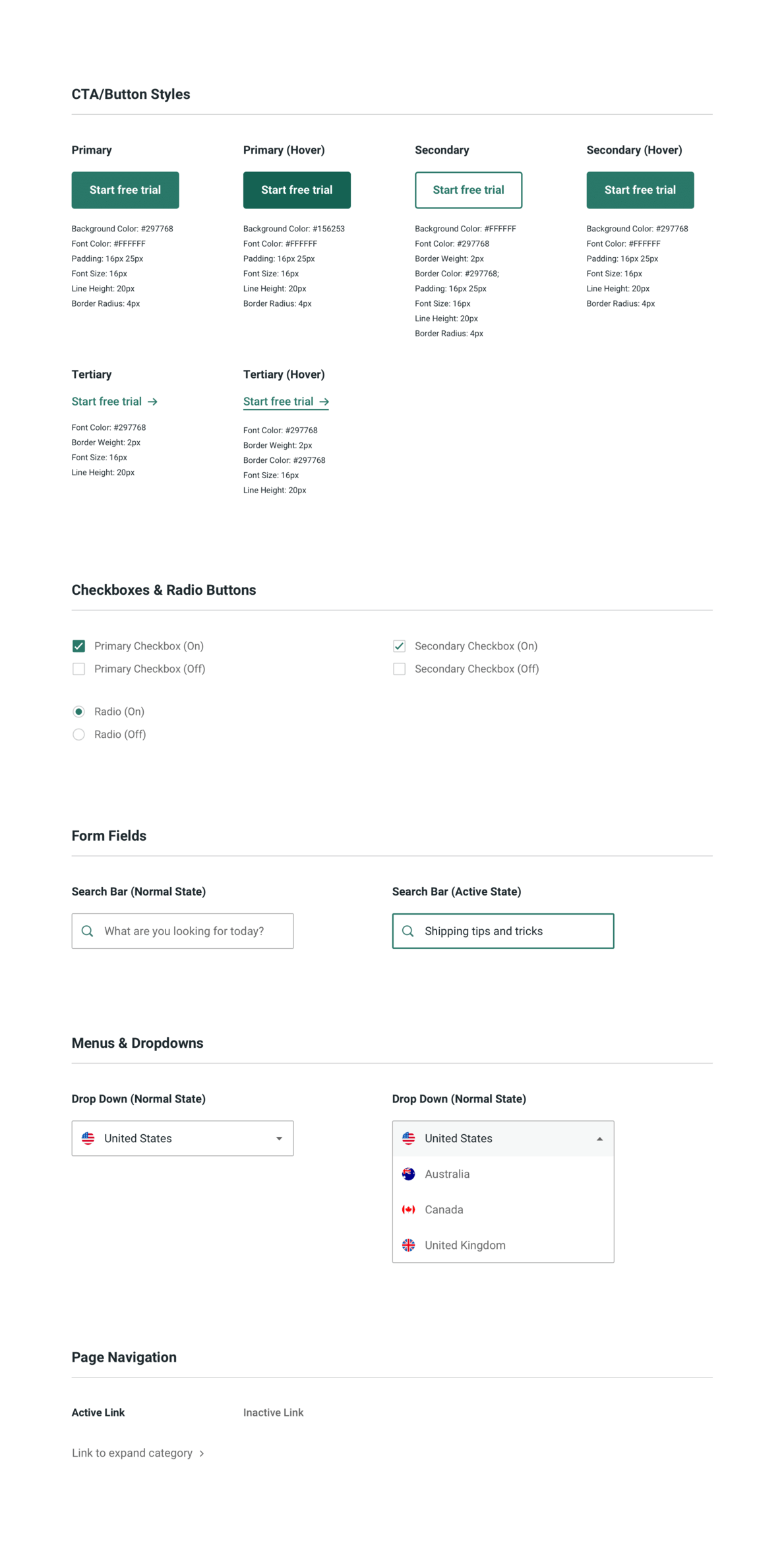
Design System
Project Overview
About ShipStation
ShipStation is a global shipping platform and mobile app that enables online retailers to manage small-parcel shipping and ecommerce fulfillment. The Austin-based company combines order processing, label creation, and customer communication with seamless integrations across major carriers and online platforms. ShipStation is owned by Stamps.com and is part of the Auctane family, which includes ShipStation, ShippingEasy, ShipEngine, and ShipWorks.
The Case for Change
I joined the ShipStation marketing team in November 2019, when ShippingEasy merged into the Auctane family. At the time, ShipStation had an established brand but a visually underwhelming — albeit high-performing — website. Despite strong results, the organization agreed it was time for a full redesign.
Project Elements
Design System Creation
Homepage Redesign
Resource Hub Creation
Design System Creation
Despite its brand guidelines, ShipStation needed a design system to structure its marketing website. We created a simple, easy-to-use framework to guide future pages and maintain consistency across the site.
Homepage Redesign
ShipStation’s homepage had remained largely unchanged for years. Despite its lackluster aesthetic, it continued to perform well — or at least well enough to not warrant a redesign. That shifted in late 2020, when accessibility complaints surfaced alongside growing confusion about what ShipStation actually does. Because the team had long been hesitant to modernize the page, we first had to unwind years of design debt that made the homepage — our top source of trials and signups — increasingly inaccessible and difficult to use. This wasn’t just a visual refresh, but an opportunity to prove that thoughtful change grounded in accessibility, usability, and clarity drives better outcomes.
Key Objectives
Clarify ShipStation’s Value:
Testing revealed many users didn’t immediately understand what ShipStation does. We strengthened the copy and product imagery to position it clearly as software.
Shorten the page:
Data showed most users never reached the midpoint, so we needed a homepage that was streamlined, shorter, and more intentional. Every word and image had to earn its place. No fluff!
Balance marketing, product, and UX standards:
The redesign required tight alignment across teams. We prioritized a more concise structure, used interactive sections thoughtfully, simplified product visuals without misrepresenting the experience, and ensured the final design remained modern, accessible, and high-performing.
Clarifying ShipStation’s Value Through User Research
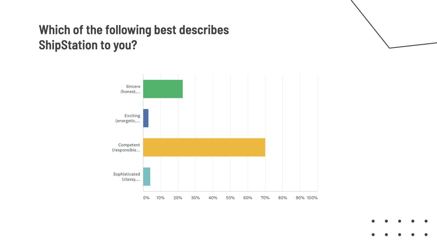
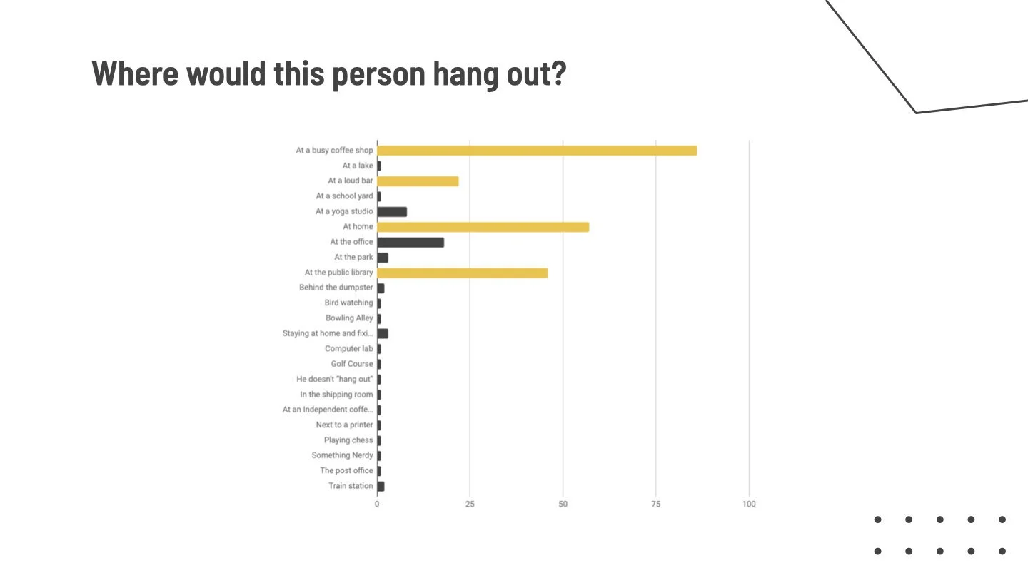
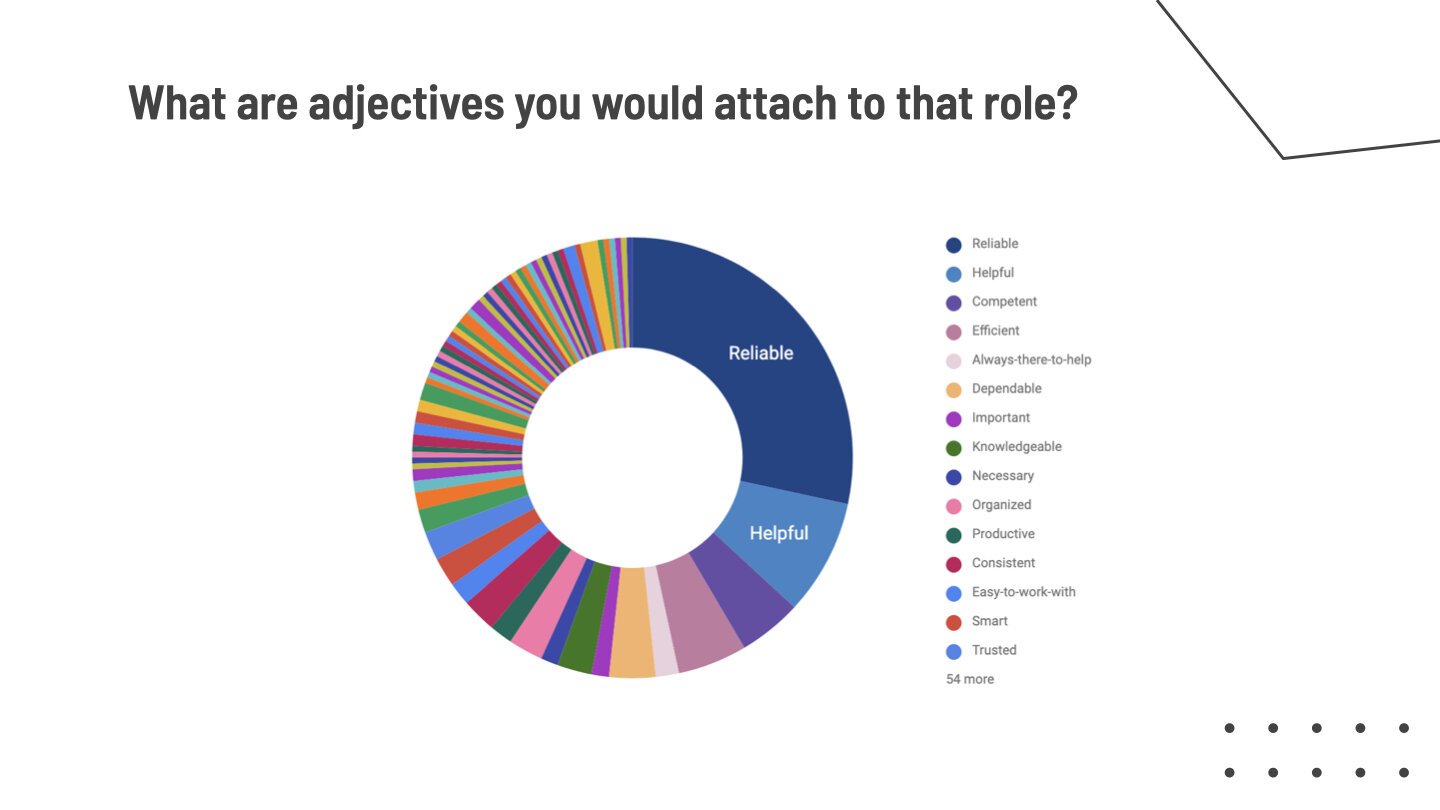
What do current customers think of ShipStation?
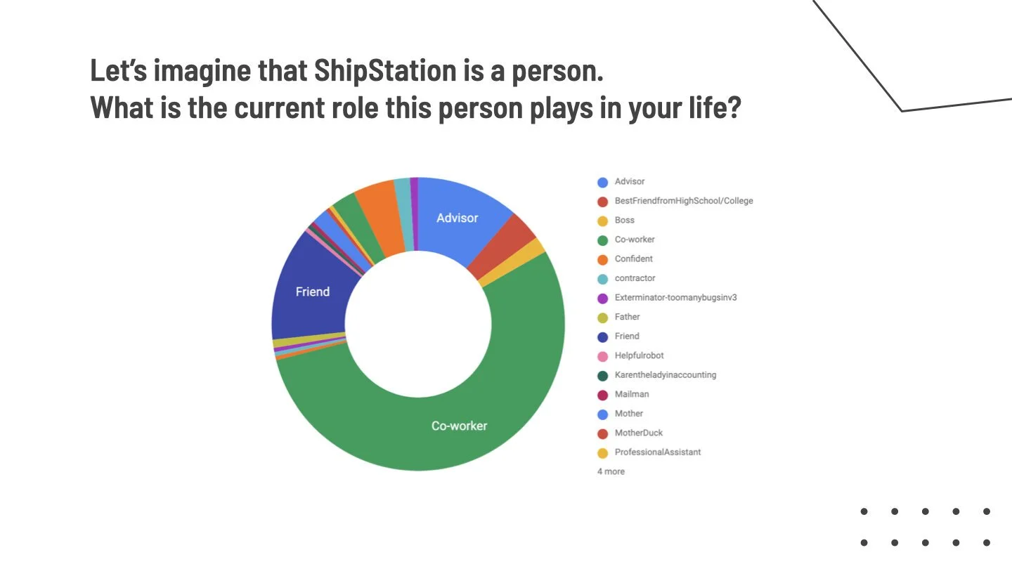
Product surveys showed customers viewed ShipStation as simple, reliable, competent, and sincere. However, brand recognition outside the app (ads, email, etc.) was weak. We asked customers what ShipStation would be like as a person. Two responses stood out:
- “The friend you can’t stand but can’t do without”
- “A semi-functional weird uncle”
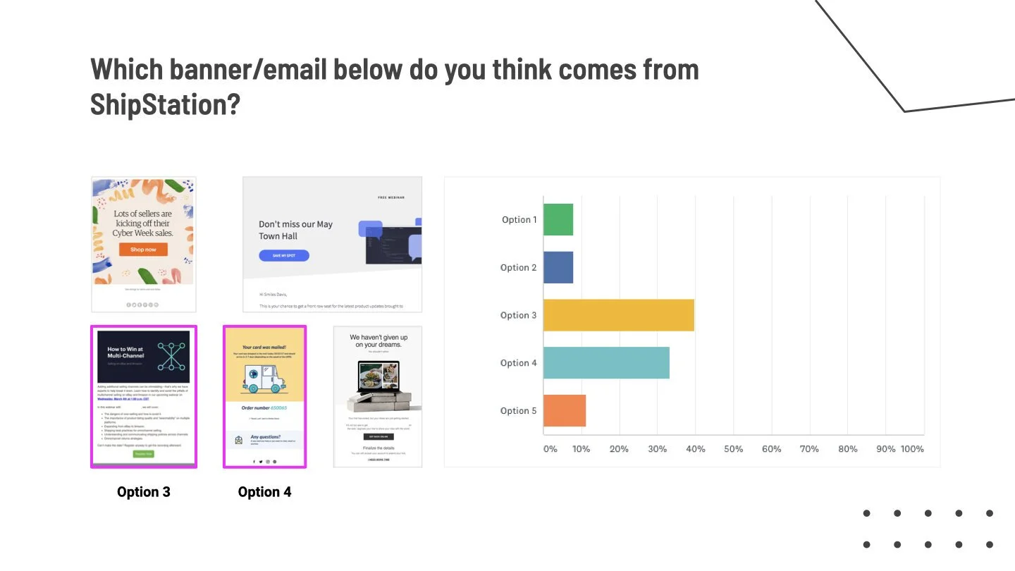
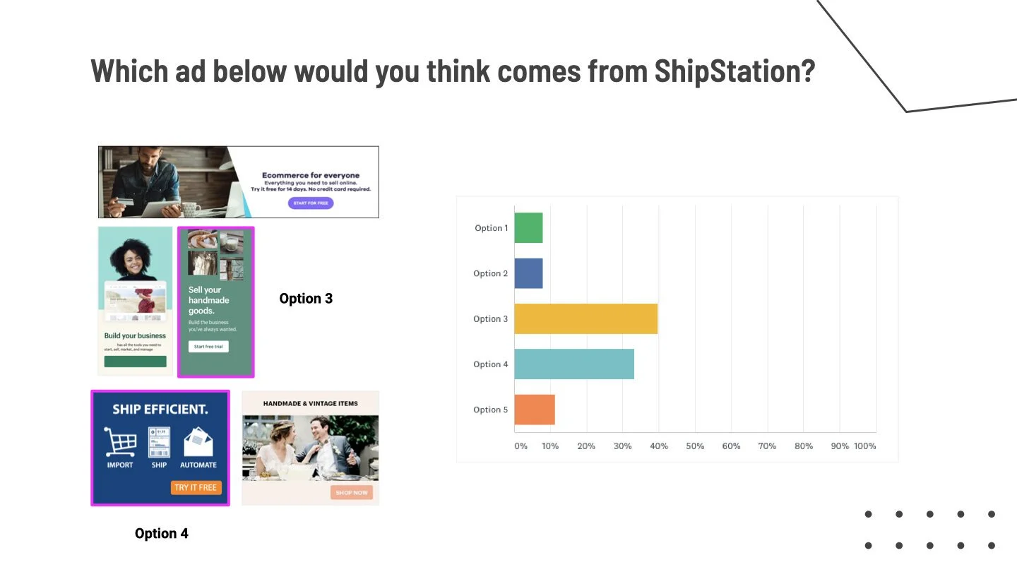
How do prospective customers perceive ShipStation based on our website?
Because existing customers rarely use the marketing site, we surveyed prospective users — focusing on the homepage. Feedback was mixed and largely neutral, with recurring confusion and some lingering accessibility concerns. Users were also frustrated by the page length.
How do employees want ShipStation to be perceived?
While secondary to user feedback, internal interviews clarified the desired brand direction and highlighted key gaps. This mattered, as the site played a significant role in recruiting talent. Key themes quickly emerged:
- The brand needed to feel more modern and intelligent
- Earlier, clearer product understanding was critical
- The experience felt inconsistent across touchpoints
- The brand underrepresented ShipStation’s scale and enterprise reach
The slides below provide a closer look at survey results (click to enlarge).
Information Hierarchy & Wireframing
Hero
Since users weren’t scrolling far, we prioritized clarity and impact. Messaging had to be immediate and compelling, so we paired it with animation. Because batch printing is one of customers’ most valued features, the hero highlights it in a simplified, brand-aligned style.
Partner & Integration Logos
This section is crucial for establishing brand credibility, but we wanted more than a generic logo bar. By elevating the treatment — adding animation and clarifying the purpose of the logos — we reduced ambiguity and made the value of each integration more obvious to users.
How it Works
We focused this section on delivering the highest-level overview of the ShipStation product, emphasizing the most obvious and relevant benefits for small and medium-sized customers.
Product Features
This was the most complex area, requiring careful balance between marketing goals, product accuracy, and UX best practices. Marketing pushed for a more modern, elevated look to better compete with alternatives like Shopify and ShipBob, so we refreshed the visuals while ensuring simplified mockups didn’t misrepresent the product. Because most users won’t explore every panel, this section builds on the high-level “How it Works” content, offering deeper product detail for those who want it.
User Stories
We featured multiple customer stories with links to the case study hub, focusing on SMB-relevant examples since most traffic comes from that audience, while testing engagement with the module.
Support Feature
We introduced a human element to highlight the value of ShipStation’s support team, showcased the chat feature, and provided a clear CTA to the main support page.
Final CTA
We closed the page by reinforcing the primary goal — starting a free 30-day trial — while also offering a secondary CTA to book a demo.
Mobile Considerations
For mobile, the hierarchy remained nearly identical, with one fewer case study and a more mobile-friendly alternative to the Features section.
A Side-by-Side Look at Old vs. New
For a closer look at the full page, click on the images below.
A Closer Look at Key Elements
On top, you’ll find our hero animation. Customers consistently cited batch printing as one of the product’s most valuable features, so the hero animation focuses on it in a simplified, brand-aligned style.
Below, you’ll find our Product Features section, with a recording of a user toggling between each feature.
Resource Hub
ShipStation produces a lot of content, and for good reason: lead generation. Our data showed users who engaged with multiple assets — ebooks, blogs, infographics, and case studies — were more likely to sign up. Outside the blog, content lacked a centralized home, so we created a Resource Hub to group materials and surface relevant recommendations.
Key Considerations:
- Improved Organization: Separating content into clear categories made it easier for users to find what they needed.
- Component Reusability: To maximize impact, we created reusable content cards for recommendations across the site.
- Better Branding: Our content marketing visuals had dramatically improved, so we made them a focal point of the Resource Hub.

