CORE: Building a Multi-Brand Design Ecosystem
2024-2025
Branding
Design System
The Aceable Design System is the foundation of CORE. If you haven’t checked that out already, I recommend starting there!
Background
Our Aceable design system — originally named VISION (the project title established prior to my arrival) — proved to be a major success. It significantly elevated the user experience across Aceable’s platforms while also driving measurable performance improvements in both our driving and real estate verticals. With a strong, flexible system in place, the next challenge became clear: how do we scale this success across Aceable’s broader portfolio of brands without starting from scratch?
That question led us to iDriveSafely and DriversEd.com (both drivers ed companies) and, eventually, to PrepAgent, a recently acquired real estate licensing platform.
The Challenge
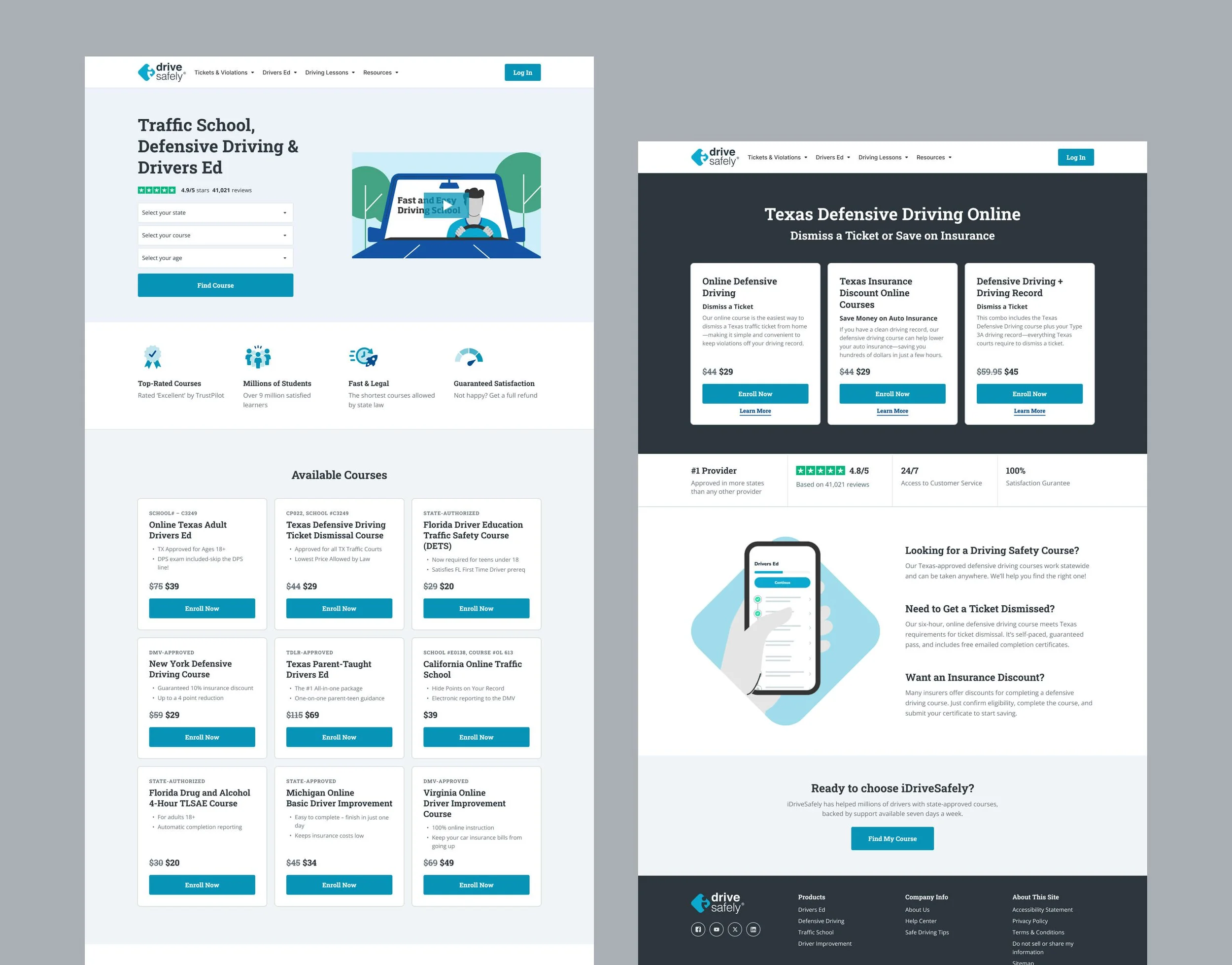
Each brand presented a different starting point. iDriveSafely and DriversEd.com desperately needed a complete overhaul, both aesthetically and from a UX/UI perspective. Inconsistent layouts, dated visuals, and fragmented interaction patterns made it difficult to deliver a modern, intuitive learning experience or establish credibility within the market.
PrepAgent was already in relatively good shape, with a functional interface and a more modern baseline. However, the platform needed to be migrated, and maintaining its existing, fully custom styling would have added unnecessary complexity and long-term overhead. Rather than replicating PrepAgent’s exact visual system we made a strategic decision to fold it into CORE’s component architecture, allowing us to streamline the migration, reduce engineering lift, and create a more scalable foundation while preserving PrepAgent’s brand identity.
Project Goals
Rather than designing three entirely new systems (or duplicating each design system file), we made a deliberate decision to extend the Aceable design system — now formalized as CORE — across all brands. Using Figma variables, we applied CORE as a shared structural foundation across brands. This allowed each product to leverage the same underlying system, including:
Component structures: Flexible page sections designed to support a wide range of content, layouts, and media types without feeling rigid or prescriptive.
Element structures: Standardized foundations for typography, color, buttons, inputs, and other UI elements, defined by how they function on the page rather than by visual style.
At the same time, each brand retained its own identity through controlled variation:
Brand-specific color palettes
Distinct typography
Stylistic differences tailored to each audience (without impacting component structure)
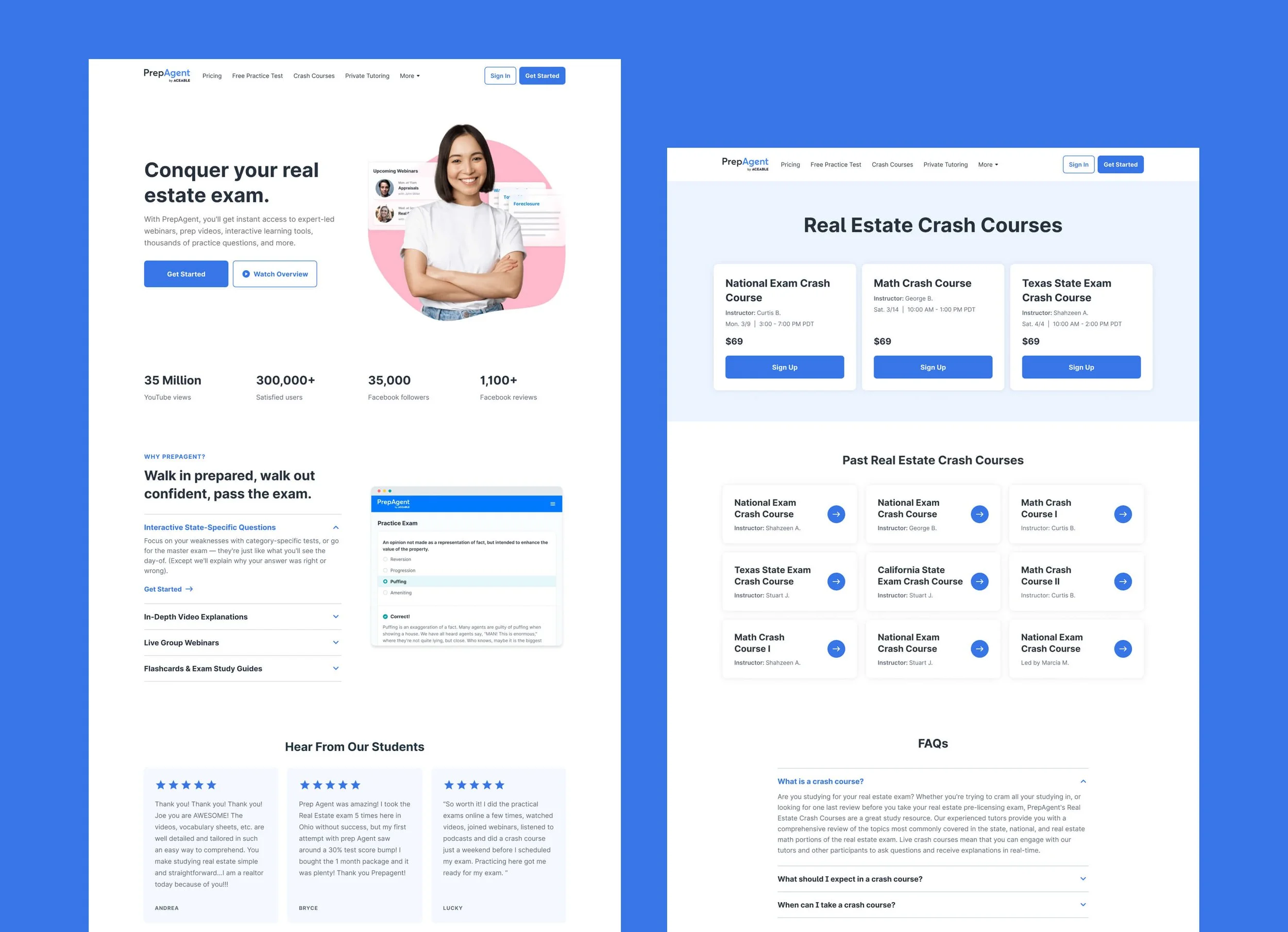
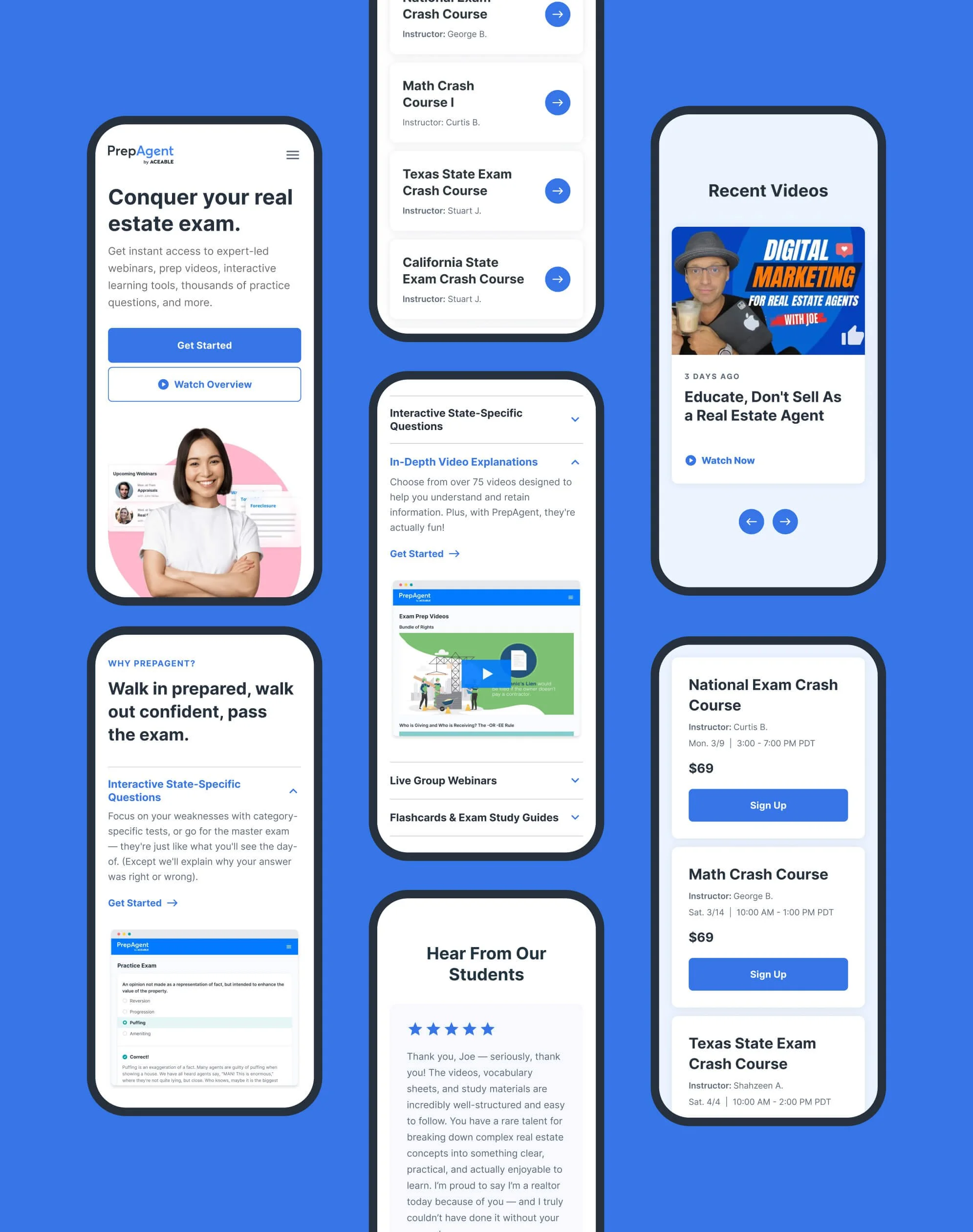
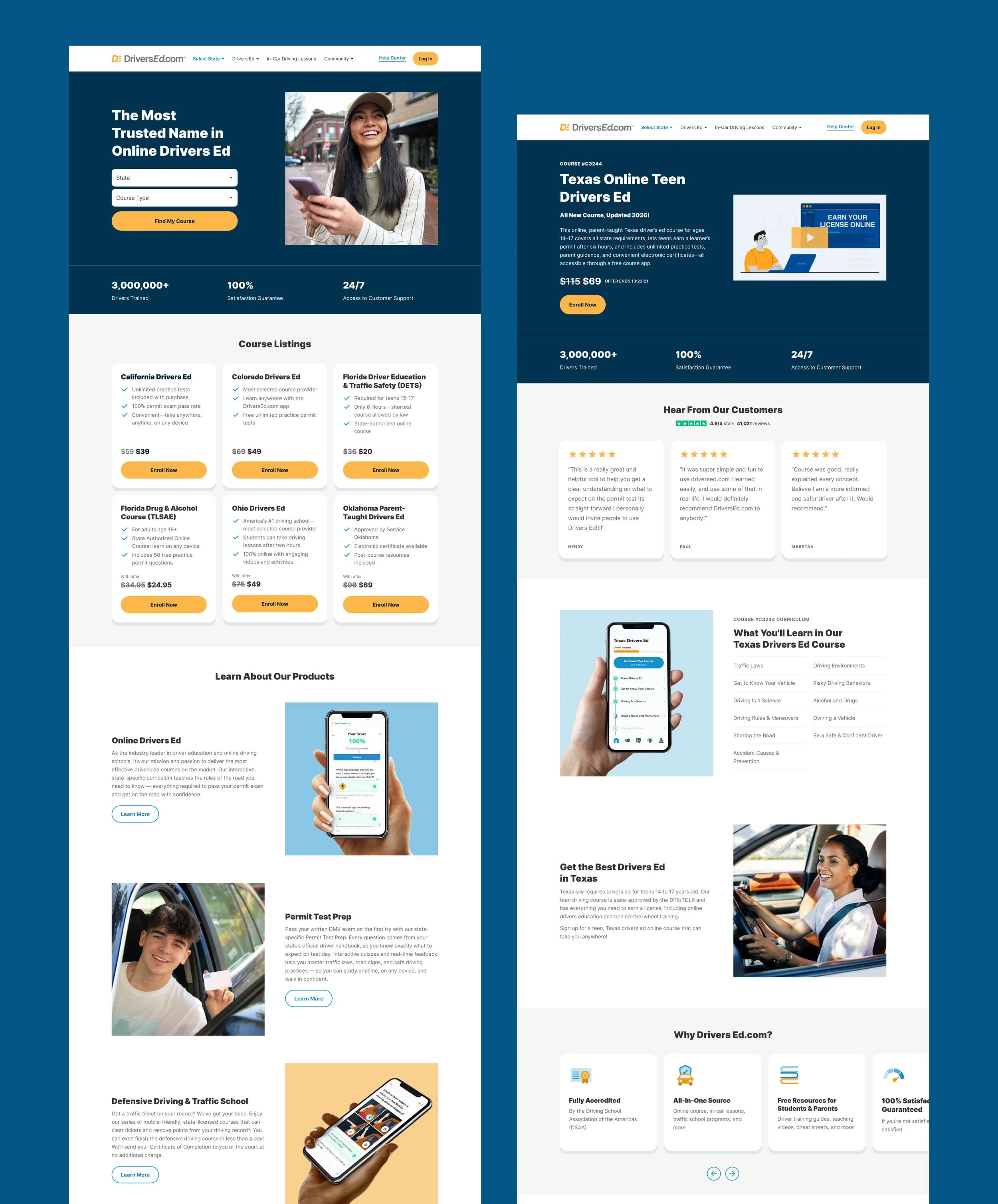
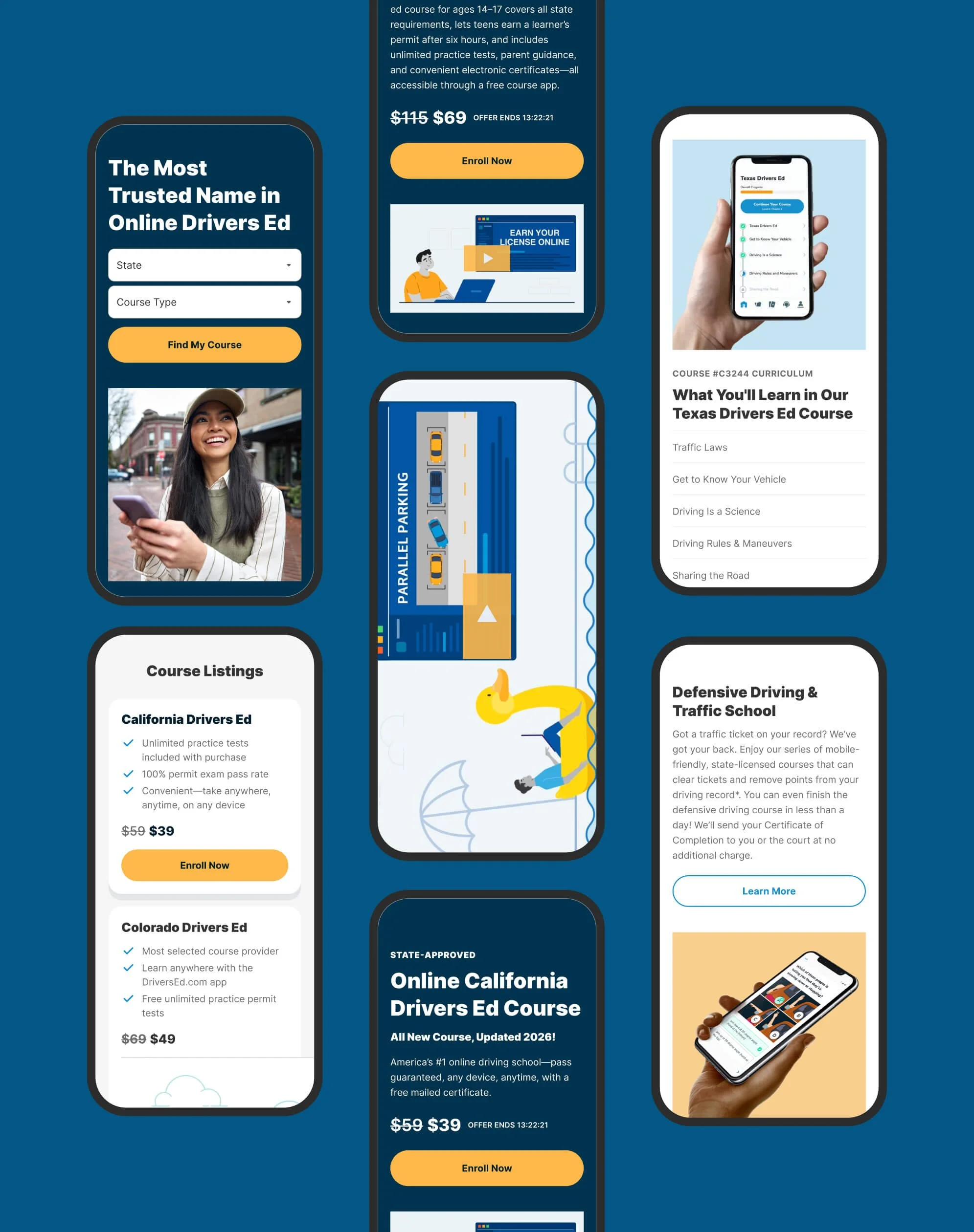
A Shared Framework for Multiple Brands
CORE builds on the Aceable Design System and extends across Aceable, PrepAgent, iDriveSafely, and DriversEd.com. The versions shown here are intentionally simplified and represent only a small subset of the full systems.
For a closer look, click the images below.
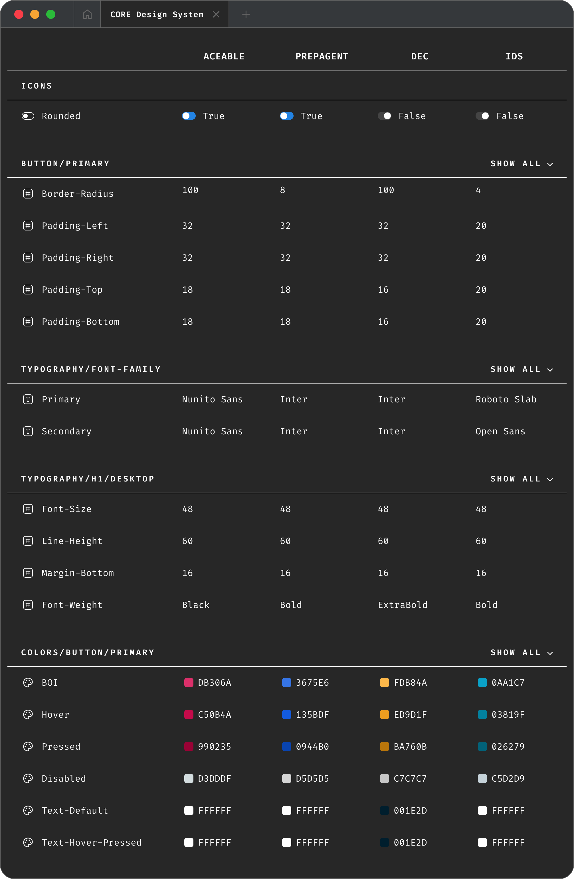
Defining Brand Modes with Figma Variables
Once our core styles (including components, color, and typography) were established, we built our CORE framework in Figma using a dedicated variable mode for each brand. As a result, we could reuse components and page sections (such as two-column layouts or slider cards) across all four brands, while maintaining a single source of truth for structure. That way, if you made a structural change to a component — like adding the option to include an additional CTA, for example — the change would apply to all four brands.
Below is a snapshot of how this is implemented in Figma. While only some properties are shown (the list is much longer), each brand defines its own values for spacing, color, and other foundational attributes. You’ll also notice that variables are named to closely mirror their CSS equivalents. (This isn’t a requirement within Figma, but using any other naming convention felt pointless. Our Engineering team agreed.)
What does this look like?
Below is a selection of components inspired by the original Aceable Design System. Click on each image for a closer look.
How does this work in Figma?
See below! Each animation shows how each variable influences a single component. The result: A lean design system that dramatically reduced JIRA tickets and kept things simple for designers — a huge win given our limited resources.
Note: This animation shows desktop only. Variable switching is supported across all predefined breakpoints: Extra Large (1236px+), Large (1024–1235px), Medium (768–1023px), Small (600–767px), and Extra Small (under 500px).
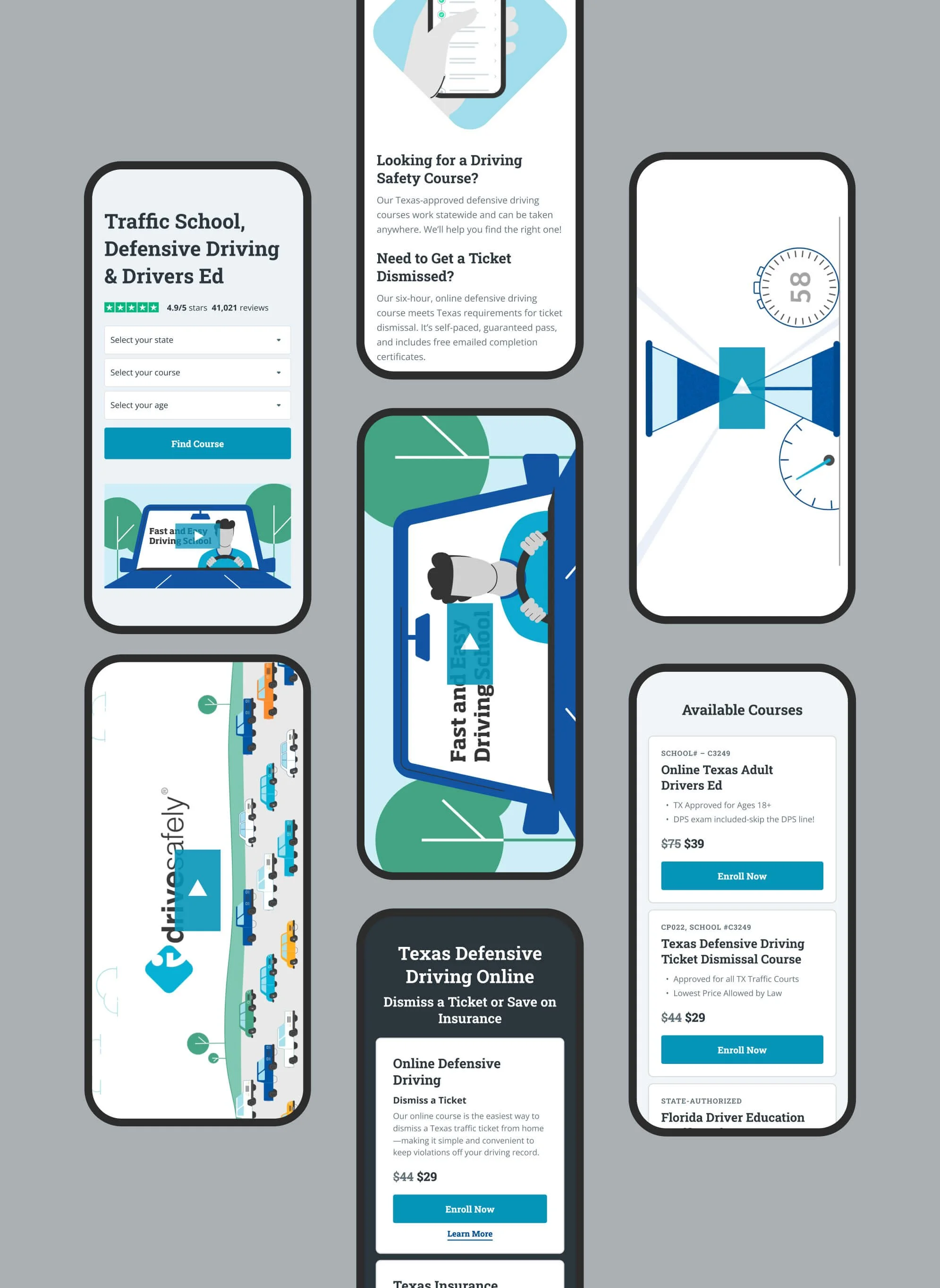
Final Page Designs
There are many more pages I could show, but here are a few key pages.