
A System-Driven Brand Evolution
2022-2024
Branding
Design System
This project is the foundation for CORE, the multi-brand design system used across the Aceable portfolio. Explore CORE here.
Project Overview
About Aceable
Aceable is an online education company that makes required courses — like drivers ed, real estate licensing, and other professional certifications — faster, more engaging, and easier to complete. Through thoughtful UX, clear content, and mobile-first design, Aceable transforms traditionally dry learning experiences into intuitive, approachable digital products.
About the Project
I joined the Aceable design team in late 2021 and was immediately tasked with reimagining the Aceable and AceableAgent websites. At the time, neither site reflected the strength of the product or the expectations of our target audiences — especially teens (and understandably so).
The Aceable website felt transactional and devoid of any appealing or consistent brand personality (click here to see what I mean). Additionally, our product pages — particularly our best-selling Texas Parent-Taught Drivers Ed page — lacked relevant course imagery and failed to communicate the human moments and trust required for a purchase of this scale.
AceableAgent suffered from similar issues. The site (shown here) felt generic, dated, and disconnected from any cohesive system or brand rationale. Inconsistent elements — like off-brand (and ugly) yellow buttons — added to the randomness of the site, further eroding AceableAgent’s credibility.
The conclusion was obvious: Aceable’s digital presence had fallen out of step with both the quality of its offering and the maturity of the business. A decisive, brand-led redesign was required.
Creating a Design System
Although Aceable had existing brand guidelines, they weren’t built to support a modern, flexible UI. Rather than trying to iterate on such a fragmented foundation, we started fresh with a design system that balanced brand expression with product and marketing requirements.
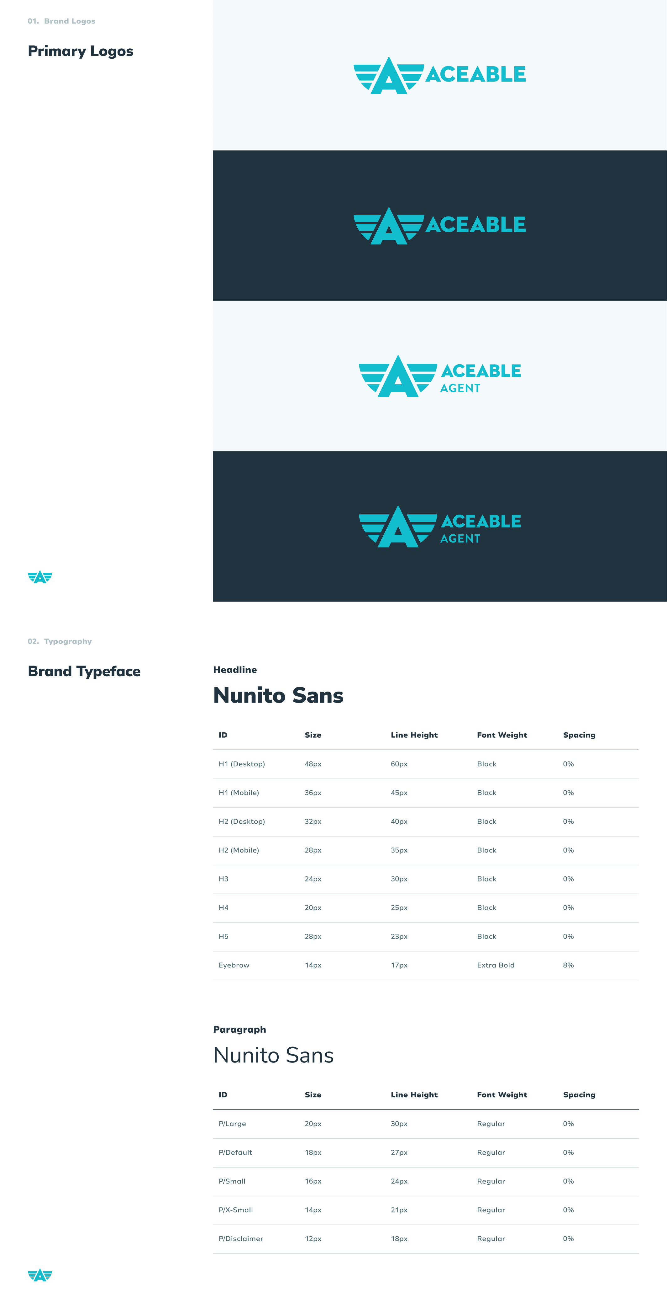
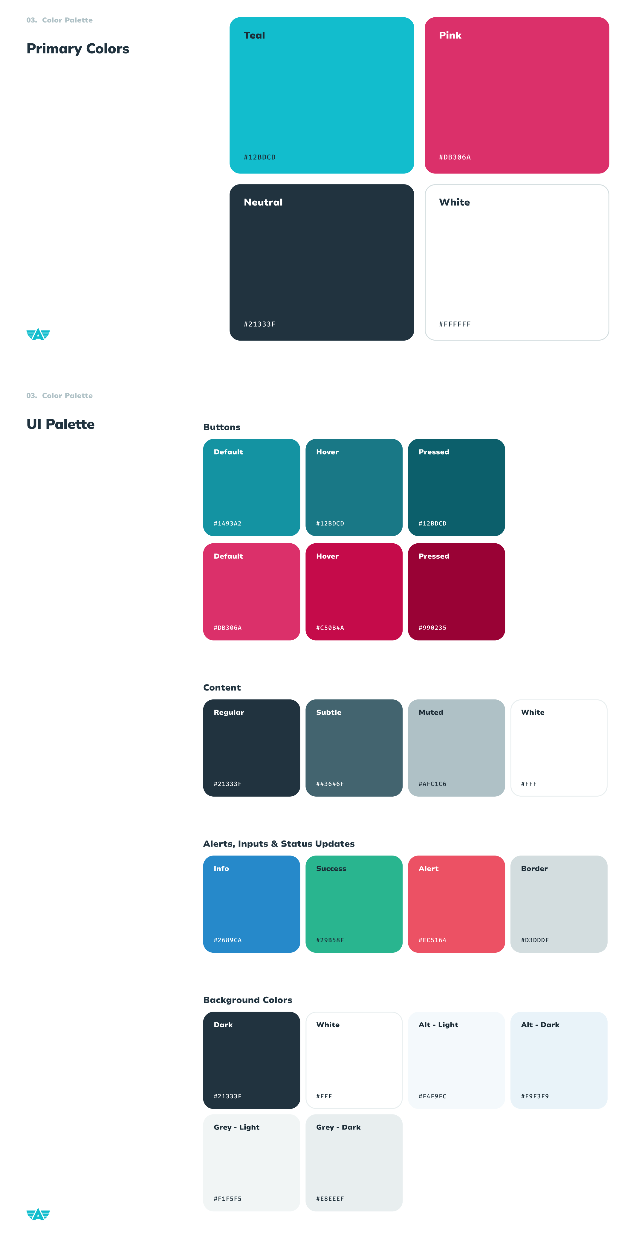
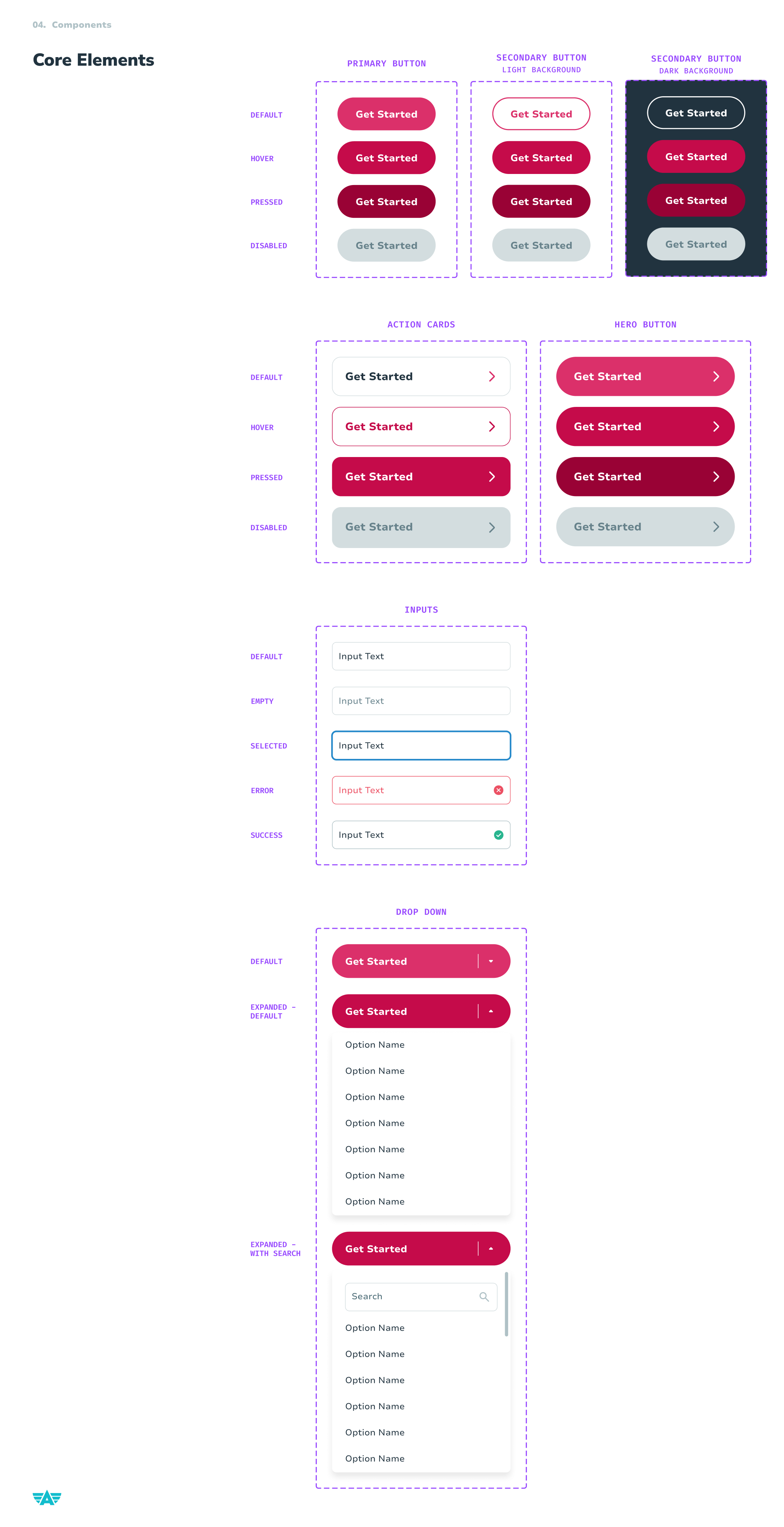
Foundational Components
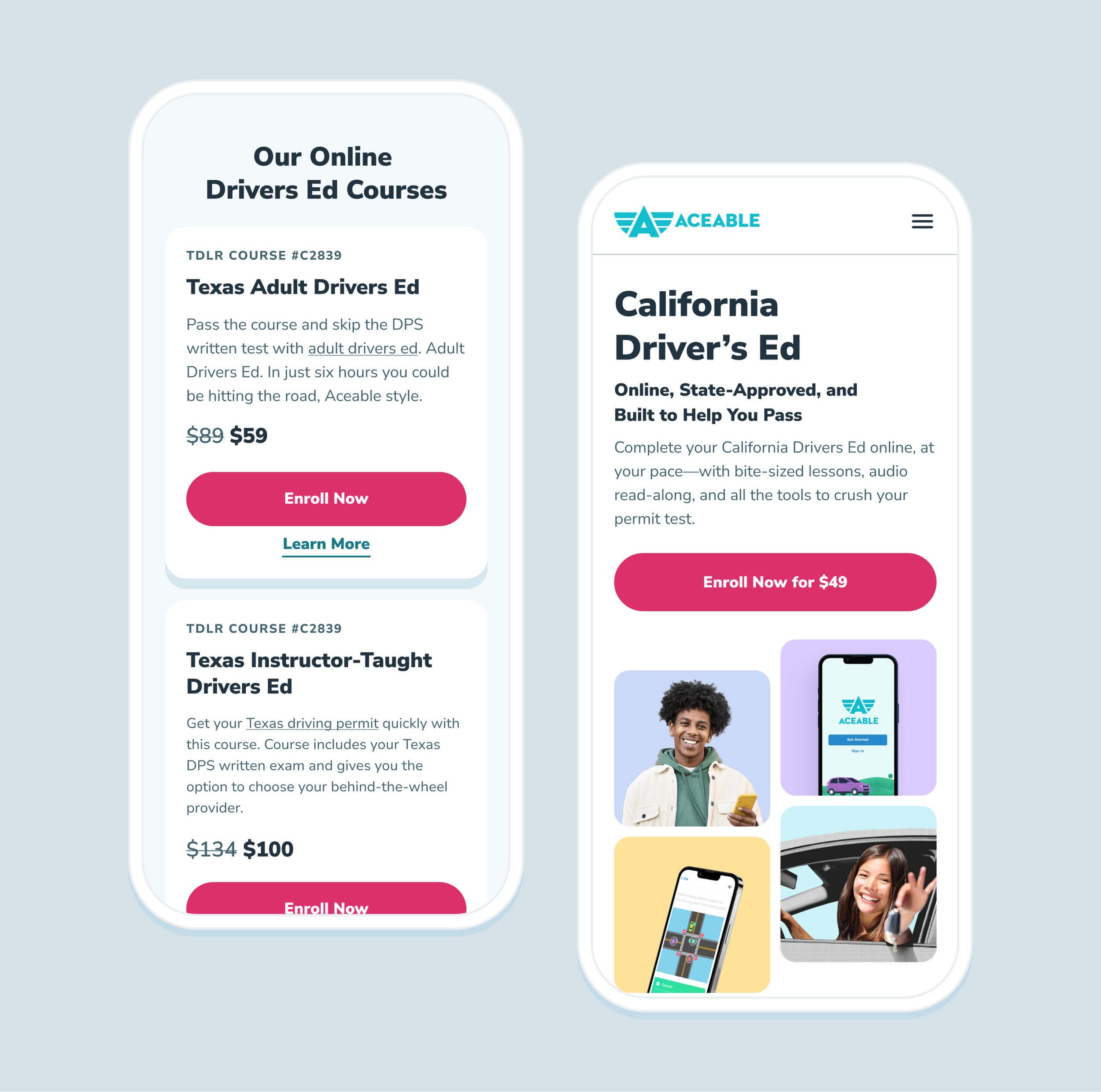
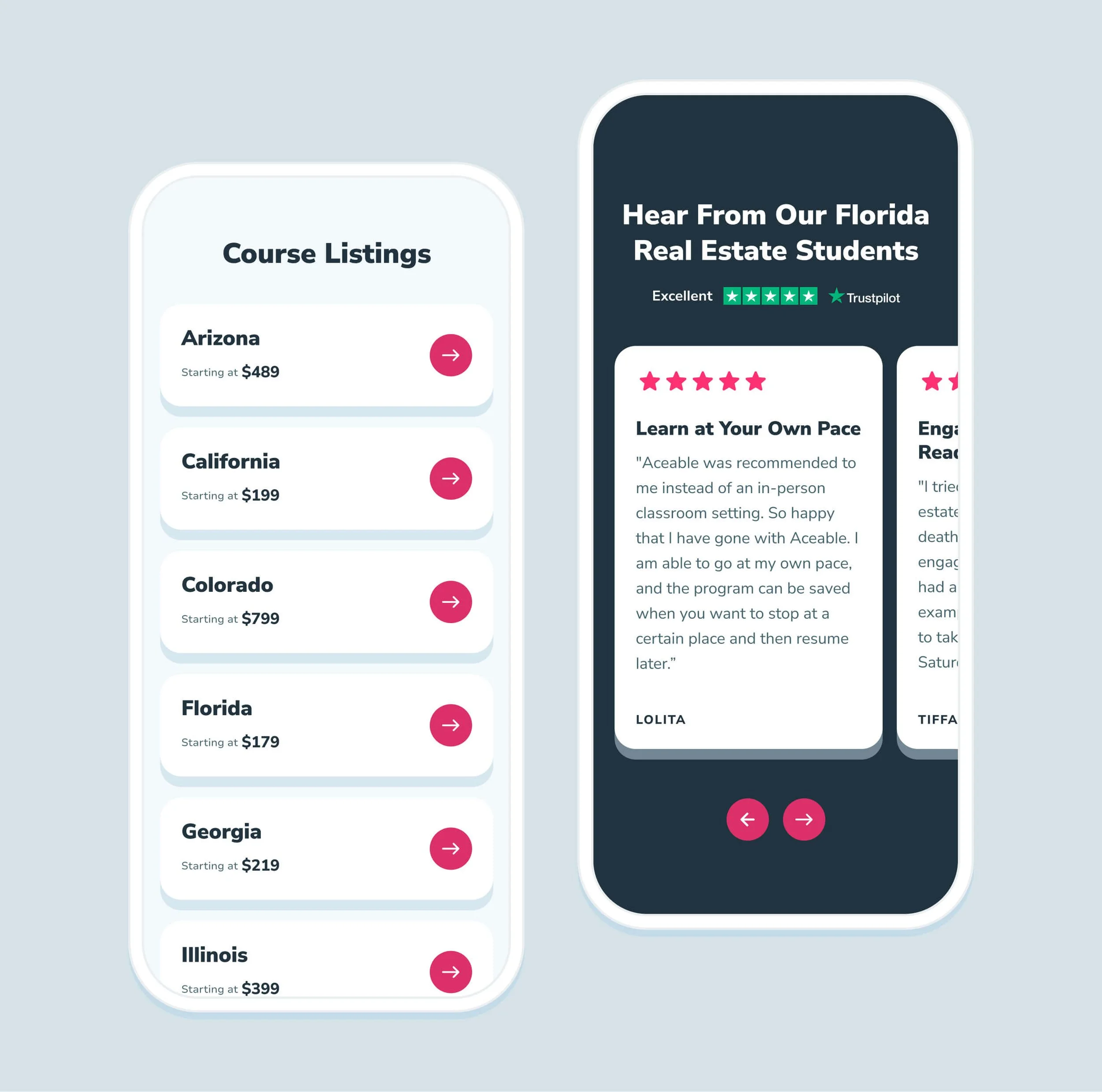
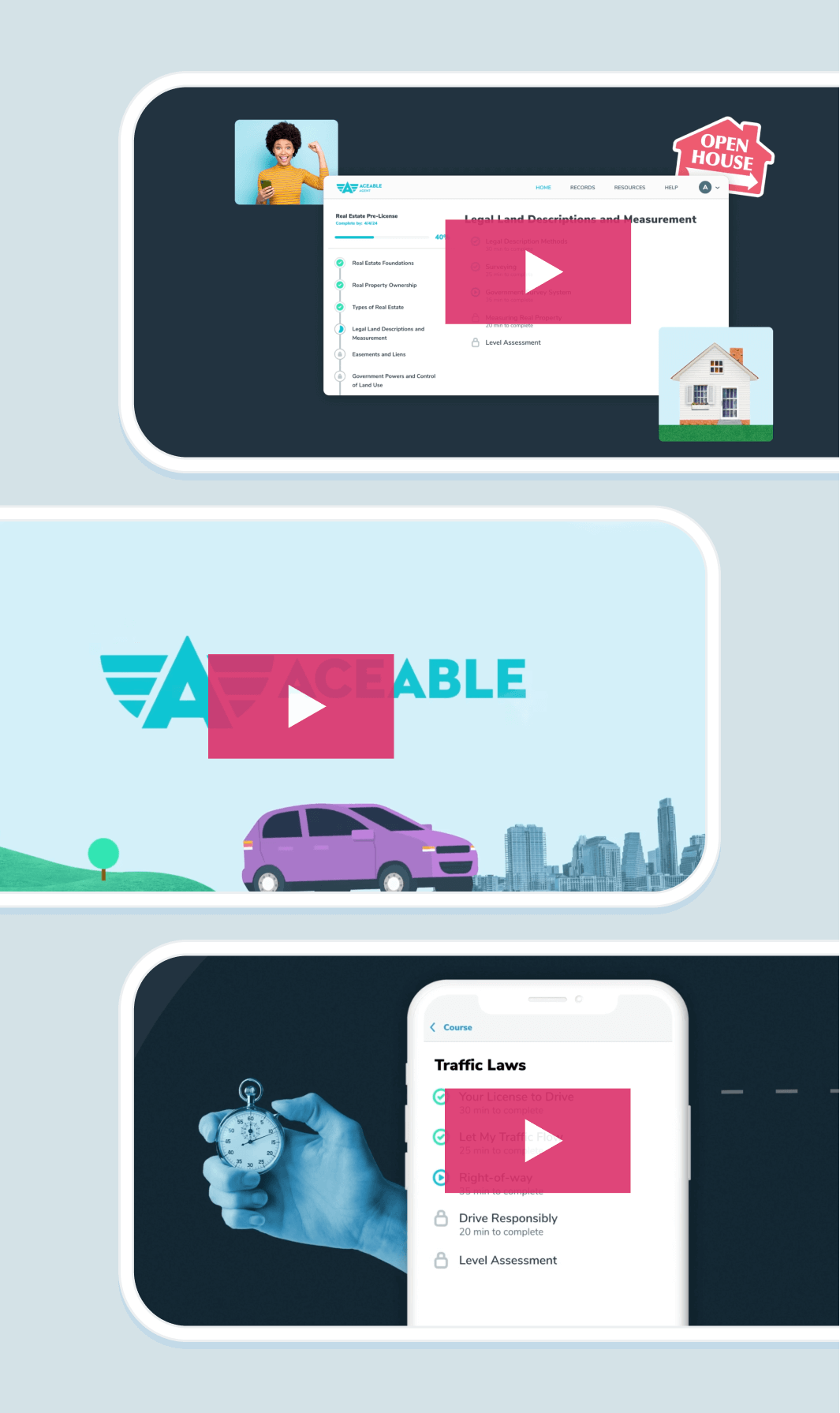
Before defining page templates or establishing layout guidelines, we started with modular components (flexible page sections that could be reused without additional development work). As shown below, these components include core building blocks such as two-, three-, and four-column layouts, accordions, reviews, and pricing cards.
Each component was designed to scale across five breakpoints: Extra Large (1236px+), Large (1024–1235px), Medium (768–1023px), Small (600–767px), and Extra Small (under 500px), with mobile layouts specifically optimized for 414px devices.
Compontent Usability
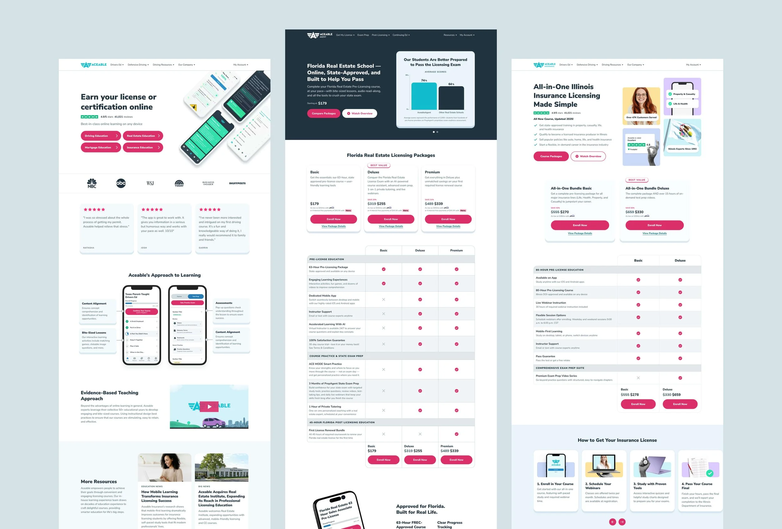
Once the foundation of our design system was established, we focused on our users: fellow designers, members of the marketing team, and engineers. The examples below show our popular Slider Card component (specifically on XL/desktop devices).
For Designers
The primary focus here was Figma. How could we make it easy for designers to create or modify pages without drifting too far from the Aceable brand, but still allow for creativity when appropriate?
The answer: Figma components! (This might be confusing, as our Craft sections are also called components. Figma components are separate, and can be as complex as an entire site page, or as simple as a single button). Through several rounds of iteration, we found the most effective approach was to create a distinct component for each page section that contained many smaller components used across the site.
What does this look like? See below.
For Marketing
For Marketing, the focus was Craft. When I joined Aceable, my boss described it as a “headless" CMS. No rules, no documentation… just a total free-for-all (yikes).
We needed not only documentation and guardrails for each page section, but also an easy-to-use and intuitive interface for the Marketing team. Without it, we knew we’d be responsible for implementing every page — something we didn’t have the bandwidth for.
To make things as clear as possible, I mocked up how the section should appear in Craft.
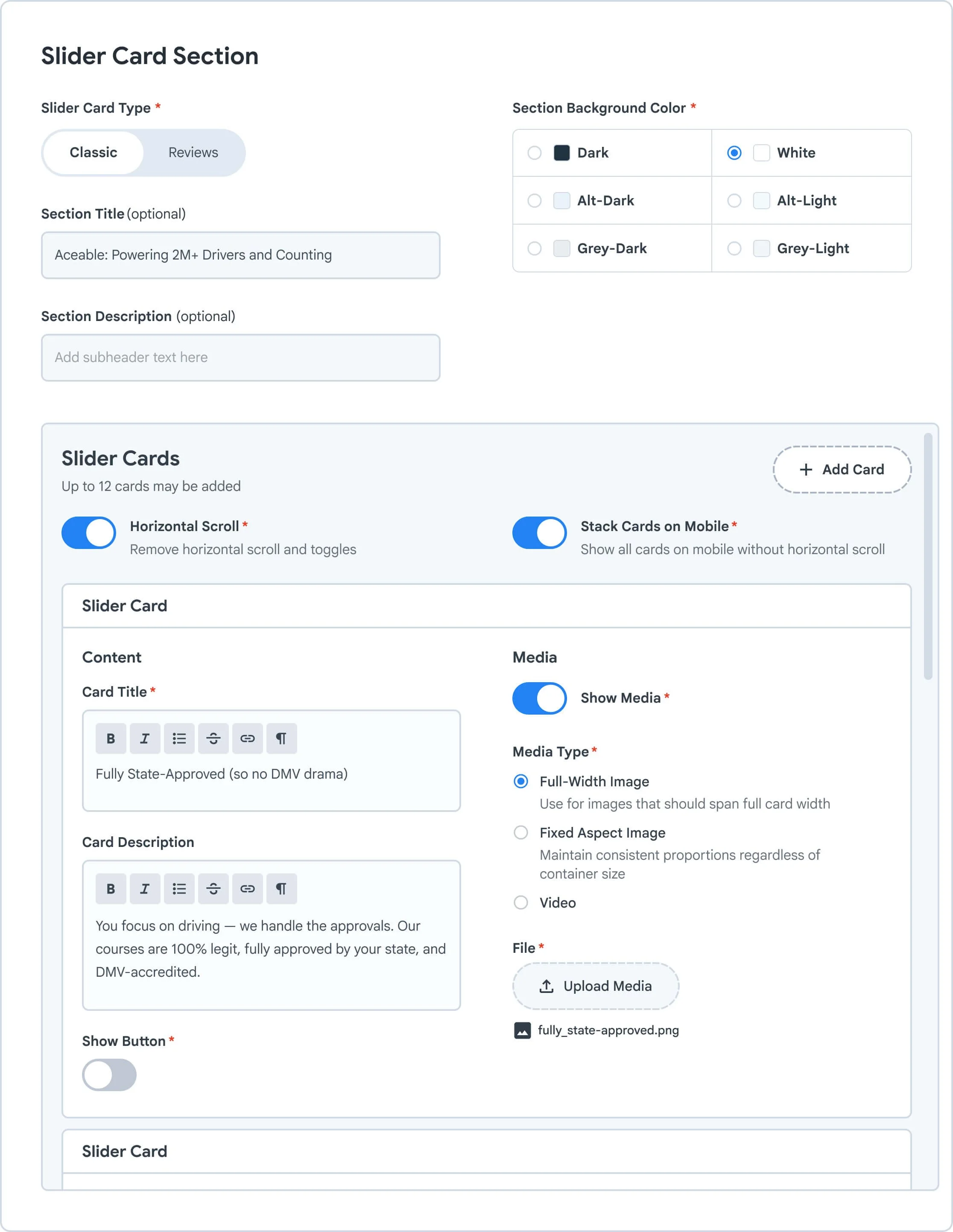
string (optional)
section-description:
string (optional)
background-color:
"dark"
"white"
"alt-dark"
"alt-light"
"grey-dark"
"grey-light"
slider-card-type:
"classic"
"reviews"
horizontal-scroll:
boolean
mobile-stack-all:
boolean
richText (required)
card-description:
richText (optional)
show-button:
boolean (optional)
button-style:
"primary"
"secondary"
"inline"
show-media:
boolean (optional)
media-type:
"full-width"
"fixed-ratio"
"video"
string (optional)
section-description:
string (optional)
background-color:
"dark"
"white"
"alt-dark"
"alt-light"
"grey-dark"
"grey-light"
slider-card-type:
"classic"
"reviews"
horizontal-scroll:
boolean
mobile-stack-all:
boolean
richText (required)
card-description:
richText (optional)
show-button:
boolean (optional)
button-style:
"primary"
"secondary"
"inline"
show-media:
boolean (optional)
media-type:
"full-width"
"fixed-ratio"
"video"
For Engineers
By documenting the component schema — including field types, allowed values, and constraints — I gave engineers a clear path forward. Instead of forcing them to rely solely on visual layouts, they could implement a predictable, data-driven component with defined variants and guardrails. This reduced ambiguity, accelerated development, and spared everyone endless rounds of JIRA ping pong.
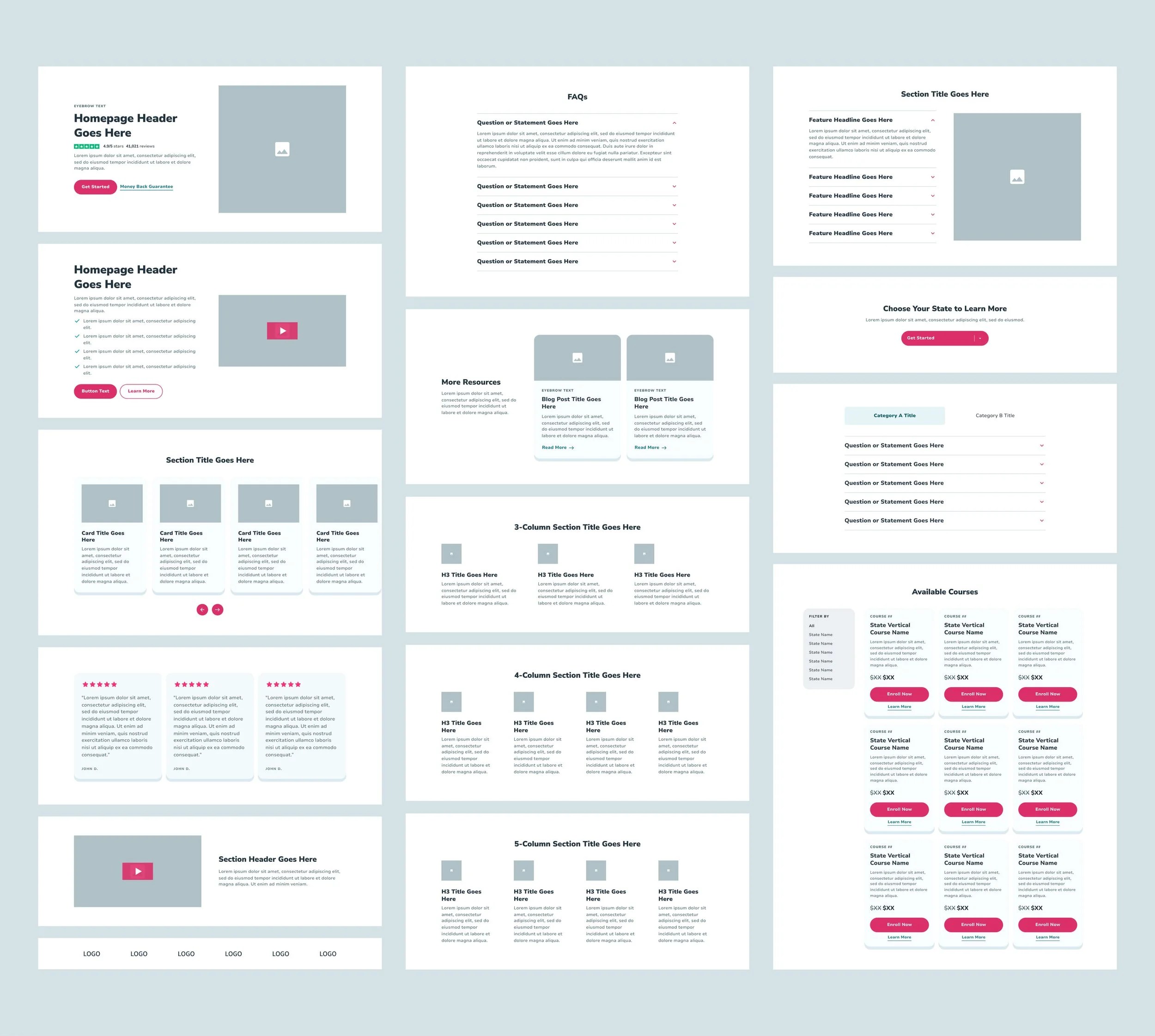
Page Templates
Once our components were clearly defined, we shifted our focus to creating templates (pre-defined but flexible page structures tailored to key stages of the purchase process). This approach gave our Marketing team a clear starting point that aligned content with a defined page structure, while also making it easy for Engineering to support non-developers building pages in Craft, our CMS. Below is a look at our primary desktop templates for Aceable and AceableAgent.
Live Pages
Feel free to check out the rest on aceable.com or aceableagent.com!
What came next?
The Aceable design system was just the beginning. See how we scaled it across the entire brand portfolio.