Creating a Flexible Email System at Scale
2024-2025
Branding
Design System
Email Design
Background
In late 2024, Aceable leadership identified a major issue for the brand: email design. Email drove a significant share of outreach and enrollments for Aceable, AceableAgent, PrepAgent, iDriveSafely, and DriversEd.com… yet our branding was incredibly lackluster. Each brand lacked consistency, clarity, and brand distinction.
There was no dedicated email designer, and I was balancing several other product initiatives. The ask was clear: improve quality across five brands quickly and sustainably. Within two weeks, I created a lightweight email design system with defined brand standards, modular layouts, and reusable components.
Objectives
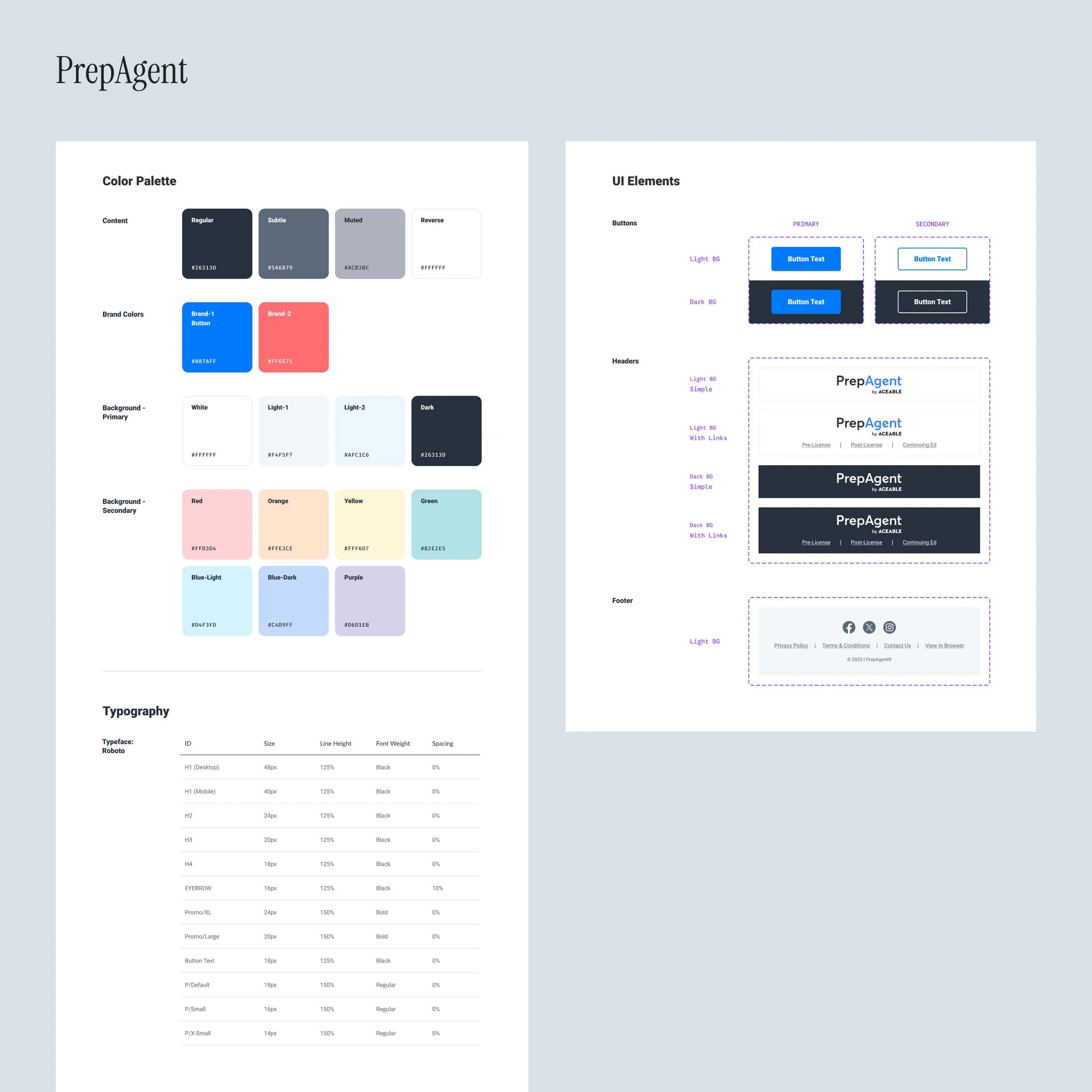
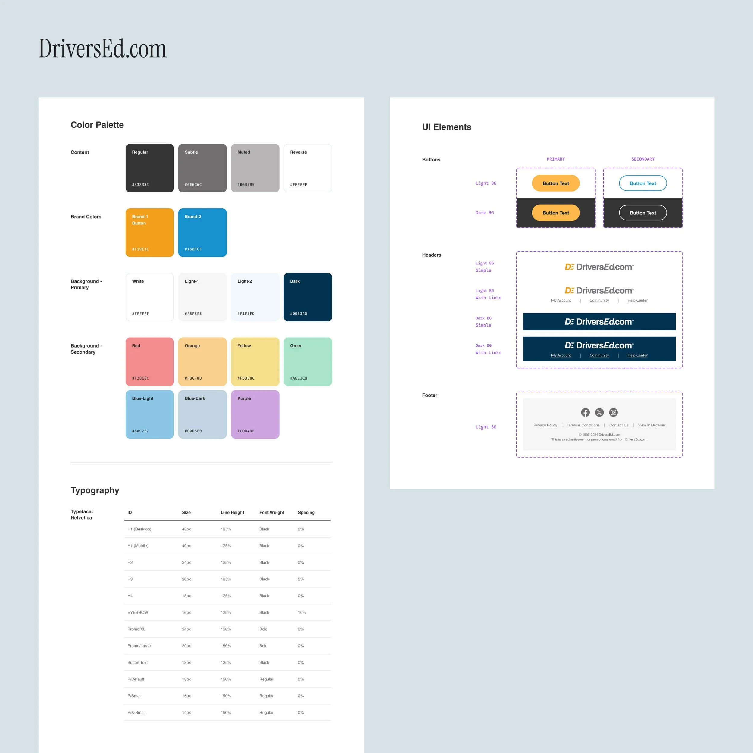
Build a Clear, Usable System
Calling it a full “design system” might be generous, but we needed clear guidelines the email team could actually follow. The goal was structure, not theory. We needed clear layout rules, defined hierarchy, intentional color usage, and modular components to eliminate guesswork.
Create Distinct Identities for Each Brand
This was tricky given the quick turnaround. I wanted each brand to feel distinct, not SO distinct that hyper-specific assets that would be required for every email. The system needed to create separation, but still be flexible and repeatable.
It also needed to be simple. Adding unnecessary flair to emails is not only distracting for users, but also risky when non-designers try to replicate the styles. With limited resources, simplicity was essential, reducing the need for design oversight on every send.
Building a Mini Design System at Scale
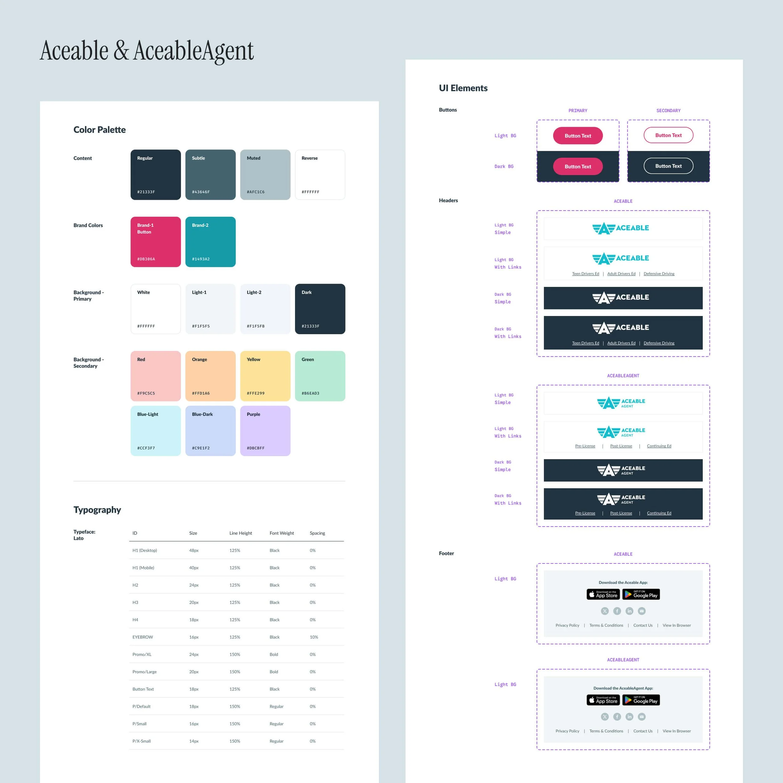
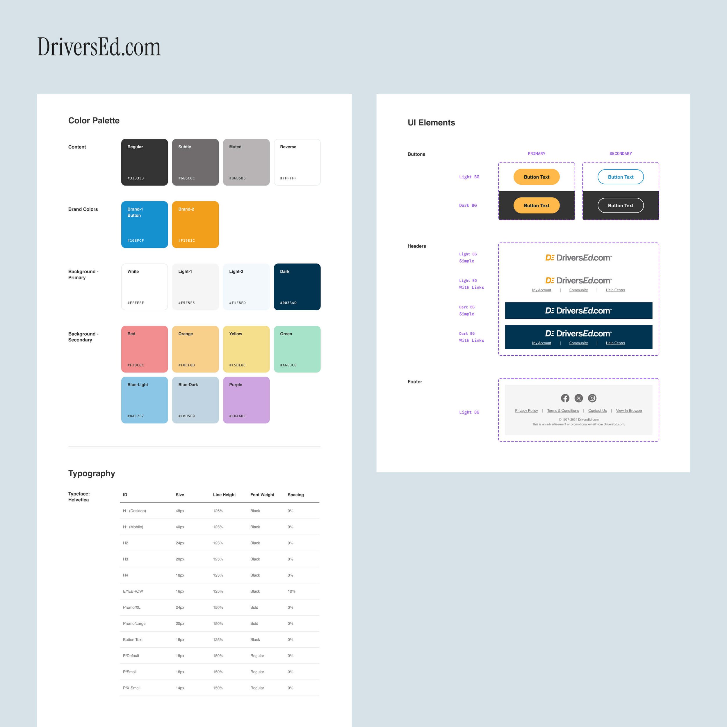
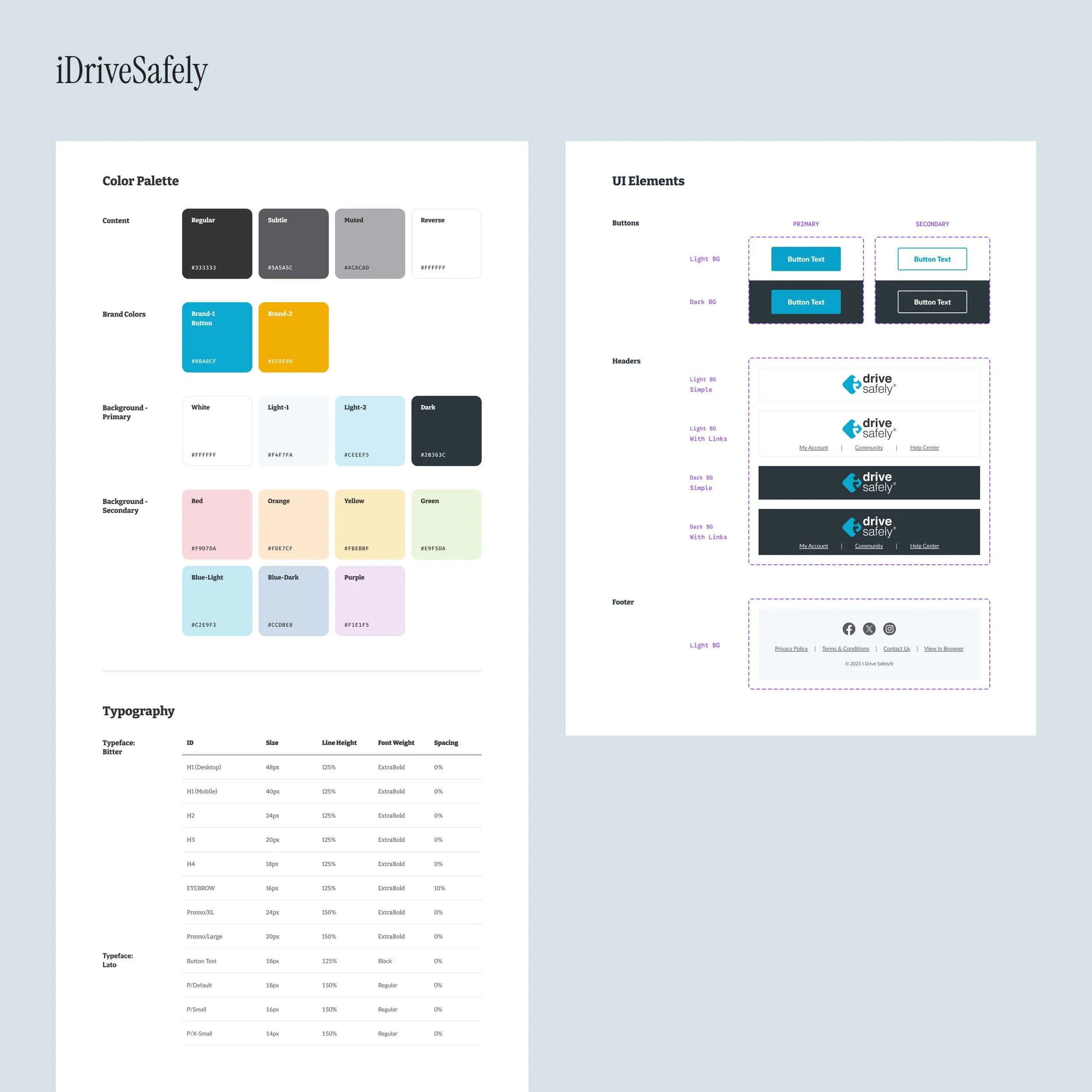
Similar to CORE, each brand follows an identical design system structure while maintaining its own personality. This makes it easy for designers in Figma, as variables allow seamless switching from brand to brand. It also keeps execution simple and efficient for everyone involved, especially our email marketing team.
You’ll notice each brand uses a different typeface in email. This is intentional, as email clients have limited font support. Rather than risk brand fonts failing to load, we selected the closest reliable match to ensure consistent rendering across platforms.
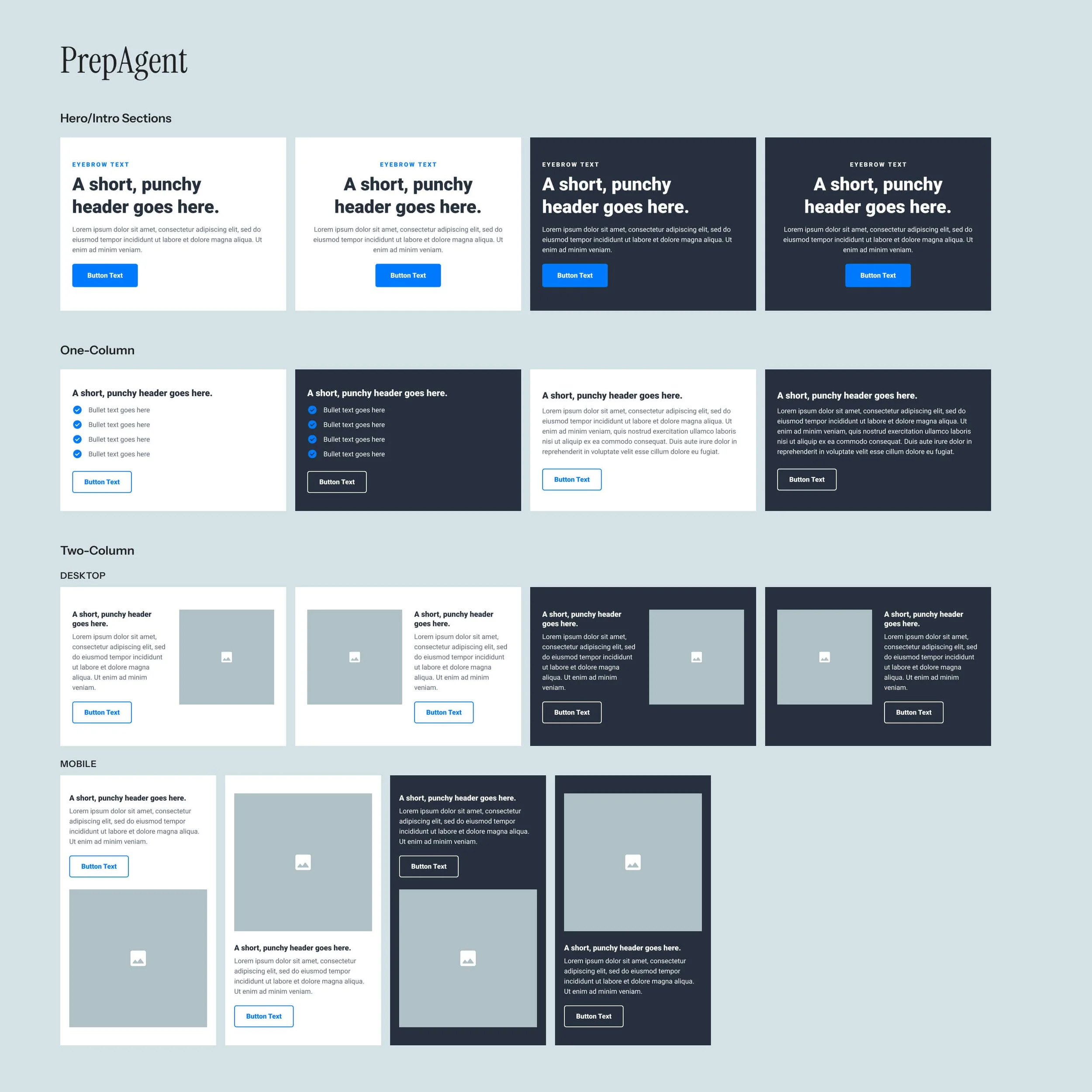
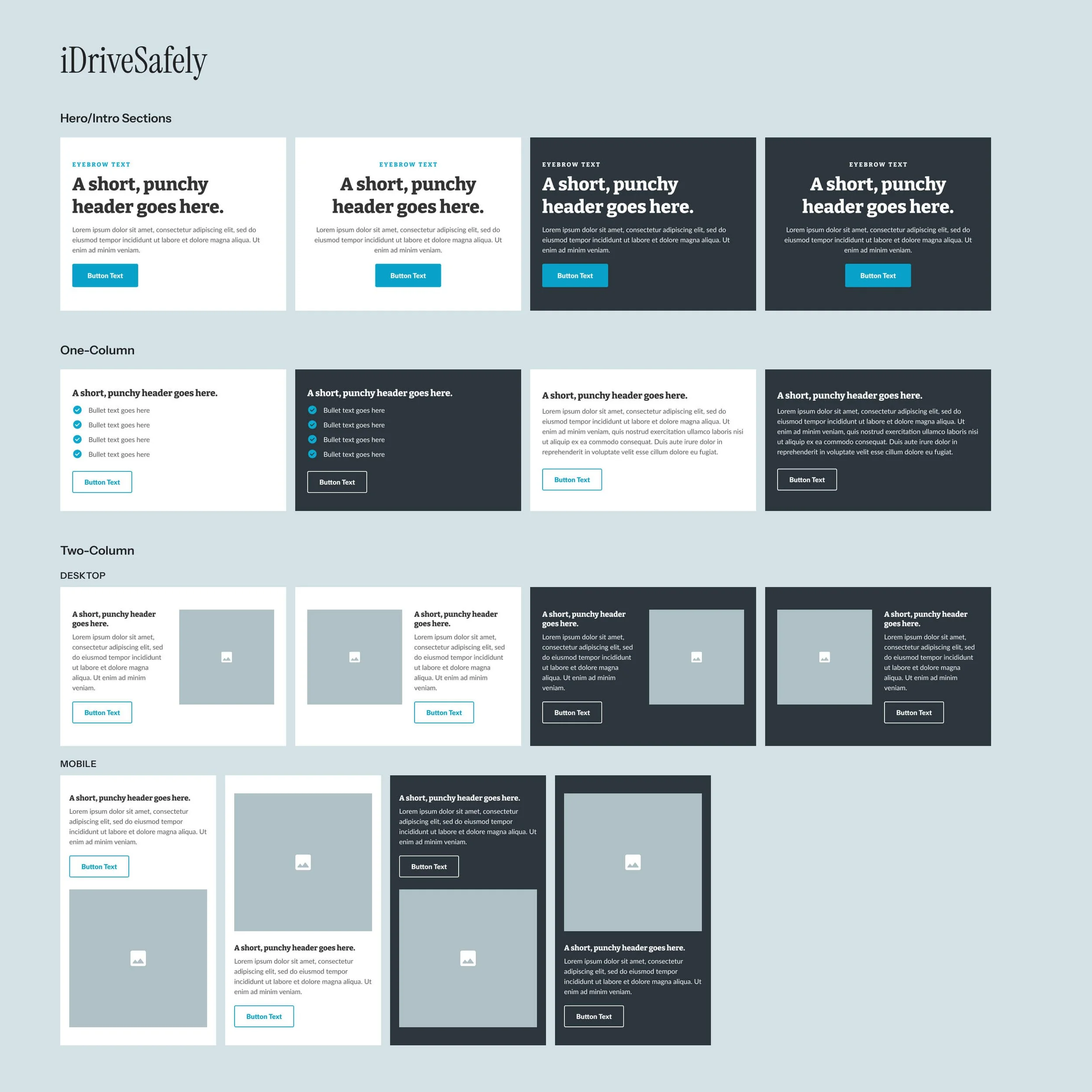
Core Components
As you can see below, our section components are nothing crazy – just enough to get the message across, while also allowing for creativity through embedded imagery.
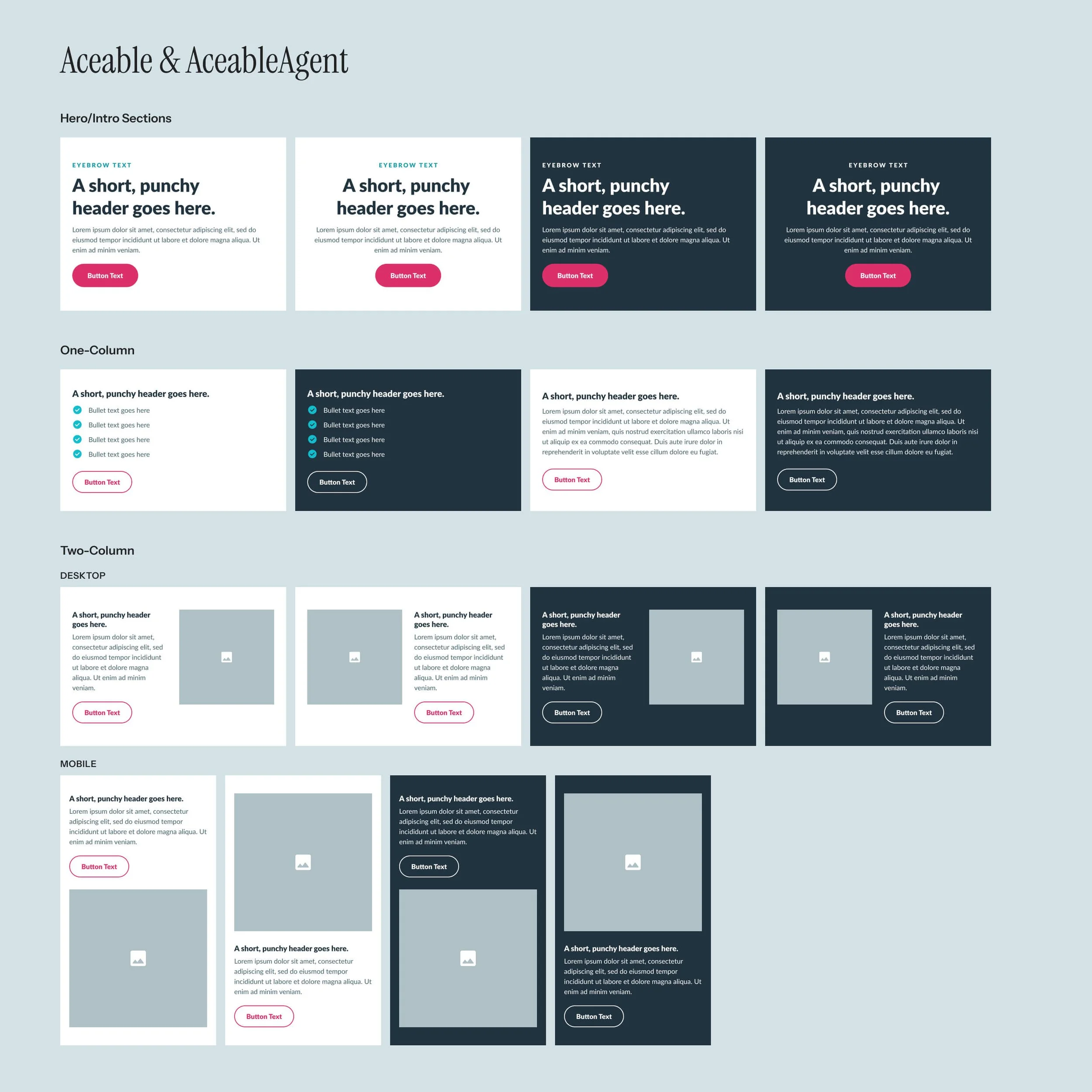
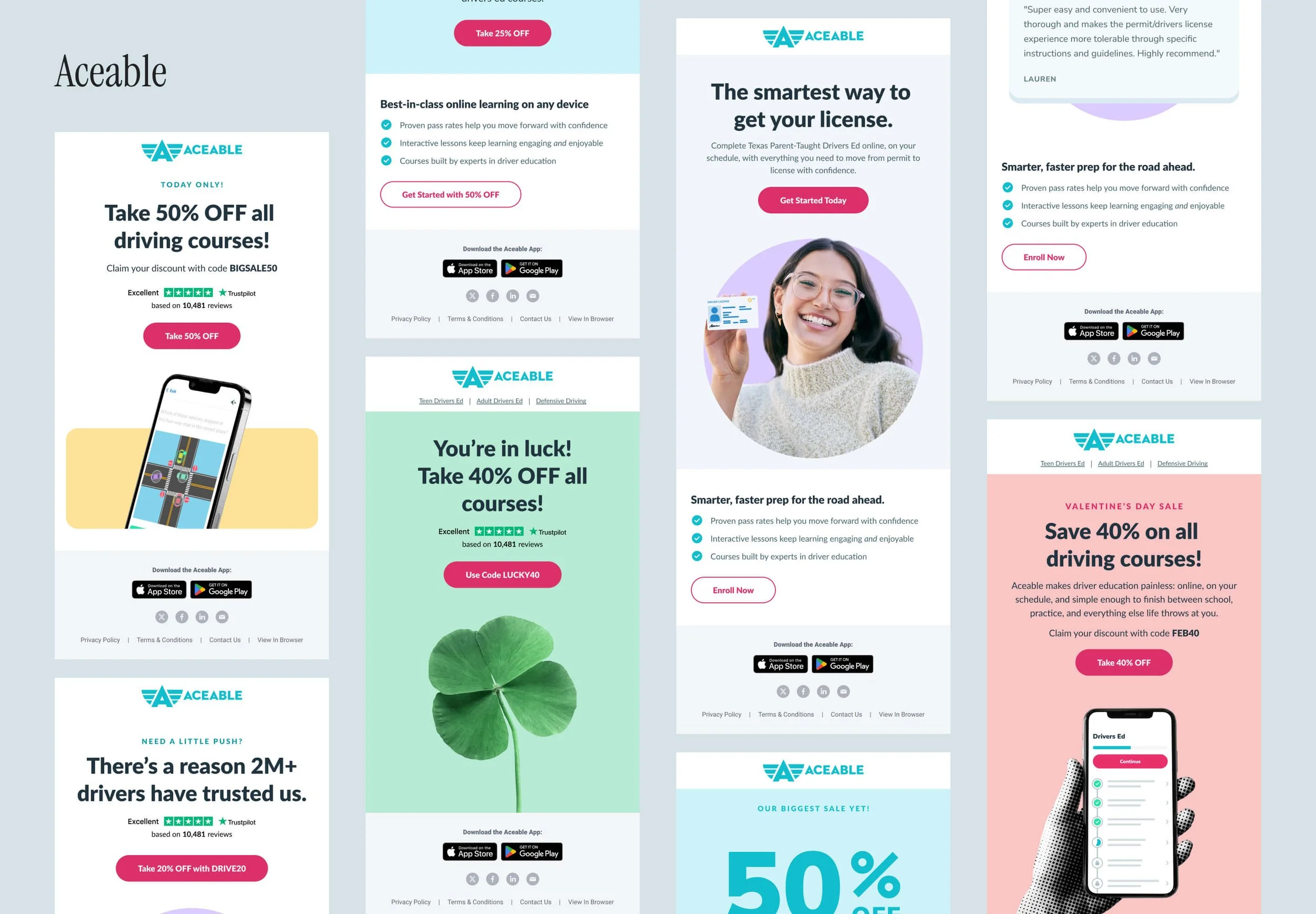
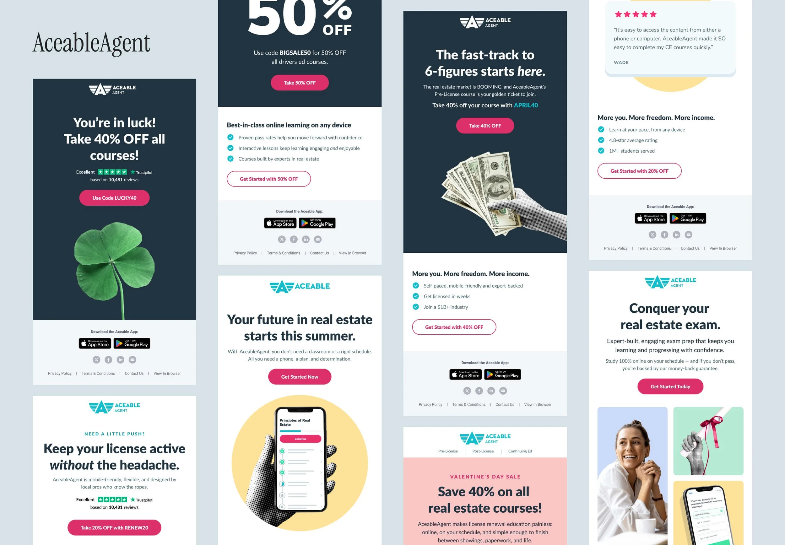
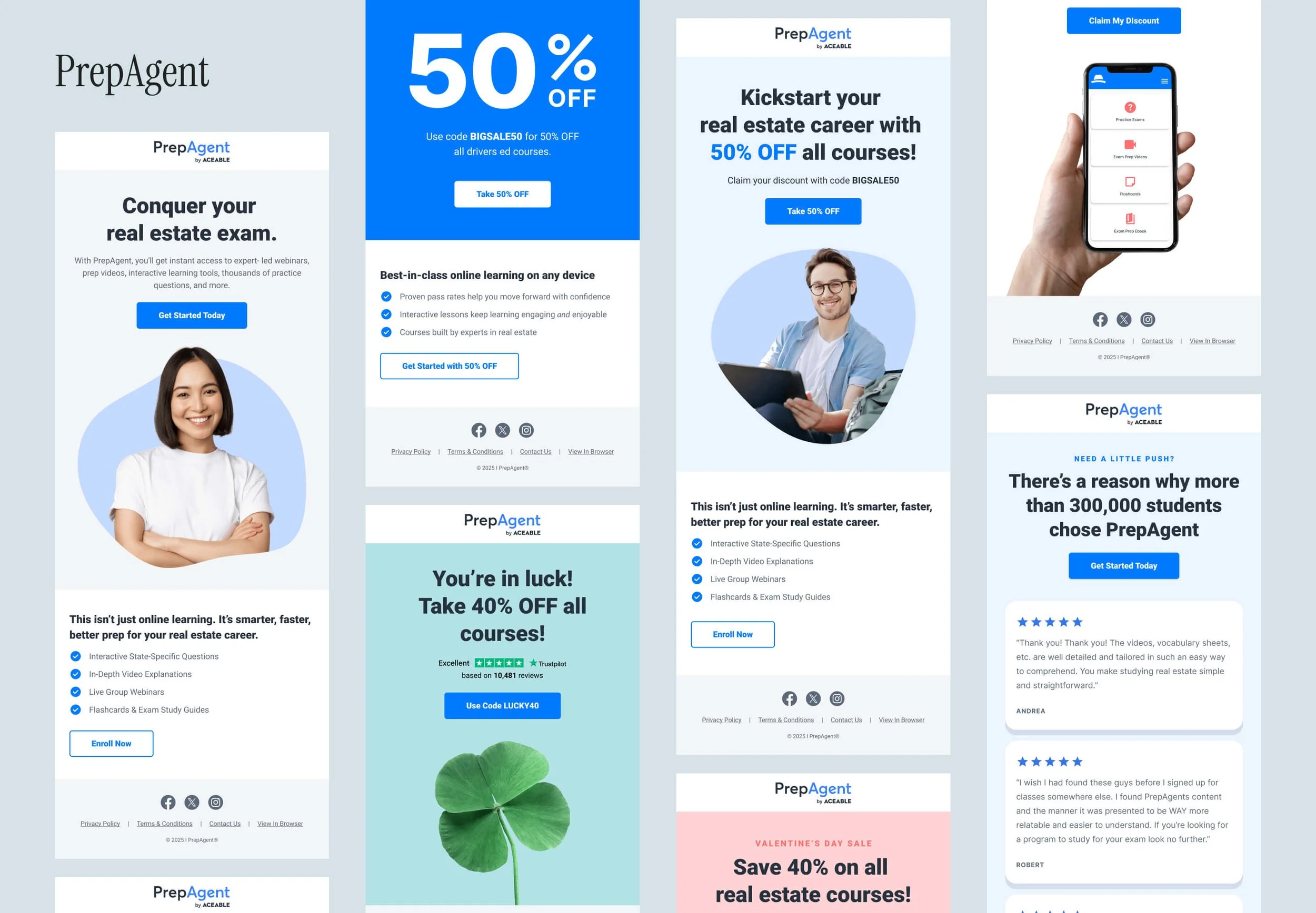
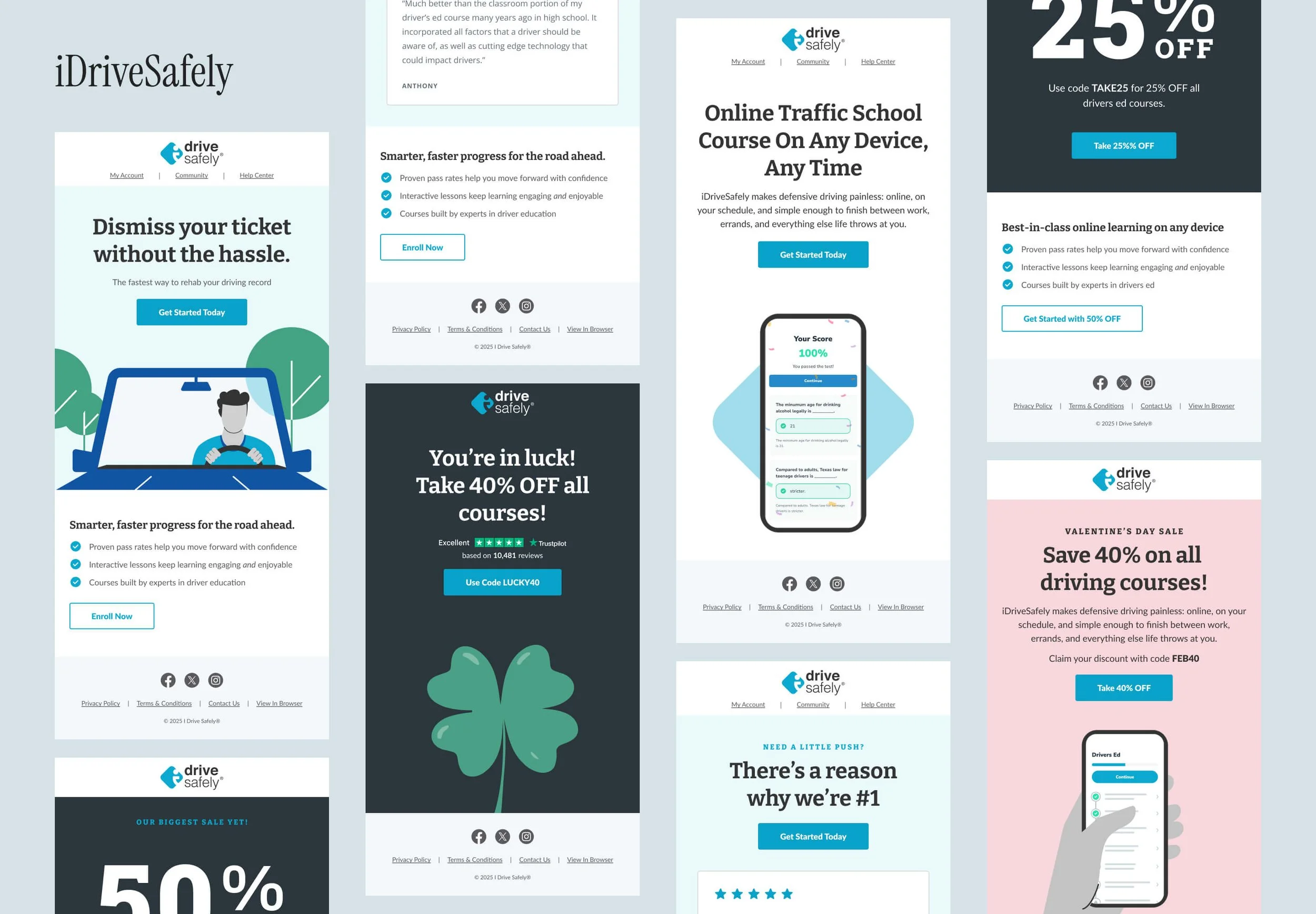
Creating Distinct Brand Identities
With the system established, I turned to imagery — a consistent weak point in our emails. Each brand needed strong differentiation, but it also had to be practical; we simply didn’t have the bandwidth for time-intensive, custom assets. The solution was a focused set of guidelines that balanced uniqueness with efficiency.
-
Never use a direct screenshot for any brand. All course previews should be simplified, stylized versions found in our Figma library.
PrepAgent: Since the app UI is especially dated, simplify course screens even more – opting for logo-only screens when appropriate.
DEC: Show devices on their own. Never Photoshop screens into lifestyle shots — never in lifestyle shots.
-
ACE/AA: Use the halftone effect on the device itself or a hand (not both).
PrepAgent: Keep it natural. Do not enhance or manipulate devices or hands.
IDS: All devices must be illustrated, adhering to IDS brand guidelines.
DEC: Show devices on a brand-colored background, contained within a rectangular frame.
-
Avoid imagery that feels AI-generated, overly staged, or cheesy, especially with unnatural lighting. Choose age-appropriate subjects that align with the product and its intended audience.
ACE, AA: Isolate people (or other subjects) from the original photo and place them on a brand-appropriate background element. You may also incorporate the 3- or 4-tile image grid frequently shown on our websites.
PrepAgent: Isolate people (or other subjects) from the original photo and place them on a brand-appropriate background element.
IDS: All imagery must be illustrated, adhering to IDS brand guidelines.
DEC: Do not isolate people or objects. Crop if needed, but don’t edit.
-
All background elements must use colors from the pre-approved brand palette. Shapes described below may be used to frame elements or as clipping masks to contain content.
ACE/AA: Use a circle for single images. You may also incorporate the 3- or 4-tile image grid frequently shown on our websites.
PrepAgent: Rounded blob shapes
IDS: Rounded diamond shape from logo
DEC: Square or rectangle
-
Subtle elements only. Details should add to the background, not steal the show.
ACE, AA, PrepAgent: Use real, photography-based objects.
IDS: Illustrated objects only.
DEC: Use a single photography-based object only. Examples are shown below.
-
Discount should be big and bold, with the emphasis on the promotion, not imagery. Unless an image is provided by the Design team, show the discount in the brand font as text in the email.
Use brand accent colors to highlight the discount and make it stand out.
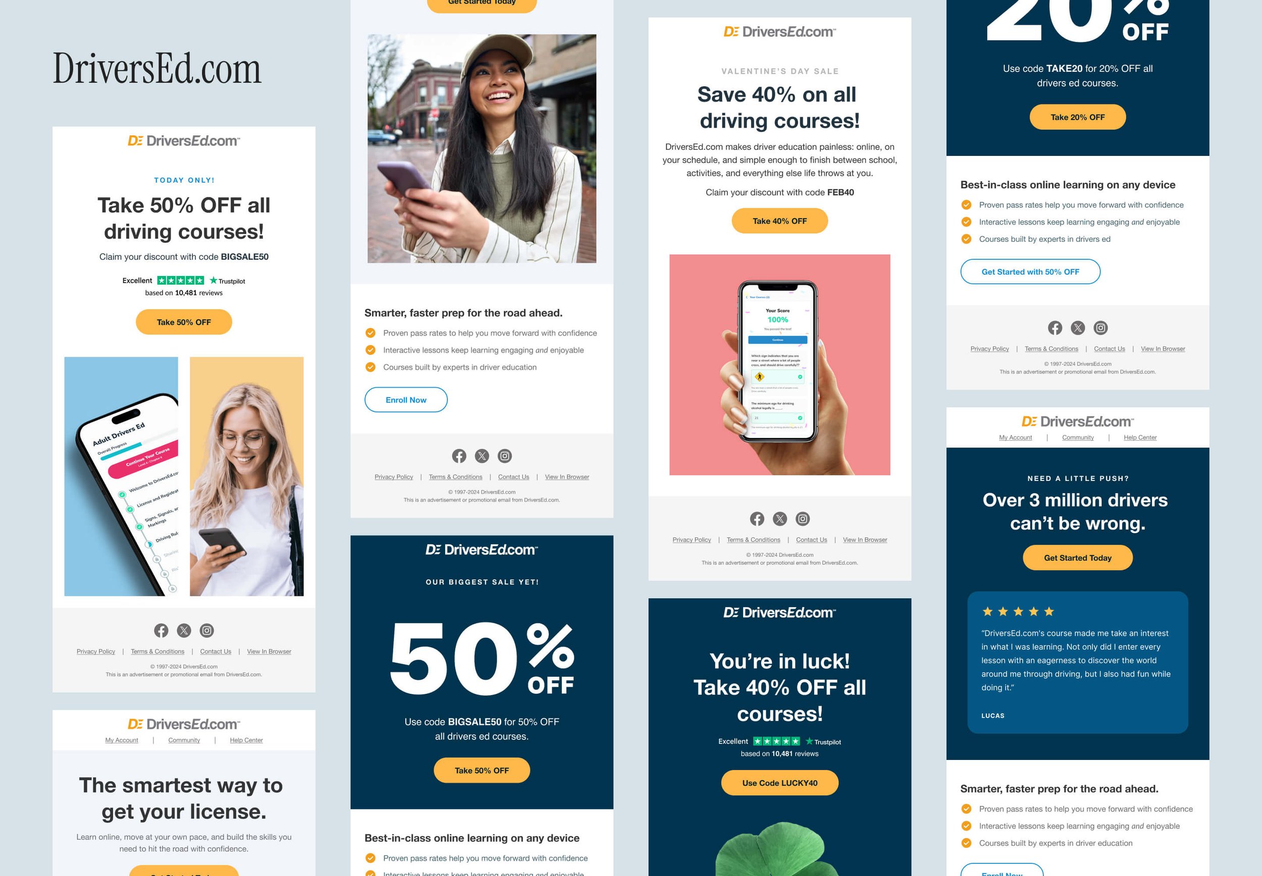
The Result
Before revealing final designs, it’s important to look back at our starting point. Below are a few legacy email templates that were frequently used by the Email team.
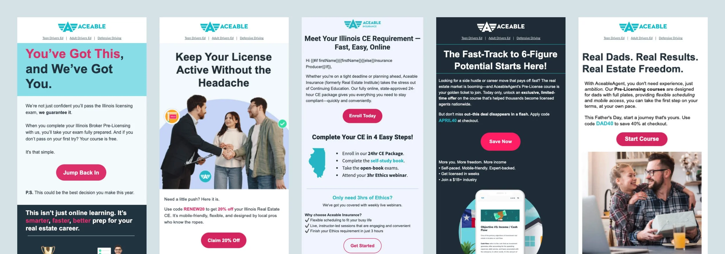
A sample of emails for each brand is shown below. While I’m unable to share specific performance metrics, each brand saw meaningful improvements in email KPIs.