Aceable
Defining the Aceable Brand
Branding
Design System
Project Overview
About Aceable
Aceable is an online education company that makes required courses — like driver education, real estate licensing, and other professional certifications — faster, more engaging, and easier to complete. Through thoughtful UX, clear content, and mobile-first design, Aceable transforms traditionally dry learning experiences into intuitive, approachable digital products.
About the Project
I joined the Aceable design team in late 2021 and was immediately tasked with reimagining the Aceable and AceableAgent websites. At the time, neither site reflected the strength of the product or the expectations of our target audiences.
The Aceable website felt transactional and devoid of any appealing brand personality (click here to see what I mean). Additionally, our product pages (particularly our best-selling Texas Parent-Taught Drivers Ed page) lacked relevant imagery and failed to communicate the human moments and trust required for a purchase of this scale.
AceableAgent suffered from similar issues. The site (shown here) felt generic, dated, and visually fragmented, with design decisions that appeared disconnected from any cohesive system or brand rationale. Inconsistent elements, including off-brand yellow buttons, further eroded credibility and clarity.
The conclusion was unavoidable: Aceable’s digital presence had fallen out of step with both the quality of its offering and the maturity of the business. A decisive, brand-led redesign was required—not as a refresh, but as a reset.
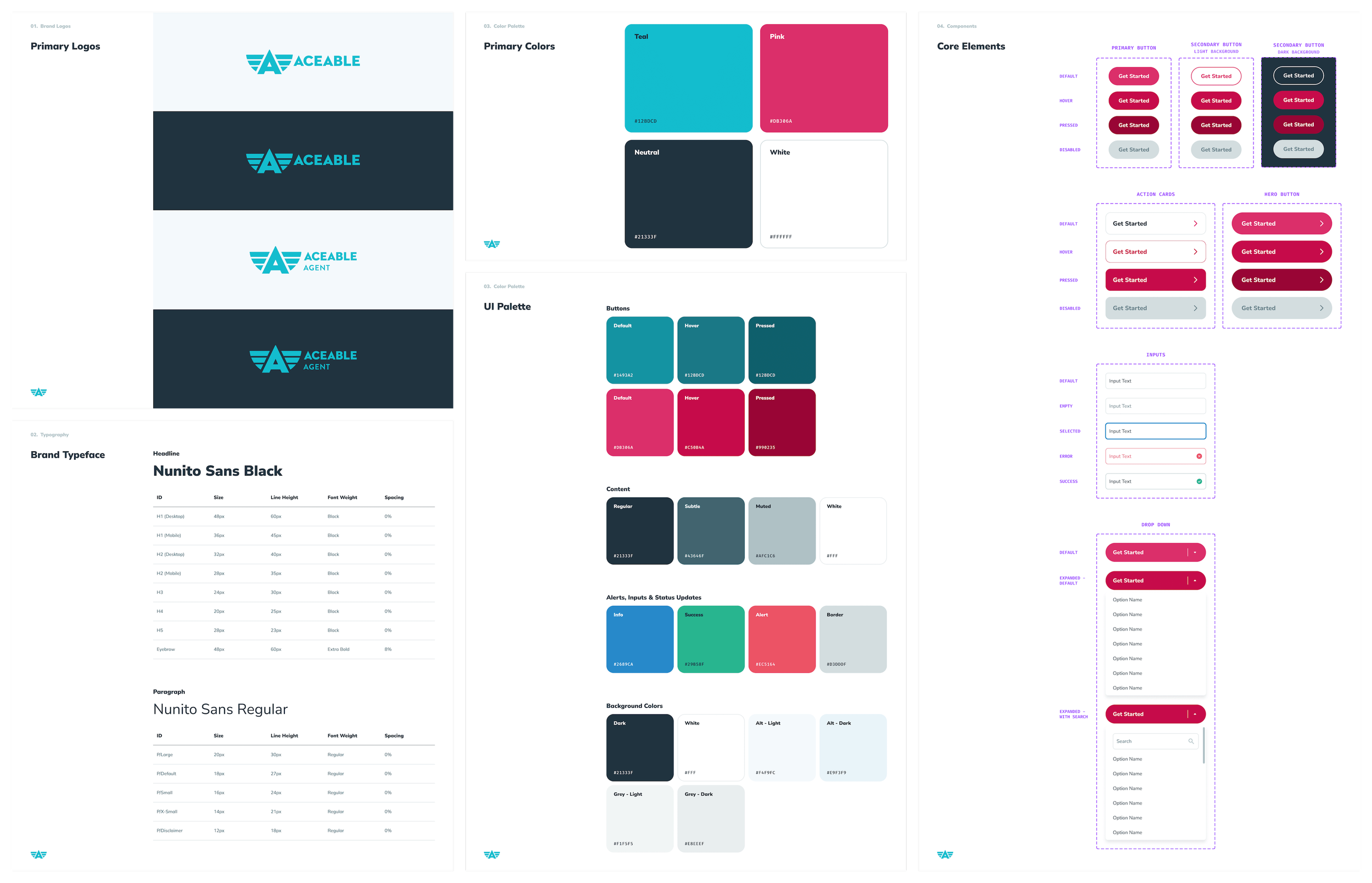
Creating a Design System
Although Aceable had existing brand guidelines, they weren’t built to support a modern, flexible UI. Rather than iterating on a fragmented foundation, we started fresh with a design system that balanced brand expression with product and marketing requirements.
Template Creation
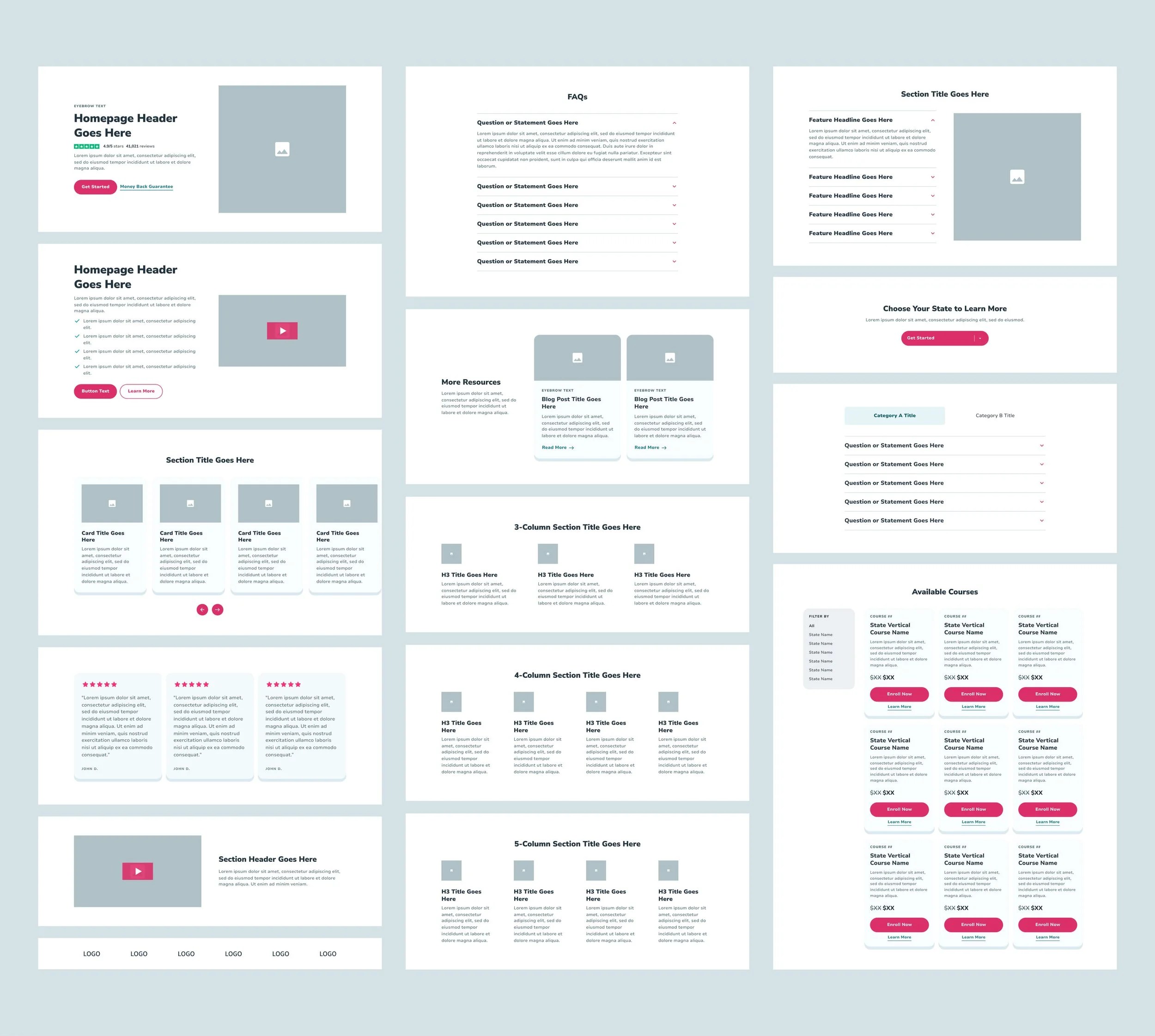
Creating Flexible Components
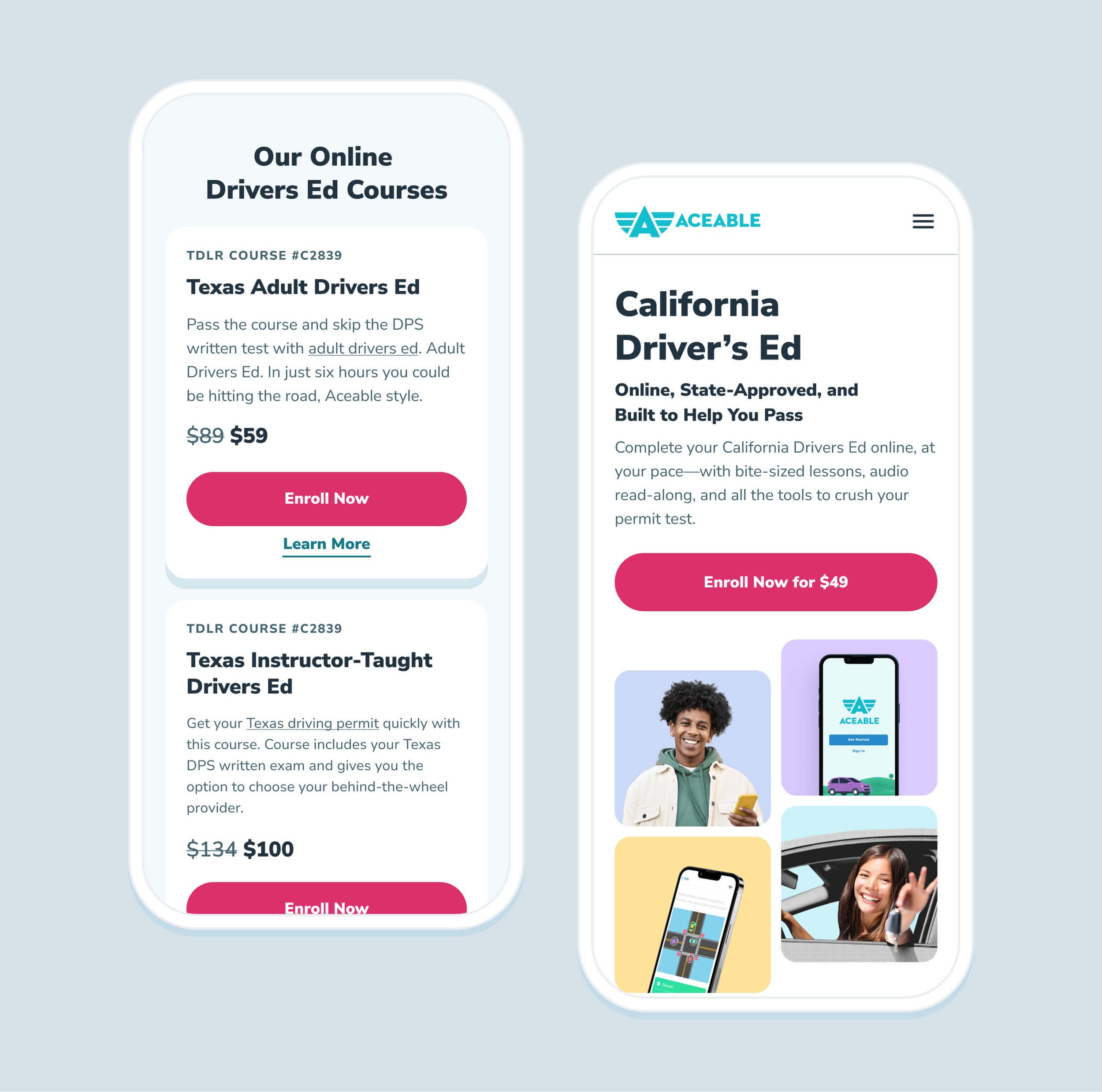
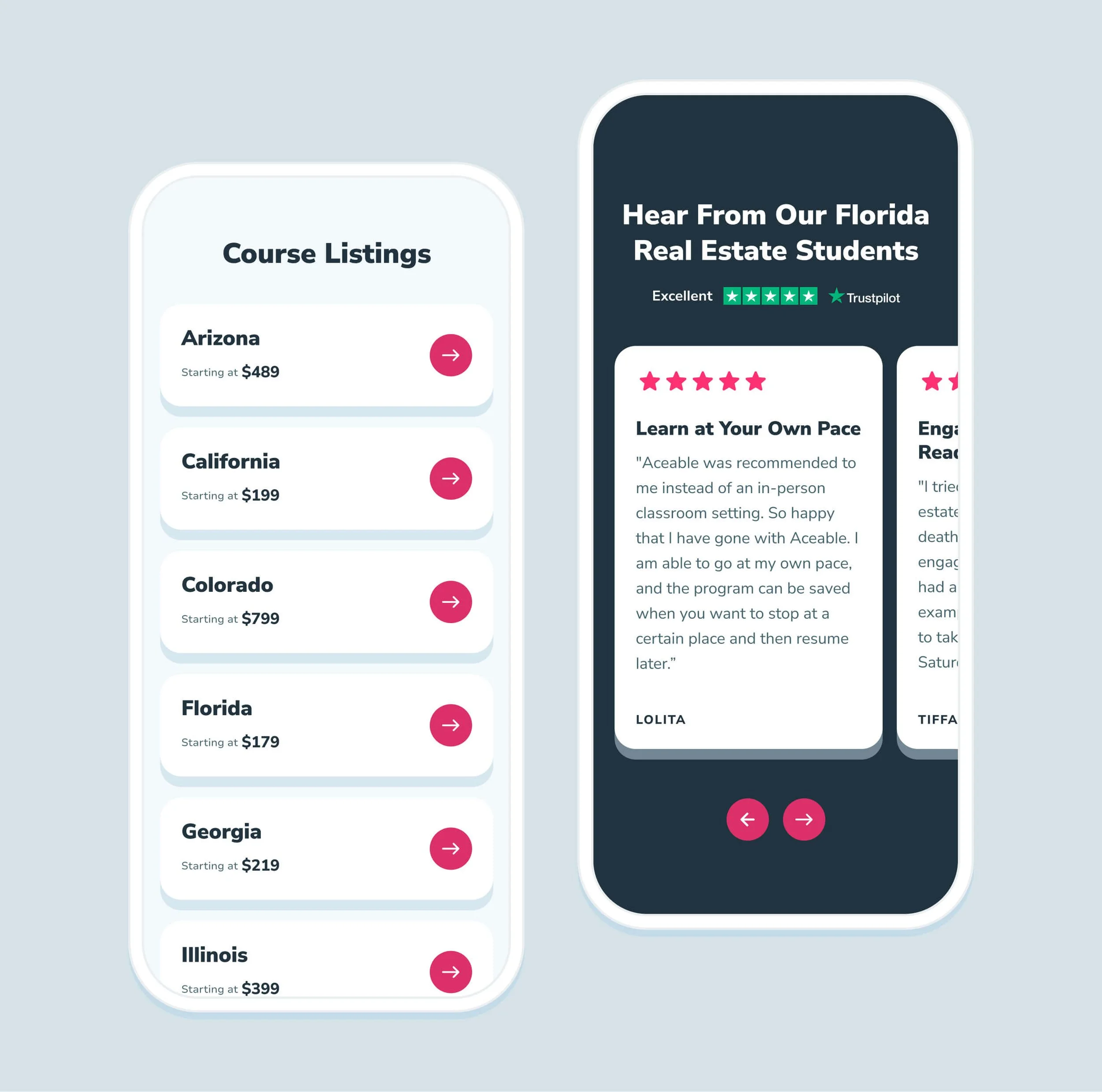
Before defining page templates — or even establishing layout guidelines — we started with modular components, or flexible page sections that could be reused without additional development work. As shown below, these components include core building blocks such as two-, three-, and four-column layouts, accordions, reviews, and pricing cards.
Each component was designed to scale across five breakpoints: Extra Large (1236px+), Large (1024–1235px), Medium (768–1023px), Small (600–767px), and Extra Small (under 500px), with mobile layouts specifically optimized for 414px devices.
Usability for Designers
Once the foundation of our design system was established, we focused on two equally important considerations: ensuring it was intuitive and usable for designers, and making it flexible enough to minimize friction for our engineering teams.
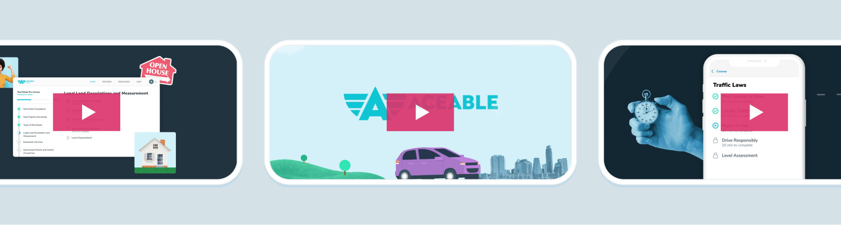
Once core UI elements like buttons and input fields were established, we focused on componentizing as much of the interface as possible to prevent design drift. Through several rounds of iteration, we found the most effective approach was to create a distinct component for each page section—such as standard two-column layouts, multi-column grids, and a slider card section (shown below). This structure allowed for controlled flexibility through brand colors and imagery, while locking in consistency to uphold our brand standards.
Creating Flexible Templates
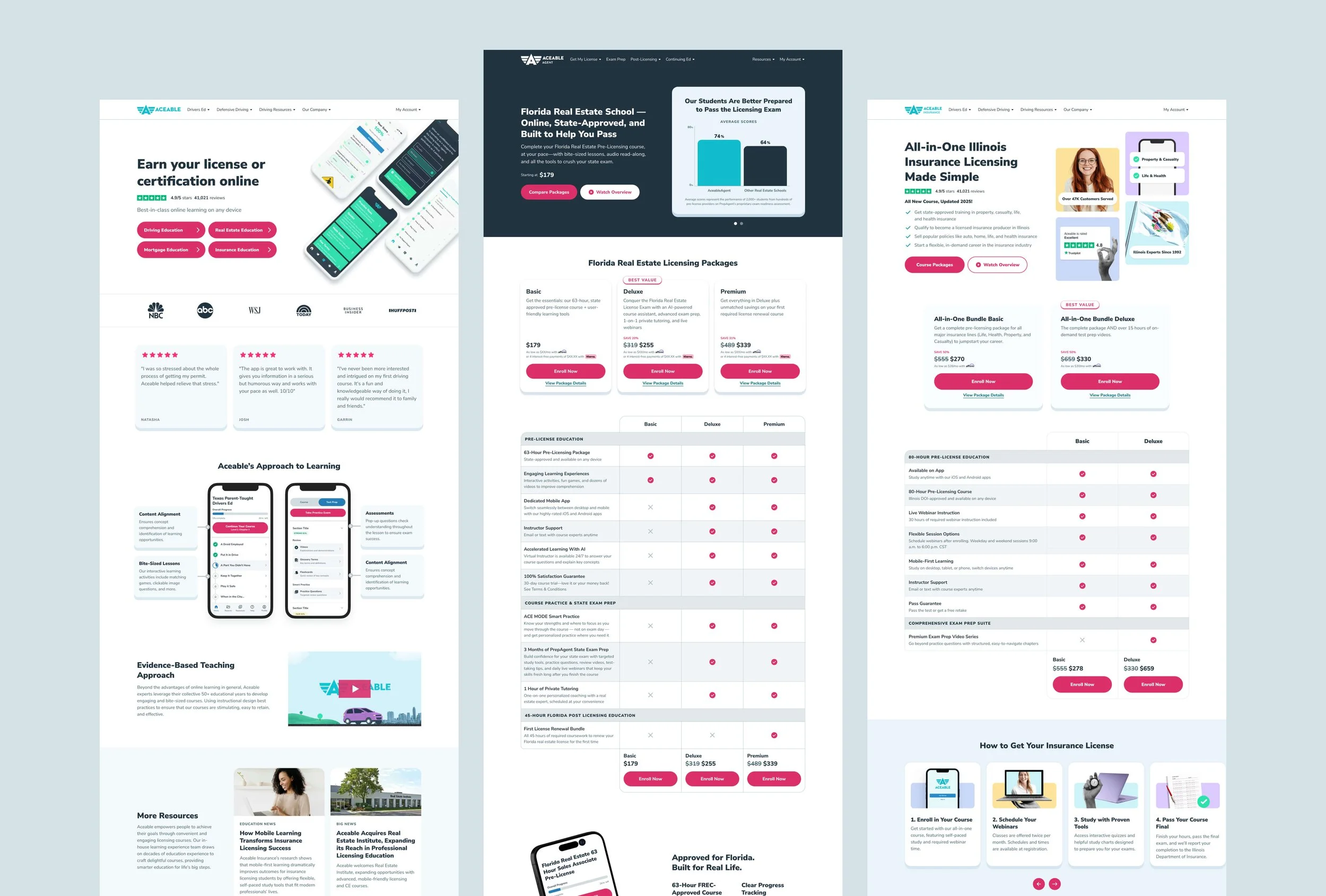
Once our components were clearly defined, we shifted our focus to templates—flexible page structures designed for specific use cases. This approach gave our Marketing team a clear starting point that aligned content with a defined page structure, while also making it easy for Engineering to support non-developers building pages in Craft, our CMS. Below is a look at our primary desktop templates for Aceable and AceableAgent.
Live Pages
Feel free to check out the rest on aceable.com or aceableagent.com!