
ShippingEasy
Revamping the Homepage Experience
Web Design
Project Overview
The Client
ShippingEasy is a web-based shipping automation platform for sellers of all sizes. ShippingEasy partners with USPS, UPS, FedEx and other carriers to offer discounted rates, and integrates seamlessly with marketplaces like Amazon, Shopify, eBay, BigCommerce and more. The Austin-based company currently serves over 30,000 online merchants, and is part of the Stamps.com/Auctane portfolio.
The Problem
For a long time, ShippingEasy’s home page was very generic. The hero was generally white or a pale grey, with the rest of the page relying on the standard two-column layout and generous white space. By late spring 2020, conversion was down and we wanted to provide an entirely new experience: one that was modern and compelling, and more on par with partners like Shopify.
The Solution
ShippingEasy clearly needed a brand refresh — but rather than choosing a “cool” design and implementing it across the site, we decided to start with the home page. Based on conversion rates and other key metrics (tracked through Google Optimize), we were able to gauge which elements worked best.
I spent about a week researching competitors and talking to individuals within our target demographic. With the help of ShippingEasy’s Brand Manager and VP of Marketing (who really let me take the lead on the visual design/UX elements of the page), we ended up with a design we feel modernizes the brand and can serve as a benchmark for its future visual identity.

Adding Animation to Product Imagery
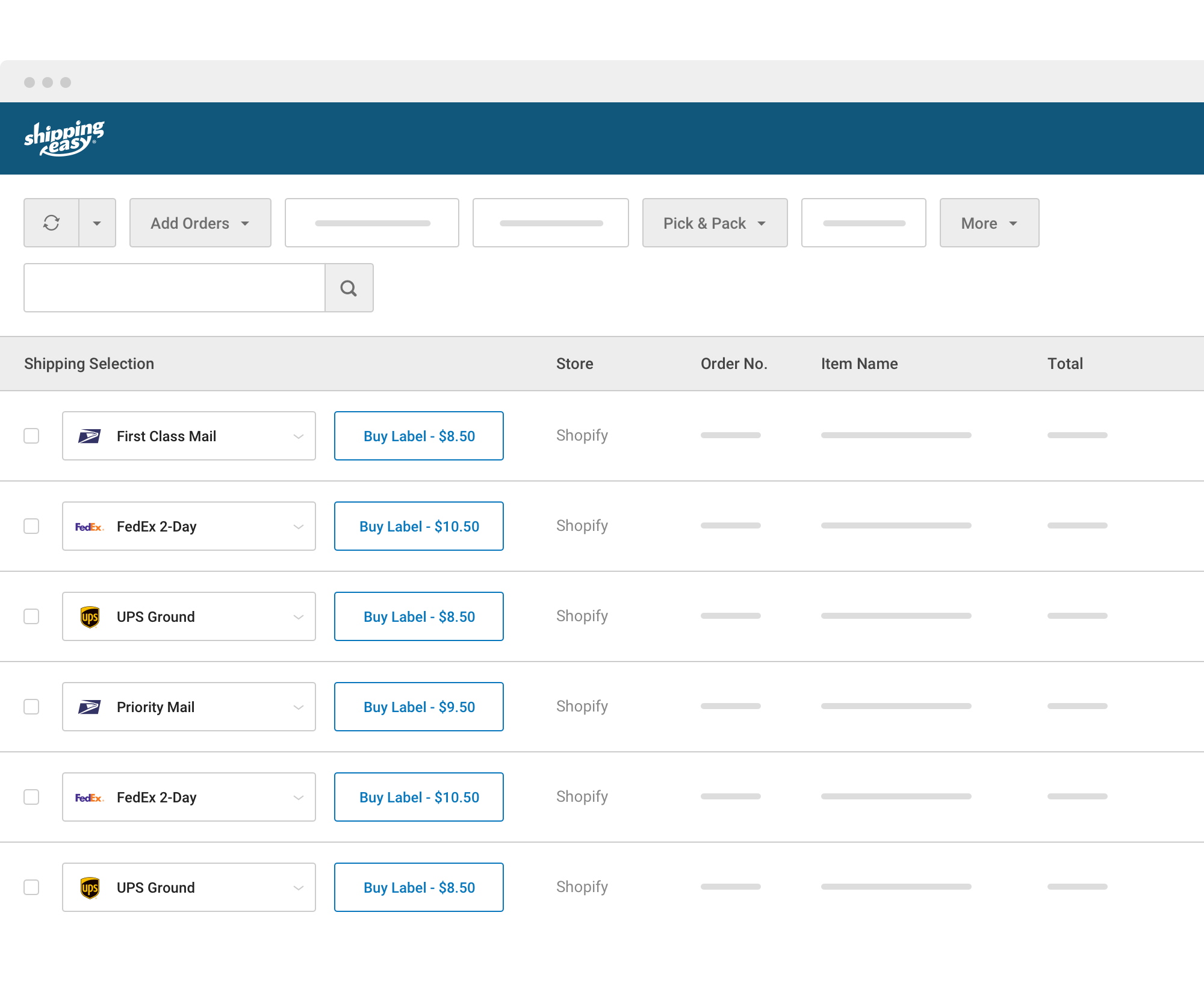
If you visit shippingeasy.com, you’ll notice the hero features an animated mockup of the product. This was a huge priority for our team, as we felt like previous imagery didn’t accurately showcase our product — an opinion our customers echoed as well.
Major Goals of the Page
Less copy, more ability to scan
The data was clear: If users were scrolling below the fold, they weren’t spending long on the page — so paragraphs of detailed information weren’t adding any value. Therefore, we wanted to see if a more visual approach would not only increase conversion, but also general engagement and length of time on the page.
Informative (not decorative) imagery
This was huge, and tough to advocate for — especially as many B2B tech websites gravitate toward the Dribbble-y, clay-like mockup aesthetic. There is no question that these oversimplified mockups are more visually appealing, but they often fail to communicate key product details and resonate with target customers. We had tried it before, and it was not as successful as we envisioned (some customers even mentioned feeling “misled” by certain mockups on our site).
A “different” experience from our previous home pages
I’ll admit this request was the most difficult to fulfill — as “different” can be interpreted in many different ways. After speaking with our Brand Manager, VP of Marketing and several product managers, I think the main goal was to ensure that ShippingEasy didn’t feel noticeably behind partners like Shopify or BigCommerce. Our old home page looked a bit dated (and lacked personality), and we wanted to add this to our home page. ShippingEasy was never a dull or dated brand… it just didn’t convey this on its website. In short, our goal was to provide a modern user experience that encourages action and makes the ShippingEasy brand feel more exciting and compelling.
Two unique experiences for mobile and desktop
Considering we built the page in 2020, this should have been obvious — but in the past we’ve tried to communicate the same information on desktop and mobile. Because this typically leads to a very long and ineffective mobile experience, we wanted to think through each one separately, and provide only the most relevant information for mobile visitors.
Design Thinking & Strategy: Key Points
The font (Poppins) is new to the brand — we typically use Gilroy (for headings) and Lato (for body text). Unfortunately, Gilroy hasn’t successfully rendered on most devices, so we’re currently using Poppins and Lato as header fonts to see which is most successful.

