Auctane
Creating a Brand & Website From Scratch
2020-2021
Branding
Web Design
About the Project
The Client
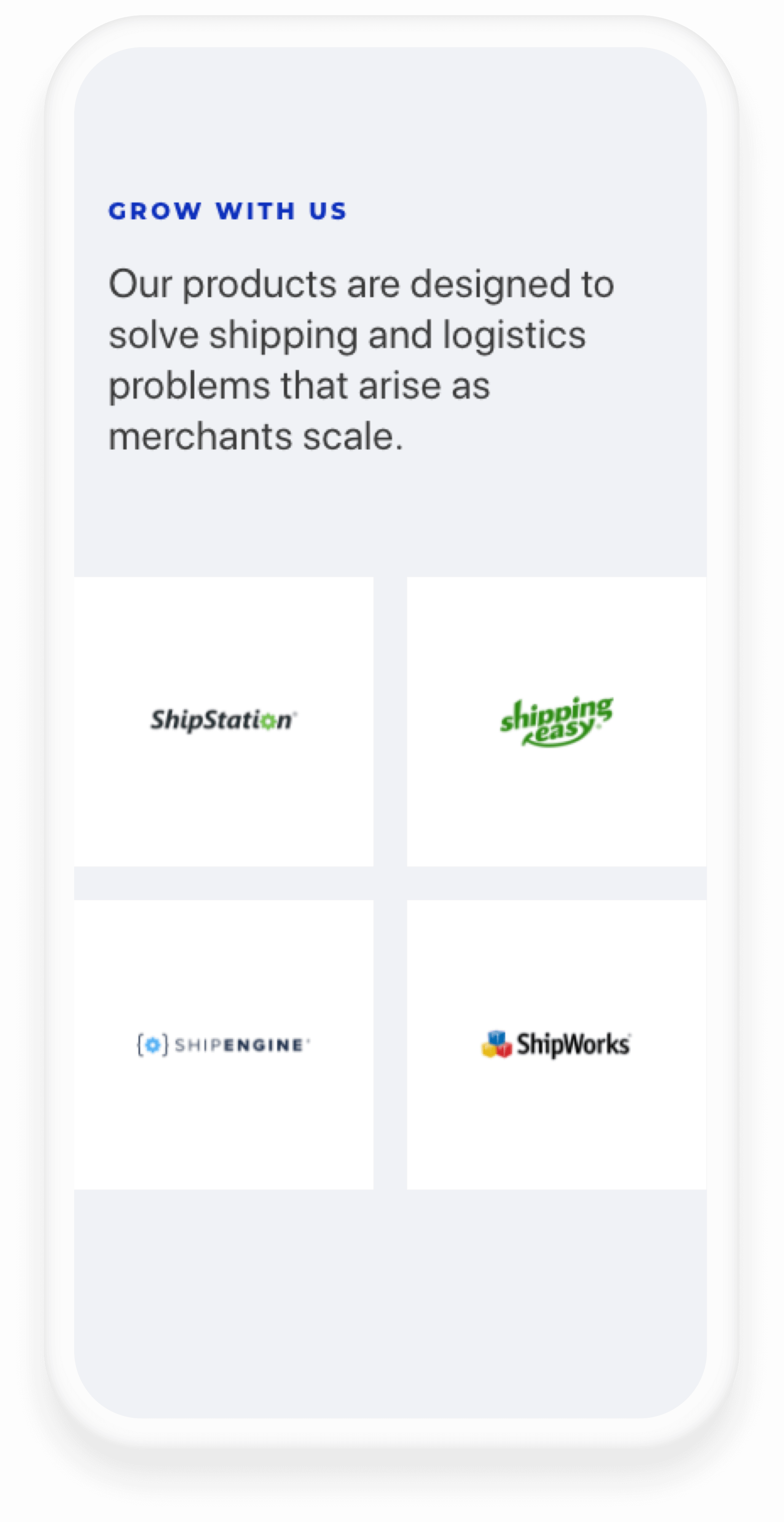
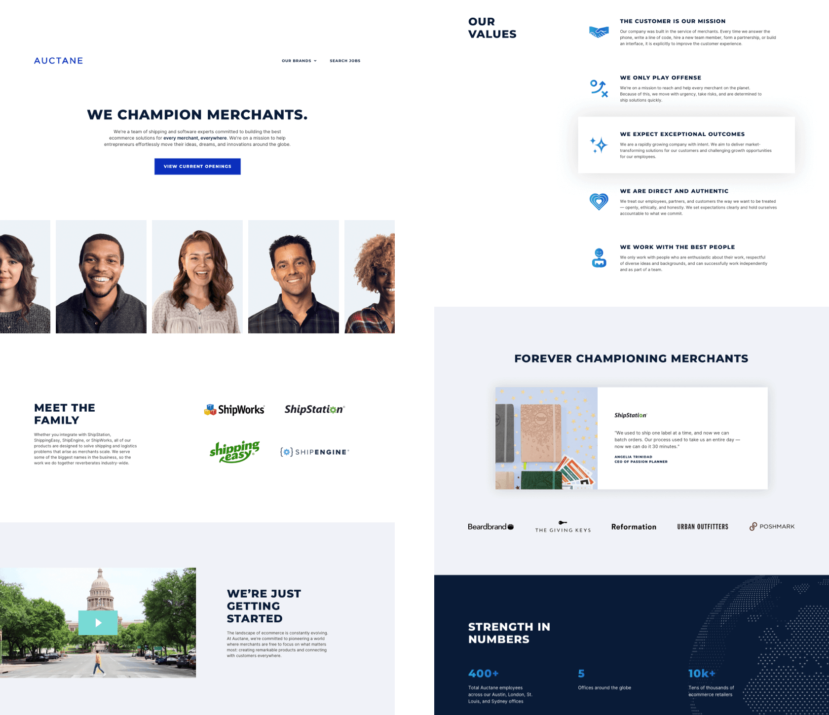
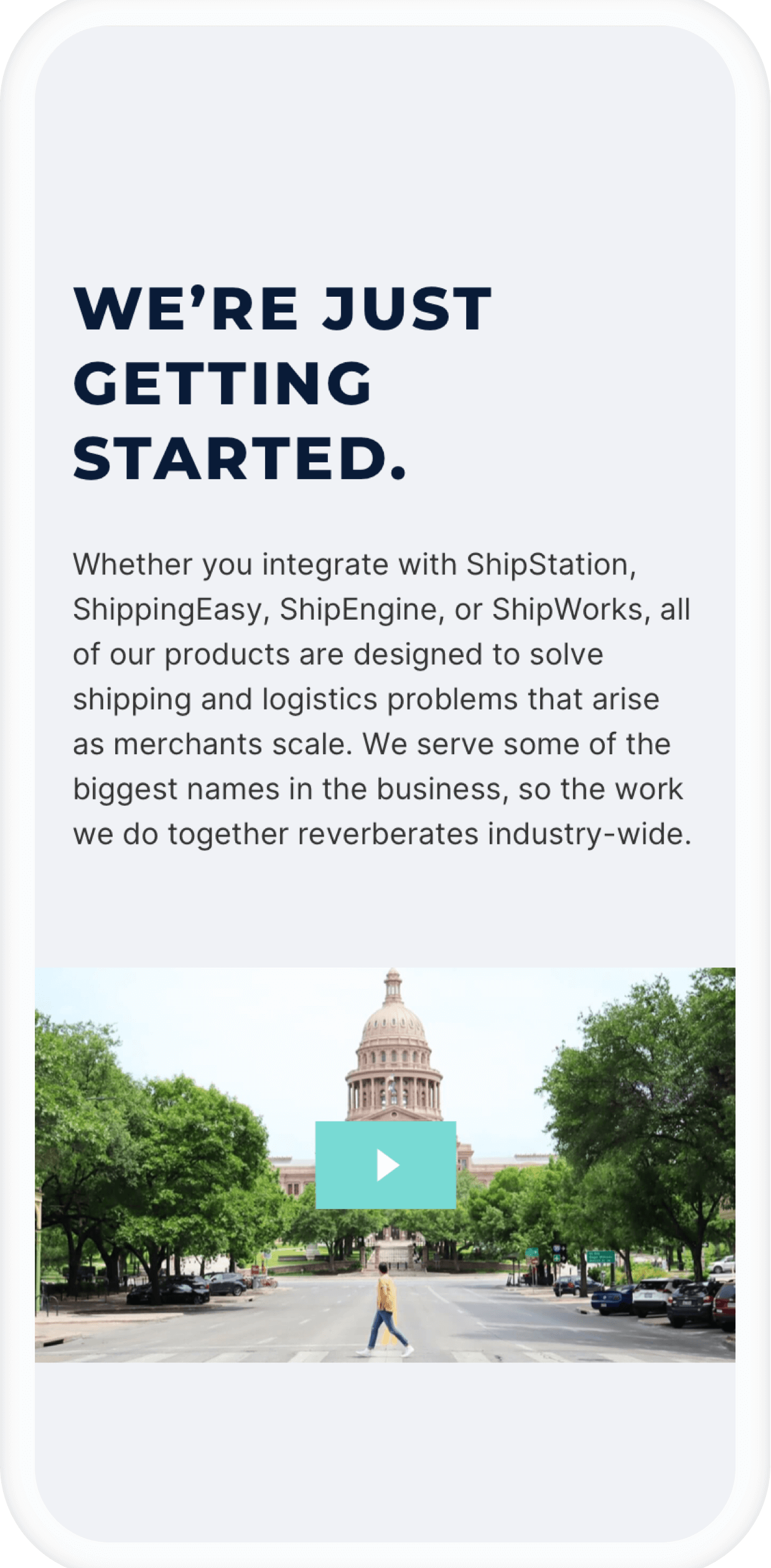
Auctane is the parent company of ShipStation, ShippingEasy, ShipEngine and ShipWorks. A subsidiary of Stamps.com, Auctane became an official brand in June 2020, as a way to formally present itself as a single organization. Unlike each shipping brand, Auctane is not a product. Instead, it’s meant to serve as a centralized brand for HR and recruiting so employees and job applicants know that ShipStation, ShippingEasy, ShipEngine and ShipWorks are part of the same organization.
Creating a New Brand
As a new organization, Auctane needed everything that comes with launching a brand — starting with a logo, visual identity, and defined voice and tone. Because we needed to launch the site as quickly as possible (about two months after kickoff), we decided to keep the project entirely in-house. I led this rebrand alongside Noah Suppin, Austin Faggard, and Kelsey Jones.
For the purposes of this case study, I won’t go into the specifics of how we came up with Auctane’s visual identity, but instead focus on the process of applying that identity to the website (which was my primary responsibility). However, the key branding elements are below.


Applying the Brand to Social Media
A look at the @auctanelife Instagram feed…

User Research & Initial Planning
Identifying the Auctane Audience
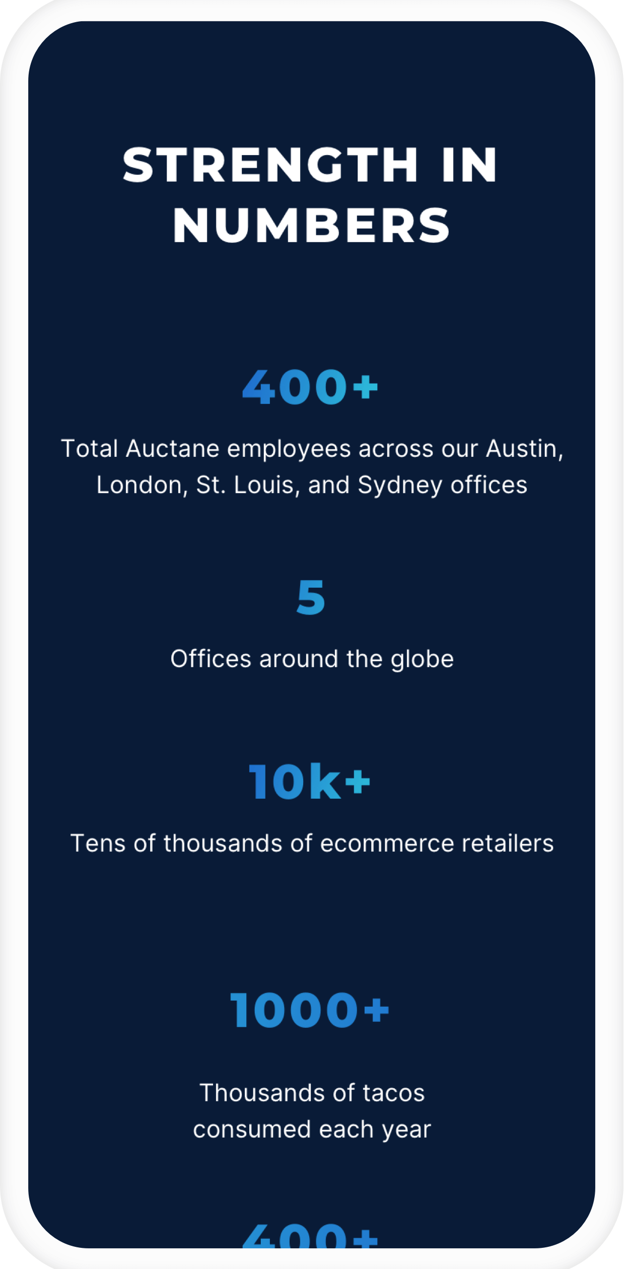
Unlike the other portfolio brands, Auctane was targeting a unique demographic: potential employees [mostly] located in the greater Austin area. With a strong internal culture, we wanted to add colleagues similar to ourselves — a seemingly easy endeavor. However, there’s no “one” type of personality or demographic at a 400-person company, so we needed to break this down further.
Type I: The young techie
Austin is an incredibly young city — something that is very much reflected in Auctane’s internal culture. With the vast majority of employees identifying as a Millennial or Gen Z-er, there are many young, hungry professionals who are passionate about Austin’s growing tech scene.
Type II: The industry-agnostic professional
Auctane also has a considerable number of employees who — unlike the techie — are less focused on the industry, and more focused on company culture and their specific role. These individuals are also quite young, but more flexible with the types of companies they apply to.
Problem Statement
How might we present the Auctane brand in a clear and compelling way, so that we can add talented individuals to our organization?
In product design, the problem almost always stems from the user — not the company. In this scenario, it’s more of a “we” problem. How can we present Auctane as a desirable place to work, and distinguish it from the many other tech companies in Austin?
Hypothesis
By adding faces to the brand and clearly explaining what Auctane is, we think our website will sufficiently inform and motivate talented candidates to apply to our company.
How will we measure success?
This one is interesting — because it’s not as simple as tracking conversion rates, session length, traffic volume and other key metrics. At the moment, Auctane does not advertise through social media or display ads, so it’s unrealistic to expect traffic to increase on its own.
Instead, we always ask candidates where and how they heard about the position. Each role is promoted not only through Auctane, but also through its specific brand website (ShipStation, ShippingEasy, ShipEngine and ShipWorks) as well as on Stamps.com.
If the candidate did hear about the role through Auctane, we ask them about the experience on the site. What was their understanding of Auctane? How did they perceive the brand? What factors (if any) on the website convinced them to apply for the position?
User Interviews
With our problem statement in mind, we needed to go a little broader for user interviews.
With ample access to individuals within our target demographic, we wanted to find out: As a candidate, what factors motivate you to apply to a specific company? What makes a company stand out?
Interview Highlights
“A website definitely influences my perception of a company, but isn’t the end-all-be-all. I think a good website shows a company values marketing and understands how it contributes to conversion. A company that invests in good design is important because it influences consumer perception. And it’s also cool to say “I work for X company” and have your friends look up the site and it looks super cool. It almost gives a company a level of prestige on first impression.”
— Kelsey, a 21-year-old college senior seeking full-time employment in tech industry
“The feedback of current employees on development opportunities, company culture, and how the leadership team’s ethos trickles down through the org tells me everything I need to know about whether or not a company will be the right fit for me. As a candidate, if you’re not back-channeling and asking current employees about their experience at said company, you’re likely not getting the full picture.”
— Caroline, a 29-year-old sales manager in the tech industry
“In terms of factors, I look for companies that are customer-centric, innovative, have a good reputation, and are on a clear path for growth. A company stands out when they treat customers, employees, and external candidates with trust and respect (clear expectations, communication, transparency).”
— Eddie, a 28-year-old program manager in the tech industry
User Flows
Because Auctane was in its infancy as a brand, we didn’t have much content — so we wanted the site to be fairly limited for V1.

User Flows, Pt. II
Many steps are optional and not required to complete the user flow. On every page, the user has the option to click or scroll.
A few things worth noting:
If the user scrolled on every page, the path would be: 1B, 2B, 3B, 4
If the user clicked on every main CTA to reach an application as quickly as possible, the path would be: 1A, 2A, 2B, 3A, 3B, 4
The call-to-action shown on 2B links to 2B via an anchor, so the career listings appear as if they live on their own page.

High Fidelity Mockups
Because of COVID, we had VERY limited office photography. Our temporary solution was to feature headshots of Auctane employees. Our primary goal for V1 was to position Auctane as an HR brand, not as a product.

Careers Page
The Auctane Careers page is designed not only to list available openings, but also to provide more information about life at Auctane.
To keep things as streamlined as possible for our Recruiting team, we display open positions and capture applications through Greenhouse (a third-party platform).
As I mentioned, the main CTA anchors to the Careers listing so the user can avoid scrolling. However, we realized later on that the page requires way too much scrolling — potentially deterring users.

Version II
Later, we realized our positioning was very unclear/confusing to candidates, so we made a few quick updates to appear more product-centric.
More to come on this.